News Funnel: my take on Designer News and Hacker News
I love practical side projects that I’ll actively use, so I created a web site that shows trending stories from two resources I check daily: Designer News (DN) and Hacker News (HN).
Many designers and developers I know consider both news sources essential reading. They’re the source of engaging Pocket reads, solid tech ideas, and inspiration that helps my career. Yet I’m not fully satisfied by the layout of the original web sites, or with other extensions or apps that aggregate content from either source. So I created my own.
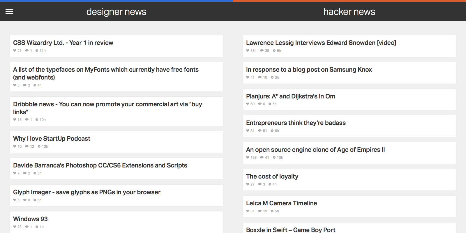
News Funnel has a rudimentary web scraper back end that feeds the 50 top ranked posts in from both Designer and Hacker News. It’s responsive and equally readable on phone, tablet, or desktop. But the site is less about development techniques and more about design exploration around how I use DN and HN. I don’t linger in either news source; it’s more jumping off point into an article or two to read or save for later via Pocket. I want content that I can browse as efficiently as possible.
An efficient design starts with typography. News Funnel is it its core a list of articles, so nailing the right font is a critical step. After researching many options in Typekit I settled on Dalton Maag’s Aktiv Grotesk as the app’s font. While I considered other, more distinctive or whimsical choices with higher contrast, Aktiv Grotesk is a grotesque that’s suited to the straightforward nature of the app. Yet it’s not the expected (and I’d argue, overused) Helvetica either. It’s cleaner, fresher, and more neutral, an effective cross between Helvetica and Univers. That neutrality is a good match for the diverse set of stories that trend on DN and HN. I also bumped up article title size and contrast more than other DN or HN aggregators; I prefer more discernible text over raw information density.
Because of how fast I move through both DN and HN, I wanted hit targets for my mouse clicks or finger taps that were large and obvious. That goal made for a logical match with the popular ‘card’ paradigm design. There’s one card or box per article, and a click or tap almost anywhere in the card opens it. For non-touch users, the border changes on mouseover to reinforce the action state. There’s also a large chat bubble icon with generous padding on each article’s right side to access the comments section.
I often visit both DN and HN for various reasons and in a range of contexts, which made adding customization a natural choice. It’s all accessible in a single side menu. By default, wide displays show DN and HN side by side, while narrow displays allow you to toggle between either source. There’s also a special combined mode which pulls articles from both sources into a single column, alternating articles in ranked order. Especially on narrow width displays (e.g. smartphones) that makes it easy to scan through both sources with minimum effort and context switching between apps or web pages. Just scroll down and keep your eye trained on a single column.
I find ranking and title to be an occasionally insufficient indicator of what I should be noticing from either news source. So to keep relevant articles front and center, I added a simple highlights toggle in the side menu. You can choose to highlight stories that have a large number of comments, high point score, or those that reached the top 50 list quickly. There’s no substitution for opening an article, but flipping on highlights and running a quick scan through the app can draw attention to good content I would have missed otherwise.
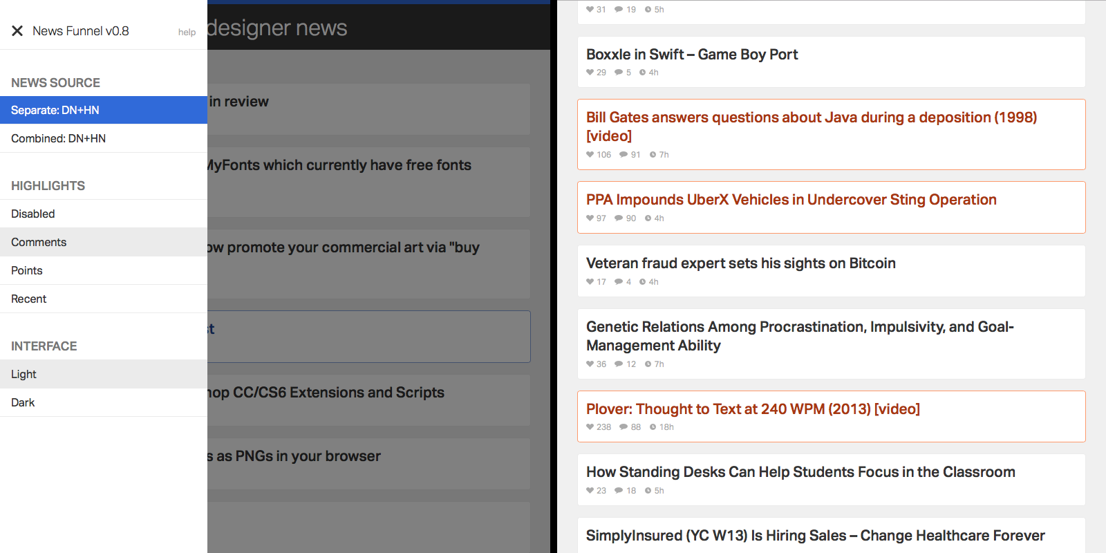
The context of where you access News Funnel matters as well. Much of that is taken care of with responsive web design so the list is readable on any device. But location and time of day is another key factor. I’m often scanning both news sources in low light scenarios, usually late at night on my Macbook or iPhone. To make it easier on the eyes, or for those that prefer a different look, I added a toggle to flip between light and dark color schemes.
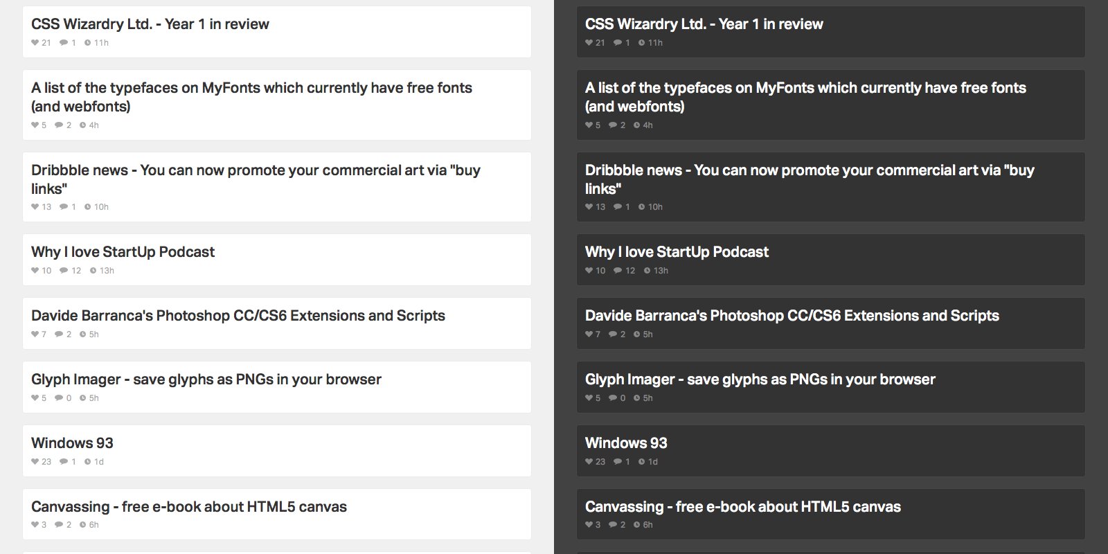
While I’m no aesthetic designer, I added a few visual touches to keep things simple and avoid distraction from the actual content. To start, animations are consistent. They run on the same easing scale and, for the exception of the side menu, are exclusively fade ins and outs. The reading color palette is monochrome. To add emphasis to clickable areas, hover states add punchier blue tones on DN content, orange on HN content (albeit toned down from the stronger “official” orange on the actual HN web site) and purple for combined content.
Overall, I designed News Funnel to be a concise way to check up on cool stories going on in the design, development, and the web. Feel free to check it out.