Apple Music shares a lot of the same DNA as other streaming platforms. There’s a huge music catalog, the ability to save a collection offline, curated playlists, and radio stations. Yet its UX feels distinct, more segmented and compartmentalized compared to its streaming peers. That’s a plus for streaming newbies and more casual users. But it comes at the the cost of comprehension and cohesion in the long run.
It’s easiest to cover Apple Music’s UX shortcomings through example. Say you browse through playlists in New on iTunes, and then jump into the For You segment to browse further. At this point, there’s no way to jump back chronologically into your previously accessed playlists. Each segment has a separate state and history. Or you want to find the source (e.g. album, playlist, radio station) of the currently playing track. It’s often awkward if not impossible to do so. Even search adds a binary toggle between My Music and Apple Music to further separate results.
Joel Johnson, writing for Fast Company on Apple News and other related publishing consolidation:
For publishers, Apple News and Facebook Instant Articles are simply another revenue stream that puts content where the audience has chosen to be…For readers, assaulted by bad advertising, these curated feeds could be a better—or at least universally banal—way to consume words and images. But it is unclear if most publications will be able to survive on only the revenue granted by these platform companies alone, and it feels incredibly aggressive for Apple to openly state that it—or at least some of its developers—have decided that advertising is always unwelcome, unless it happens to be advertising that Apple itself lords over.
This is exactly one of the major concerns I have with Apple News. Strong consolidation of media under a monolithic company like Apple generally doesn’t bode well for journalism and publishing in the long run.
Steven Levy on how technology will eventually save us from notification overkill:
So what’s the solution? We need a great artificial intelligence effort to comb through our information, assess the urgency and relevance, and use a deep knowledge of who we are and what we think is important to deliver the right notifications at the right time. As time goes on, we will trust such a system to effectively filter all our information and dole it out just as needed.
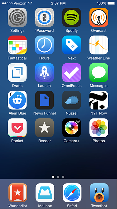
My iPhone app usage aligns with the 80-20 rule. Most apps I try are completely disposable; within a few days I delete them or relegate them to a folder off the home screen, for use only on rare occasions. Yet I use a handful of apps every day. They stand the test of time for months, if not years, of usage. As we wrap up 2014, I wanted to highlight my “must-haves”. Many are well known within tech circles, but there’s a few lesser known apps that are also worth your time.
News and Social media
Alien Blue. My Reddit usage pales in comparison to other social media and news sources. I never comment, happy to scan a handful of design and gaming subreddits for links and general information. Thankfully, Alien Blue handles the browsing component well. It deserves special praise for its handling of image galleries and videos, both of which pop up frequently on Reddit threads.
News Funnel. Another plug for my self-built news site that lists top stories from Designer News and Hacker News. It sizes down effectively for the iPhone (and other mobile devices) so I can scan both sites easily.
Nuzzel. The app aggregates and lists the most linked to articles in your Twitter feed, ordered by popularity. There’s no faster way to see what’s trending among my Twitter friends. And via the “news from friends of friends” option, I usually discover some tech, film or gaming related articles I would have otherwise missed. I’ve tried many tools that build content off of my Twitter feed; none of have stuck the way Nuzzel has.
NYT Now. I was I was skeptical of the streamlined, simplified interface of NYT Now when it debuted earlier this year. Yet after a week of usage it secured a permanent slot on my phone’s home screen. At its core, NYT Now lists the full NYT app’s top stories, but adds larger imagery and helpful bullet point summaries for articles I don’t have time to read. It’s that smart use of bullet points that make all the difference on the go.
Reeder. I like having full control over my news aggregation, so for me there’s no substitute for RSS in the form of a Feedbin account. On the go, Reeder is my Feedbin reader of choice. There are other quality apps with Feedbin integration, but I find Reeder syncs faster than the competition. Also, the screen density of list items – dense but not too dense – matches my workflow. It’s about speed and sharing to other services like Pocket and Twitter, not lingering to read full stories.
Tweetbot. I check up on Twitter frequently, which makes a strong Twitter client essential. And while there’s been strong improvements on the official Twitter app lately, it still can’t match the speed and customization Tweetbot offers. Its timeline sync between devices is an especially nice touch.
Productivity
Hours. I like to keep track of how much I’m working on both my day job and side tasks. I first tried popular web based time tracking software like Harvest and Toggl. But both felt optimized around more complex, team based workflows, when I prefer a simpler system. Enter Hours. The app centers on an intuitive interface for me to start, stop, and switch timers easily. It could use a Dropbox or iCloud based backup, not to mention a more customizable export system. But those are small quibbles on an otherwise strong 1.0 product.
Mailbox. I generally shy away from email apps that try to add their own productivity features on top of my inbox. But Mailbox adds its extras elegantly; with swipe gestures to archive or delete messages, I’m able to move through my inbox much faster than previous mail clients (there’s no coincidence Apple added similar swipe functionality to Mail with iOS8.) Overall, Mailbox adds just enough functionality to add value, but not too much to distract from my inbox content.
Pocket. My one stop source for catching up on content I’ve saved elsewhere on the web and aforementioned news apps like Tweetbot and Reeder. Parsing has gotten better over the years and the clean, stripped down reader view is easier on the eyes than many original web sources.
Wunderlist. I dig Omnifocus as a task manager for complex work tasks, but it’s overkill for simple to-do lists I write for chores, tasks at home, and other miscellaneous work. I’ve previously bounced around and tried Clear and Todoist, but both ultimately lacked staying power. Clear has a cool minimalist interface driven by gestures, but it was too simplistic for my needs and I’d run into occasional iCloud sync delays between devices. Todoist provides a lot more power, but the additional filters and searches overlapped too much with Omnifocus. Wunderlist finds a middle ground between Clear and Todoist; its sync is rock solid and the shared lists are useful and easy to set up with family members.
Miscellany
Next. Like with aforementioned time tracking, my budgeting needs are simple, centered on daily spending for expenses like restaurants, drinks, apps, and electronics. Because I’m entering in new entries manually each day, a smart entry UI is critical, and Next nails this perfectly. I tap a large category button, enter the amount and I’m done.
Overcast. For years I used Instacast to listen to podcasts. But eventually the complexity of extra features I never used (e.g. sleep timers, individual podcast settings), combined with several periods of slow syncing let me to try other clients. Marco Arment’s new Overcast matches my podcast flow perfectly; its interface is stripped down and straightforward, syncing is extremely reliable, and I use both of the exclusive “smart speed” and “voice boost” features heavily. There’s also a few small design touches I appreciate, like the audio equalizer animation during playback and the use of Concourse for typography.
Rise. I first scoffed at the idea of a dedicated alarm clock given the utility of Apple’s Clock app. But Rise is beautiful and has custom alarms that can progressively rise in volume, which I find is a more relaxing, peaceful way to be woken up. Most importantly, its gesture interface makes setup very easy, an important consideration given how often I change my wakeup time slightly from day to day.
RunKeeper. I run several times a week, and while I like select features on Strava and other fitness apps, I’ve always come back to RunKeeper for GPS-based run logging. The app has a straightforward interface that’s easy to both interact with and read as you run. I also appreciate the high degree of customization for automated voice notifications on your distance, time and speed.
Weather Line. I feel like I’ve tried at least twenty weather apps over the years, but since I started using Weather Line a year ago, I’ve been hooked. Like a few other weather apps, it has Dark Sky integration, which I find essential (so much so I own the original Dark Sky app for extra detail during rainy weather.) But Weather Line has a unique line graph interface that’s easily scannable to see how the rest of the day or week will pan out. I haven’t found another app that’s quite as intuitive, especially for a quick glance.
It’s that time of year again; several critically acclaimed apps get a discount for the holidays. Many rarely get a discount, so it’s worth jumping on these sales before they end on December 26th.
It’s a extremely strong set of applications, but I’d personally recommend Tweetbot, Drafts 4, Scanner Pro, MindNode, Next, and Clear.
New app icons for iTerm, Mailbox, nvAlt, Spotify, Sublime Text, and Tweetbot.
Yosemite’s most striking change to Mac OS X are its visuals, a nod to bring the OS more in line with iOS. That’s distilled in its new set of default system app icons. As John Siracusa writes in his Yosemite review:
Apple is trying to discipline the world of OS X icons. While one icon shape has been deemed insufficient, Apple believes three shapes should just about do it: circle, rectangle, and tilted rectangle…Visual simplification is the order of the day, and details that don’t read well at small icon sizes have been excised.
Unfortunately several apps I use heavily haven’t updated their icon and clash with Yosemite’s new look. In a sea of flat minimalism, bold colors, and thinner typography, a few icons that don’t follow trends can really stand out. So I hunted on Dribbble to find suitable replacements. Below I’ve provided a few direct links if you’re interested in grabbing them for yourself.
The default app icons.
If you haven’t replaced an app icon yet, it’s an easy process in Yosemite:
Right/command click on the app in Finder. Select “Get Info”. A dialog box will open.
In another Finder window, find the new replacement .icns file for the app. Click on the icns file and drag it over to the existing app Get Info dialog box. Release the file on top of the existing app icon at the very top of the dialog box.
In terms of my replacements:
iTerm isn’t far off the mark but I wanted a more minimal, flatter look that better paired with Apple’s Terminal icon. Jason Long’s take is a better match.
Mailbox overall looks great, but the “in construction” thin lines (albeit with good purpose to signify beta status) all over the Mailbox icon were distracting. Chris Jennings made a very clean replacement that goes well with Mailbox’s minimalist aesthetic.
nvALT has a clever icon with a small stack of sheets alongside a rocket ship taking off. But it’s busy in the context of Yosemite. So I went ahead and created my own amateur work in Sketch combined with Icon Slate for output. Download it here.
Spotify’s default icon already works with color and a circular shape. Yet I wanted something with a more subtle gradient, punchier color and more clearly defined edge to the icon. Sebastian de With’s Muir set was my first choice, but after using it for a few days the white coloring for the icon’s sonic waves felt off from Spotify’s black aesthetic. So I switched to Jean-François Goncalves’s work. It’s very similar, but with black instead of white accents.
The great Iconfactory put together Sublime Text’s “big button” style original icon, yet it never resonated with me; it was just a bit too “cute” for my tastes. I’ve used other replacements while on Mac OS 10.9, but for Yosemite I’ve settled on a simple tilted rectangle icon from Rafael Conde. I love the subtle cross hatching on the icon’s background.
Tapbots have always had a playful and original bent to their wonderful Tweetbot app; that gives some creative license away from Yosemite’s usual icon layout. But Ilja Miskov put together an option that plays better; it mirrors Tweetbot’s simpler iOS icon cropped to circular form for Yosemite.
Journalistic site Krautreporter, writing a post on Medium:
Three years after the death of its charismatic founder, Apple is doing all it can to maintain this reality distortion field, mainly by exercising total control about anything that is reported about the company or its products. In contrast to Apple’s design philosophy this strategy does not manifest itself through clarity and elegance, but through a subtle and sometimes questionable toying with our, the reporting journalists’ vanities and dependencies. If you write positively you’ll be wined and dined, if you criticize, no matter how fairly, you’ll be penalized. Admittedly this is common practice with large corporations, but hardly any one of them will go as far as Apple does. And there is no other corporation that the media have allowed to get away with this kind of manipulation for such a long period of time.
As much as we all admire Apple in many ways, it’s interesting to get a much harsher perspective on its treatment of the media. I question if it’s quite as black and white as Krautreporter portrays here, but there’s been many times where I’ve questioned the relationship between the tech press and Apple.
Another OS release, another great review by John Siracusa. Some might find John’s depth maddening (the review’s word count is probably larger than most other OS reviews online combined), but I think that’s exactly why it’s so essential. Treat it like a small novella: have a drink, sit on the couch and parse through the whole thing for a few hours on a low key night. If you love tech, it’s great entertainment.
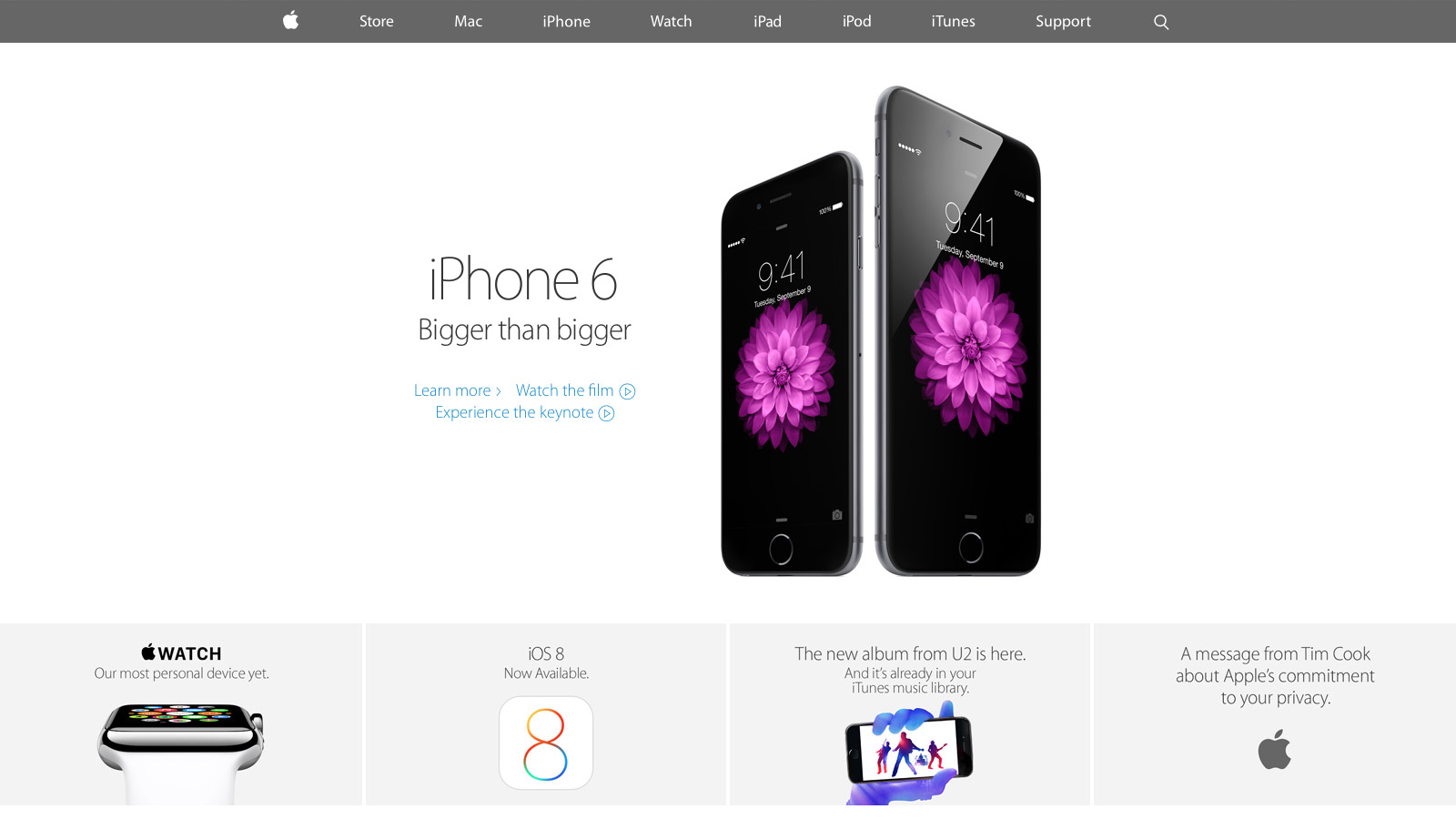
With the keynote announcement of the new iPhone and Apple Watch this month, select parts of apple.com have undergone a significant redesign. Curious to see how Apple stacked up against its competition, I researched the front end tech behind their new home page, iPhone 6 and Watch product pages. With only the web inspector as a guide, it’s an imperfect look, yet overall I’m impressed with how far Apple has come since their last major redesign.
CSS and JavaScript best practices: A-
Like most large companies with a big e-commerce presence, Apple has historically done well with CSS and JavaScript performance basics. They use global CDNs for their image assets and minify all CSS and JS references, ensuring their page weight is minimized.
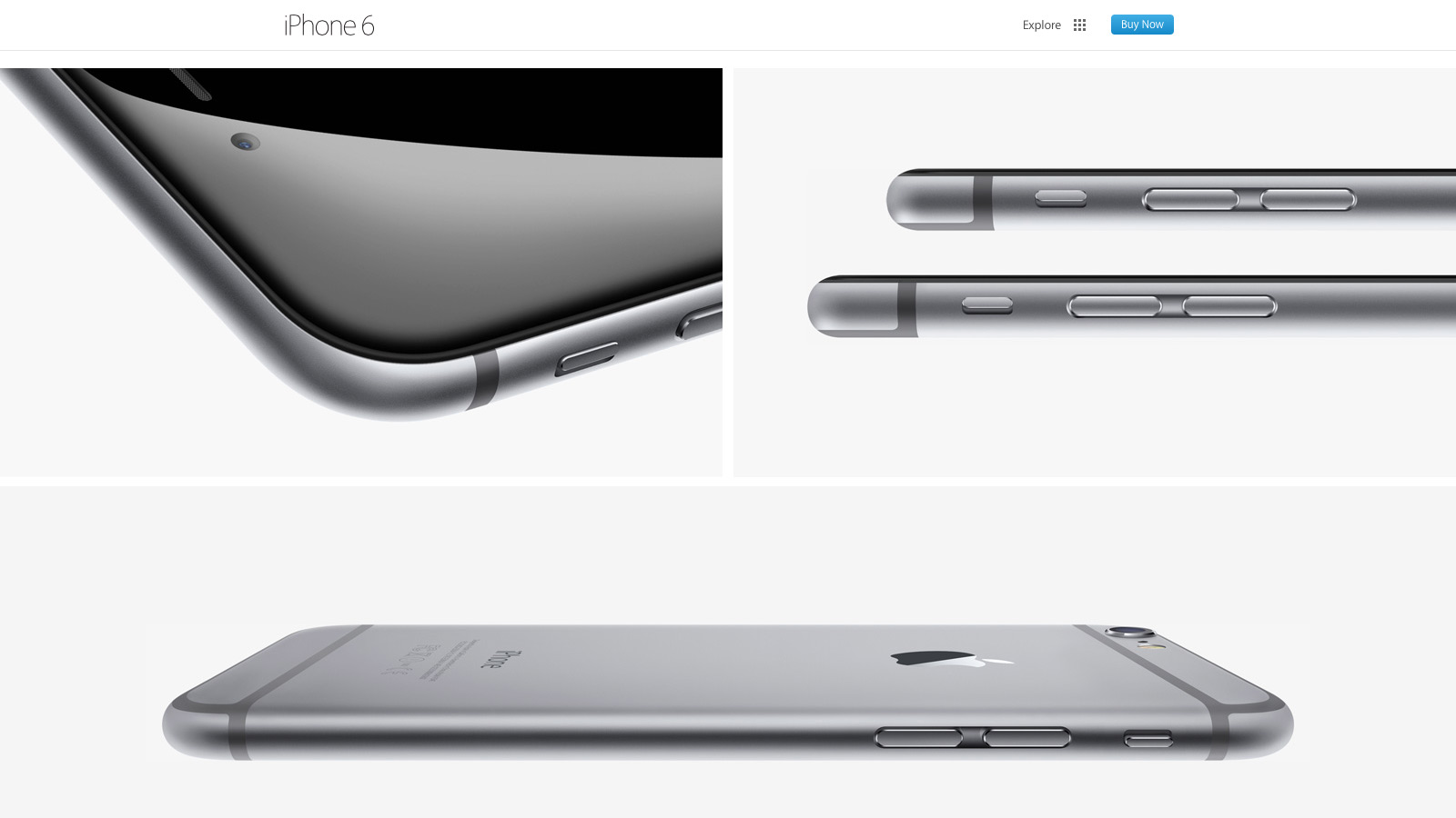
Much more was added with the September refresh. For the first time I spotted a Modernizr-like detection script that runs in the header. It illustrated Apple moving away from device specific styles and functionality (e.g. checking the browser user agent string to adjust content for iPad or iPhone) toward universal feature checks that adapt to whatever the browser supports. In addition, for both the iPhone 6 and Watch product pages, Apple delays select imagery from loading (Figure A) by a few seconds. This “lazy load” effect reduces page weight and increases page speed.
Figure A: images further down the iPhone 6 page load later to maximize page speed
There’s also smarter use of animation as the user scrolls down each product page. Apple added CSS3 animations all over the iPhone 5S product page a year ago, but their usage has expanded significantly since then. Animations are smartly limited to opacity and 3d transforms that stay fast by leveraging the computer’s GPU.
My only disappointment was the lack of sprites for some imagery, most notably the sub “explore” menu on the product pages. Arguably combining eight or more images into a single request won’t make a large difference, but it still feels like a missed opportunity.
Responsive web design: B
For the first time Apple relies heavily on media queries for a legit first class responsive web experience. Apple has used media queries in the past, but mostly for small tweaks like moving a product image from landscape to portrait orientation. Now there’s a major breakpoint to radically alter the site navigation and most imagery has fluid sizing to take full advantage of mobile device viewports. There’s also a custom responsive grid for aligning select elements. SVGs comprise the top navigation, a subtle nod that the usual 1x and 2x raster images won’t cut it for super HDPI devices like the iPhone 6 Plus.
The responsive design motif is a big step forward yet feels mildly safe: I wanted to see Apple exploit native responsive imagery (the picture element or srcset attribute of the img element), especially considering iOS8’s Safari supports srcset. Apple also uses device-width and device-height heavily in their major break points which seems unnecessary: if I navigate to apple.com with a slightly narrow browser on my laptop, it feels odd to just cut off content and add scrollbars when there’s a better optimized view available.
Typography: B
Unlike past designs that relied on occasional text images or web safe fonts, Apple has transitioned mostly to modern, custom web typography. Myriad Pro is deployed at several weights throughout the site and it’s a manageable (albeit a bit higher than I’d like) download at a bit over 300k.
Nevertheless, I wasn’t crazy about several paragraphs of product detail that use the thin Myriad Pro Light against a low contrast background (Figure B). It looks great on HDPI devices (e.g. Macbook Pros with Retina Displays, modern mobile devices) but can be a bit hard to read on lower resolution displays.
Figure B: Myriad looks great but can be harder to read on select product descriptions
Design and layout: A
Tech quibbles aside, Apple nailed their new design aesthetic for the home and product pages. They’ve done their homework in what’s common to modern design: generous white space, grid ratios, lots of vertical scrolling, “flat” layout that lacks depth and shadows, along with “full bleed” imagery that covers the entire browser viewport. Even carousels, controversial web elements that arguably lack engagement, are used well to highlight the Apple Watch. All carousel panes point to the same link and highlight the same product to avoid engagement issues. At the same time, the carousel’s huge imagery and slow transitions evoke a high-end, luxury vibe to match the aspirations of the Apple Watch itself.
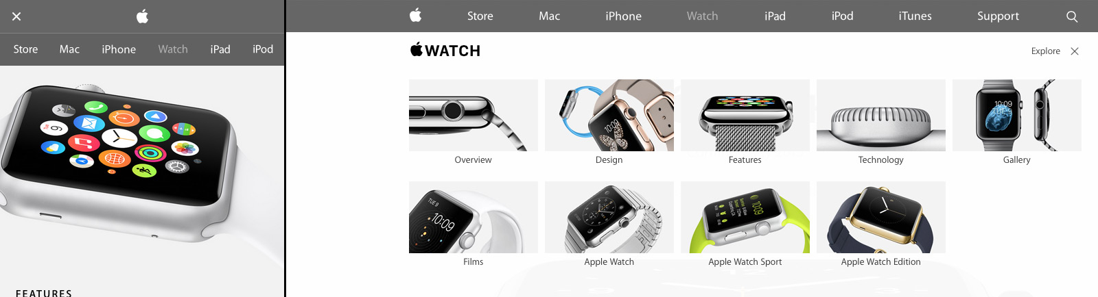
Apple’s new design isn’t just a nod to modern web trends either; Apple sets off in its own direction with a few small flourishes (Figure C). First there’s Apple’s spin on the now ubiquitous “hamburger” menu icon for narrow width browsers: Apple uses two lines, not three. Also when users open the mobile navigation, the pages display a lightweight, scrollable navigation menu. It’s a big deviation from the expected “off canvas” listing where navigation covers the viewport or slides the existing content off to one side. I didn’t care much for the menu design at first, but it’s growing on me and does succeed in setting Apple’s design apart. I also really liked the “explore” on the iPhone and Watch product pages. It’s functionally a mega menu but the extra imagery and large hit targets give a more breathing room and a high-end feel.
Figure C: Apple sets off in its own direction with a few small design touches
Overall: B+
Apple has come a long way since their last major refresh a year ago. Some issues with their responsive design decisions aside, they’ve finally caught up with most modern web practices. There’s even a few of their own “Apple-like” touches in their design to keep things fresh. Hopefully Apple will extend this design soon to other parts of the site, especially their support and e-commerce pages which are in serious need of a refresh.
There are hundreds of new features in iOS 8 and the ecosystem surrounding it that signal a far-reaching reimagination of what iOS apps should be capable of, the extent of user customization on an iPhone and iPad, or the amount of usage data that app developers can collect to craft better software.
Seven years into iOS, a new beginning is afoot for Apple’s mobile OS, and, months from now, there will still be plenty to discuss. But, today, I want to elaborate on my experience with iOS 8 in a story that can be summed up with:
iOS 8 has completely changed how I work on my iPhone and iPad.
I’d consider Federico a much more hard core power user than most, but his argument is pretty sound. For years I’ve been extremely envious of Android users and their custom widgets, keyboards, and third-party sharing capabilities. No more.