There’s many other aspects to recommend about Matthew Butterick’s wonderful book, but one of my favorites is this section, where Butterrick breaks down how to apply typographic principles to presentations. Given I teach courses part time, it really helped improve the quality of my work.
Wonderful mini tips roundup from teacher Paul Scrivens (Makers Cabin) on a tool I find myself turning to more and more. I’m doubt I’ll ever fully leave Photoshop entirely given the web’s remaining reliance on raster graphics, but it’s exciting to see a focused tool like Sketch gain so much momentum.
Another few months, another Sublime Text icon replacement. This one, put together by designer Rafael Conde, is really gorgeous in its simplicity and subtle grid pattern. And Rafael mentions in the Dribbble comments, it flows especially well with stock icons in OS X Yosemite.
In light of an inevitable design iteration on the iPhone next week, it’s relevant to remember others that move slowly. As Michael Bierut describes in The Design Observer, much more slowly:
And from a design point of view? Unbelievably boring. Or, I should say, unbelievably, wonderfully, perfectly, exquisitely boring. To a field that today seems to prize innovation above all else, The New Yorker makes a case for slow design: the patient, cautious, deliberate evolution of a nearly unchanging editoral format over decades. And the case they make is — let’s admit it — pretty hard to argue with.
It’s clear the PS4 is an unqualified sales success. It’s sold around ten million units, roughly 2 to 1 against the Xbox One. Those are impressive enough sales to be a key factor in Sony’s profitability for Q1 2014 after years of losses.
But even hit consoles need work; almost a year into its lifecycle, the PS4 needs to improve its user interface. As I’ve argued previously, the UI gets the job done as a quick, no-frills game launcher. Yet its “horizontal ribbon” layout, with every app (in this post, ‘app’ is a loose interpretation encompassing both games and entertainment apps like Netflix) on the system ordered in strict reverse chronological order, is hampered by its lack of customization (note the upcoming major UI update, as of this writing, doesn’t alter the app layout at all.)
Customization matters
Core gamers, often with large game libraries, have the most immediate demand for a more organization-friendly UI. Yet it’s not just a traditional fan base that may juggle between many apps. Popular premium subscription services like PS Plus, Xbox Live Gold and the recently announced EA Access offer new “free” game downloads at regular intervals as long as you’re a member. And casual gamers that only buy a few $60 AAA titles may buy more games as inexpensive and free-to-play indie titles proliferate on the PSN store.
Also, in 2014, customization isn’t just a nice to have, it’s essential to the DNA of most modern tech gear. Every smartphone, tablet, or laptop allows you to organize apps into folders or across multiple home screens. If I’m paying the same price for a dedicated gaming console as I am for the next iPhone, I expect basic levels of customization to define it as my own.
There’s a philosophical argument as well: gaming is going through the same pattern as all media post-internet, splintering into fragmented, niche genres. With so many on the same base console but able to purse much more individualistic tastes, some basic UI customization helps distinguish my PS4 from somebody else’s.
A multi ribbon interface
With such a large install base, major UI changes can be tricky. Thankfully, the UI doesn’t need a redesign from the ground up, just evolutionary growth into a multi ribbon system. Users create as many additional ribbons as they want and move apps to any ribbon they choose. To keep things straightforward, like with iOS, there are no extra “shortcuts” or “aliases” of app icons, only a single canonical icon within a set of ribbons.
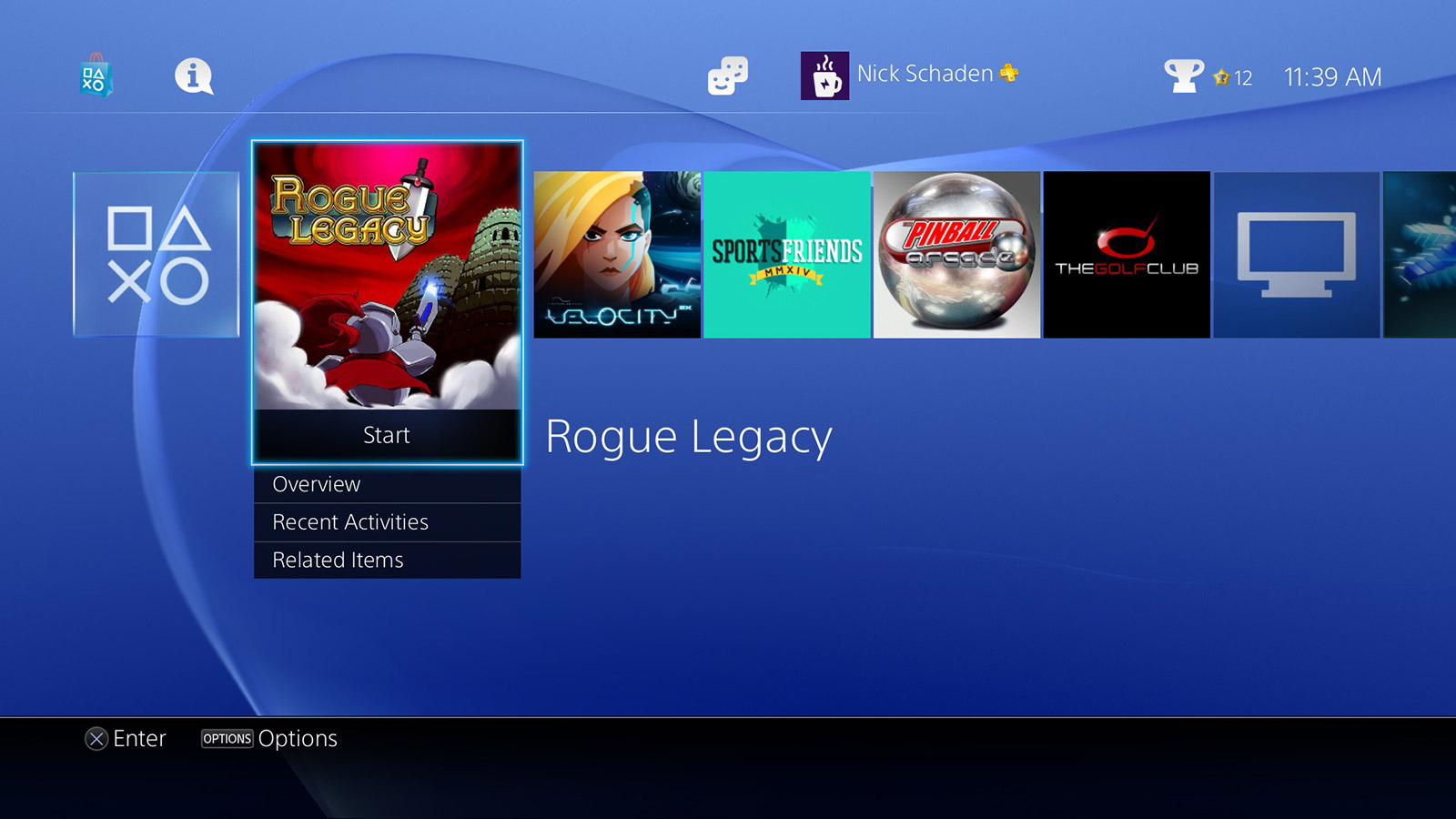
The original, single horizontal ribbon remains unchanged by default. Navigation and controls are identical to before, retaining the three row structure: settings, notifications and trophies are in the top row, apps in the middle, and details on an individual app or game at the bottom (figure A). Only one ribbon appears at a time.
Figure A: Start state of the proposed UI
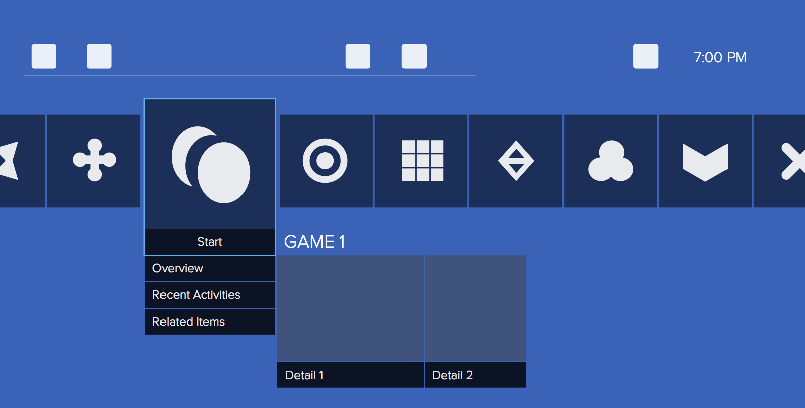
Users tap the DualShock controller triggers (L2, R2) or speak voice commands to cycle through their ribbons. As each ribbon appears, the scrolling text region in the screen’s top left briefly displays the ribbon name (figure B).
Figure B: user jumps to a new ribbon
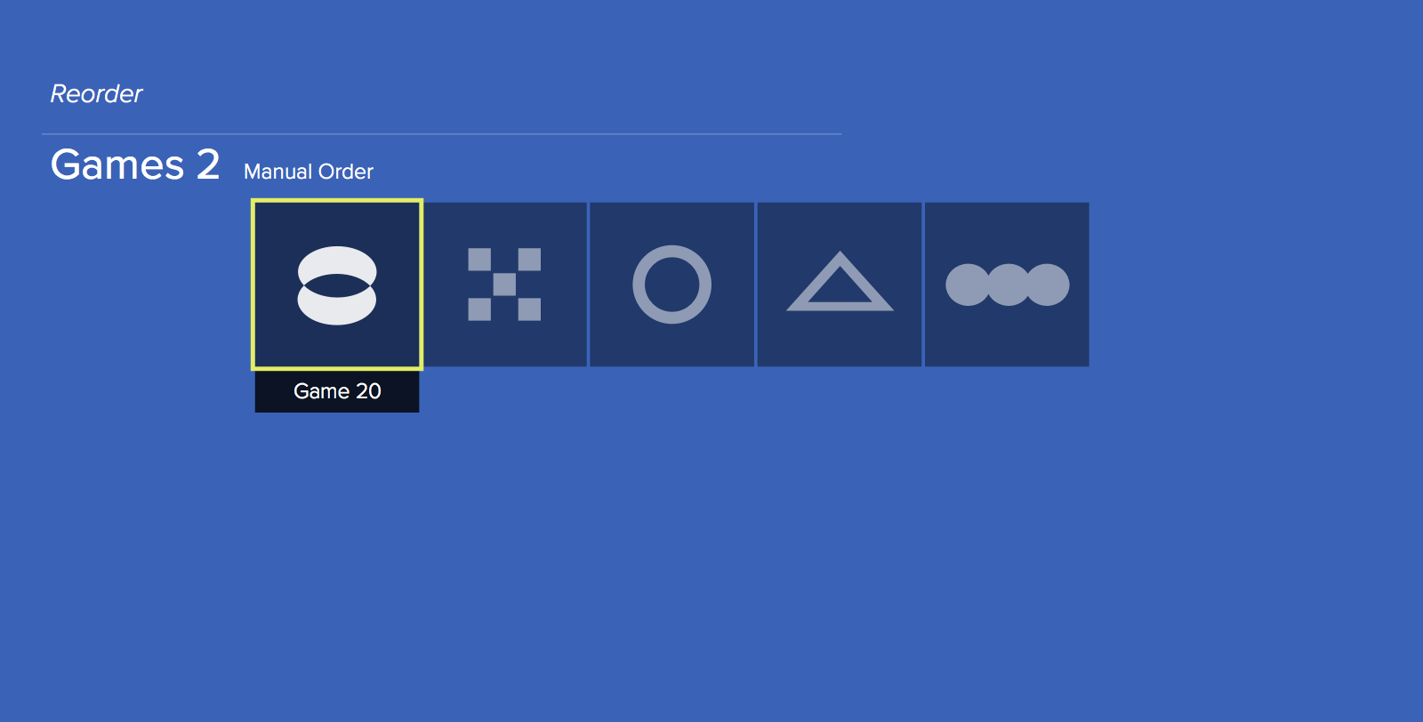
Reordering games and editing ribbons
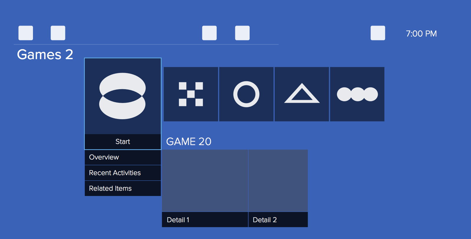
To reorder apps in a single ribbon or move an app to another ribbon, users enter a special “app reorder mode” by holding both DualShock bumpers (L1 and R1) down for a few seconds. This is a nod to the “hold an icon until it wiggles to edit” paradigm in most mobile OSes.
The UI’s look in this mode changes significantly: the top and bottom rows are removed and the app icon the cursor is selecting no longer enlarges the icon. In addition, new text labels are added around the ribbon to clarify the name of the active ribbon and its order (Figure C).
Figure C: app reorder mode
A new, simplified control scheme applies in this mode:
Controller bumpers cycle through the current ribbon’s order options: chronological (default), alphabetical, and manual.
X selects an individual app for movement.
Options opens up a menu to change the current ribbon’s name. Upon creation, all ribbons have an automatic, sequential ordering naming convention like “Games 4” and “Games 5”. But for users with a lot of content or who want a particular organization, custom labels are helpful.
The D-pad and analog sticks navigate between ribbons (up/down) and individual apps on a ribbon (left/right).
Square exits app reorder mode.
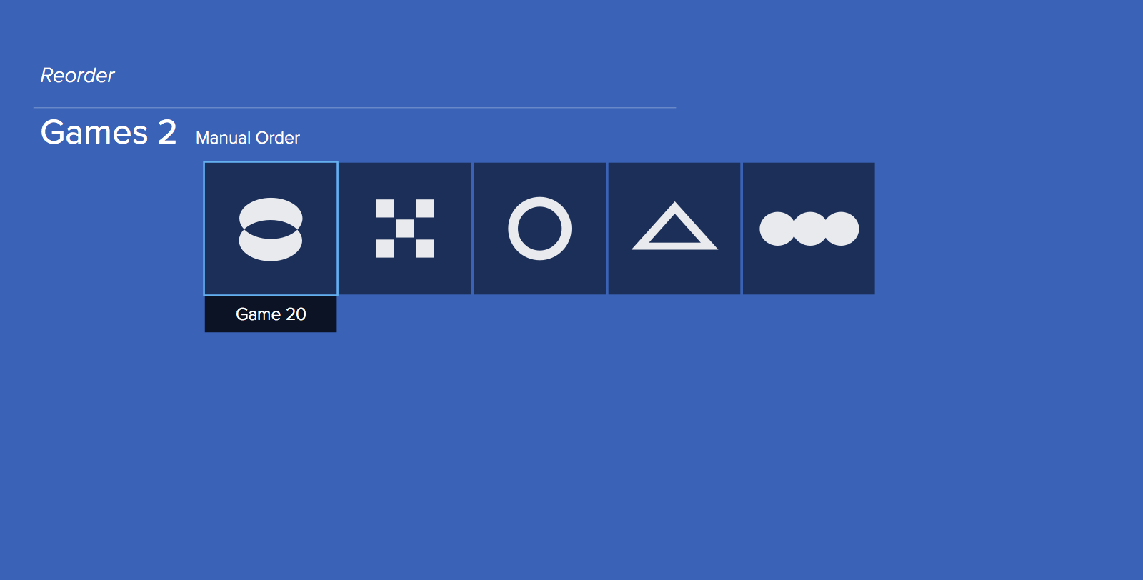
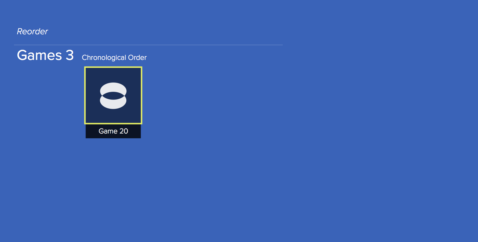
Once an icon is selected, a visual change (e.g. change in selected icon border color or thickness, icon appears to hover) indicates it’s available to move. Up and down always shuffles the app between ribbons. To keep things simple, the ribbons cycle with a definitive beginning and end; the first is at the top, the last is at the bottom and there’s no looping. This way, to create a new ribbon, all it takes is moving ‘down’ from the last occupied ribbon (figure D, E). Conversely, to remove a ribbon the user removes all icons from it.
Figure D: Game 20 is selected, ready for movement.
Figure E: Moving Game 20 "down" once auto creates a new ribbon.
Small change, big impact
Adding smarter organization isn’t going to move the needle for PS4 sales. Nor is it likely to affect Sony’s ongoing battle against the Xbox One, a fight centered on game selection, exclusives, and raw performance. Instead, a stronger UI makes users happier while improving their attachment to the device. For a dedicated gaming console in an increasingly mobile-centric world, that’s an underrated, compelling factor in the long run.
Design Sagi Shrieber reviews why Sketch is his new “go to” choice for design work: plugins, fast version releases, background blurs and much more. I learned a useful keyboard shortcut too; Ctrl/Cmd+C brings up a color picker.
I’ve listened to Dave Rupart for a while on the popular Shop Talk Show and also consider him an innovator in the RWD space with his work at Paravel. I pay attention when he talks about a new direction for design handoffs.
Designer Brent Jackson succinctly goes through the weaknesses of the hamburger menu; can’t say I completely agree with this more recent backlash against this now ubiquitous navigational choice, but Brent presents a strong argument.
Yesterday’s Google I/O keynote had it share of ups and downs but for me one clear highlight was their new “Material design” language for UX and the aesthetic look across web and Android. There’s a lot of interesting ideas here for the web, from well thought out typographic guidelines to a set of punchy color palettes to match the aesthetic.
Susan Robertson over at A List Apart wrote an excellent post detailing why style guides are important for web projects and how they can help maintain consistency for a project over the long run. It’s a solid intro for those new to the topic.