With the keynote announcement of the new iPhone and Apple Watch this month, select parts of apple.com have undergone a significant redesign. Curious to see how Apple stacked up against its competition, I researched the front end tech behind their new home page, iPhone 6 and Watch product pages. With only the web inspector as a guide, it’s an imperfect look, yet overall I’m impressed with how far Apple has come since their last major redesign.
CSS and JavaScript best practices: A-
Like most large companies with a big e-commerce presence, Apple has historically done well with CSS and JavaScript performance basics. They use global CDNs for their image assets and minify all CSS and JS references, ensuring their page weight is minimized.
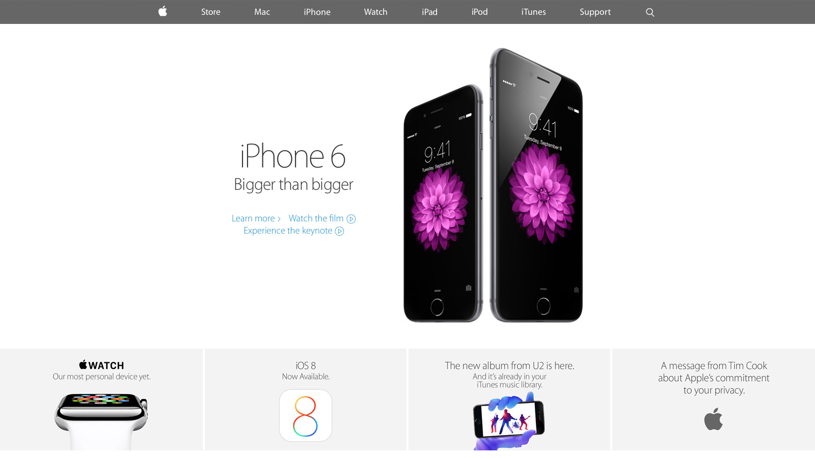
Much more was added with the September refresh. For the first time I spotted a Modernizr-like detection script that runs in the header. It illustrated Apple moving away from device specific styles and functionality (e.g. checking the browser user agent string to adjust content for iPad or iPhone) toward universal feature checks that adapt to whatever the browser supports. In addition, for both the iPhone 6 and Watch product pages, Apple delays select imagery from loading (Figure A) by a few seconds. This “lazy load” effect reduces page weight and increases page speed.
Figure A: images further down the iPhone 6 page load later to maximize page speed
There’s also smarter use of animation as the user scrolls down each product page. Apple added CSS3 animations all over the iPhone 5S product page a year ago, but their usage has expanded significantly since then. Animations are smartly limited to opacity and 3d transforms that stay fast by leveraging the computer’s GPU.
My only disappointment was the lack of sprites for some imagery, most notably the sub “explore” menu on the product pages. Arguably combining eight or more images into a single request won’t make a large difference, but it still feels like a missed opportunity.
Responsive web design: B
For the first time Apple relies heavily on media queries for a legit first class responsive web experience. Apple has used media queries in the past, but mostly for small tweaks like moving a product image from landscape to portrait orientation. Now there’s a major breakpoint to radically alter the site navigation and most imagery has fluid sizing to take full advantage of mobile device viewports. There’s also a custom responsive grid for aligning select elements. SVGs comprise the top navigation, a subtle nod that the usual 1x and 2x raster images won’t cut it for super HDPI devices like the iPhone 6 Plus.
The responsive design motif is a big step forward yet feels mildly safe: I wanted to see Apple exploit native responsive imagery (the picture element or srcset attribute of the img element), especially considering iOS8’s Safari supports srcset. Apple also uses device-width and device-height heavily in their major break points which seems unnecessary: if I navigate to apple.com with a slightly narrow browser on my laptop, it feels odd to just cut off content and add scrollbars when there’s a better optimized view available.
Typography: B
Unlike past designs that relied on occasional text images or web safe fonts, Apple has transitioned mostly to modern, custom web typography. Myriad Pro is deployed at several weights throughout the site and it’s a manageable (albeit a bit higher than I’d like) download at a bit over 300k.
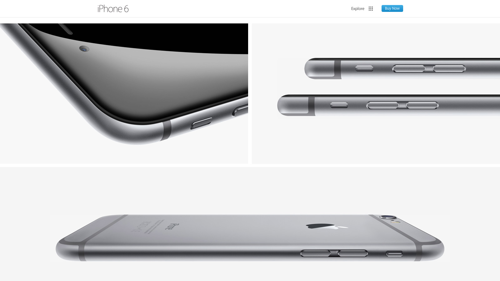
Nevertheless, I wasn’t crazy about several paragraphs of product detail that use the thin Myriad Pro Light against a low contrast background (Figure B). It looks great on HDPI devices (e.g. Macbook Pros with Retina Displays, modern mobile devices) but can be a bit hard to read on lower resolution displays.
Figure B: Myriad looks great but can be harder to read on select product descriptions
Design and layout: A
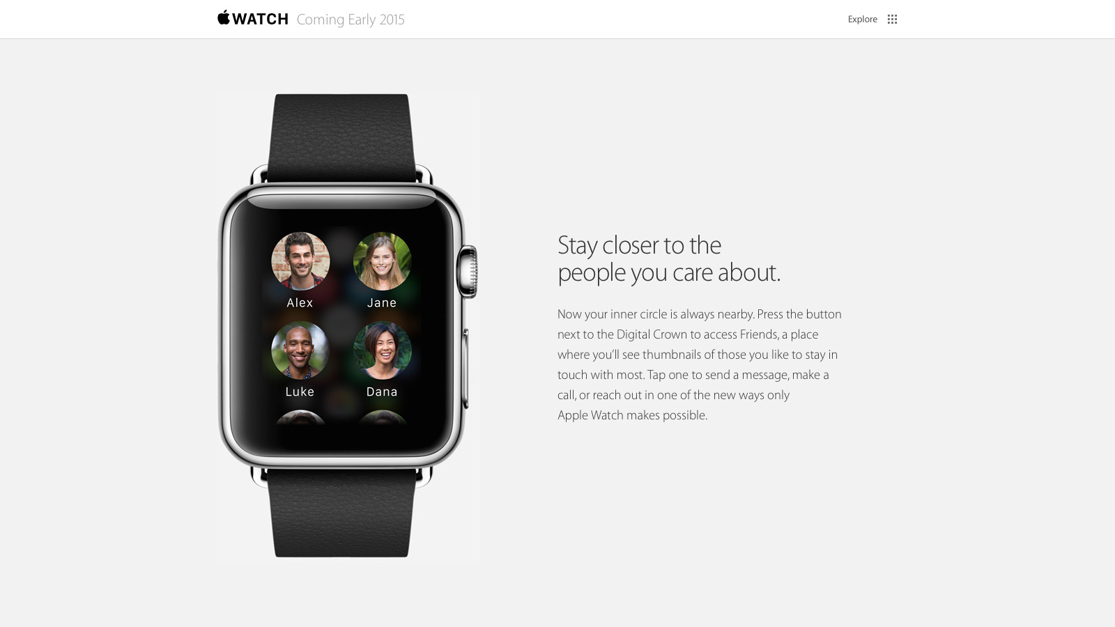
Tech quibbles aside, Apple nailed their new design aesthetic for the home and product pages. They’ve done their homework in what’s common to modern design: generous white space, grid ratios, lots of vertical scrolling, “flat” layout that lacks depth and shadows, along with “full bleed” imagery that covers the entire browser viewport. Even carousels, controversial web elements that arguably lack engagement, are used well to highlight the Apple Watch. All carousel panes point to the same link and highlight the same product to avoid engagement issues. At the same time, the carousel’s huge imagery and slow transitions evoke a high-end, luxury vibe to match the aspirations of the Apple Watch itself.
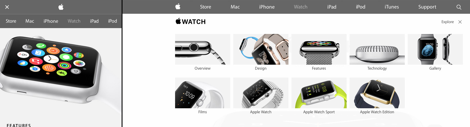
Apple’s new design isn’t just a nod to modern web trends either; Apple sets off in its own direction with a few small flourishes (Figure C). First there’s Apple’s spin on the now ubiquitous “hamburger” menu icon for narrow width browsers: Apple uses two lines, not three. Also when users open the mobile navigation, the pages display a lightweight, scrollable navigation menu. It’s a big deviation from the expected “off canvas” listing where navigation covers the viewport or slides the existing content off to one side. I didn’t care much for the menu design at first, but it’s growing on me and does succeed in setting Apple’s design apart. I also really liked the “explore” on the iPhone and Watch product pages. It’s functionally a mega menu but the extra imagery and large hit targets give a more breathing room and a high-end feel.
Figure C: Apple sets off in its own direction with a few small design touches
Overall: B+
Apple has come a long way since their last major refresh a year ago. Some issues with their responsive design decisions aside, they’ve finally caught up with most modern web practices. There’s even a few of their own “Apple-like” touches in their design to keep things fresh. Hopefully Apple will extend this design soon to other parts of the site, especially their support and e-commerce pages which are in serious need of a refresh.
If there’s something I do frequently at work, it’s take screenshots and send them to coworkers. There is your usual stable of options like Cloud and Droplr, but my storage live mostly revolves around Dropbox, and I wanted to stay in-house. Enter this great workflow by “Carlos-Sz” on the Alfred forums. I run a simple global keyboard shortcut, take a screenshot, and it’s saved a public folder in Dropbox, along with an auto generated short bit.ly link copied to my clipboard.
Wonderful brief look back over at The A.V. Club at Wong Kar-Wai’s Chungking Express, still one of my favorite movies of all time. Whimsical, gorgeously shoot, this is essential 90s cinema that many overlooked in favor of Kar-Wai’s later In the Mood for Love. In the Mood is still wonderful, but it never quite connected with me tonally like Chungking Express did.
French-Tunisian director Mabrouk El Mechri, working from a script he wrote with Frédéric Benudis and Christophe Turpin, pours these biographical details into a scenario that’s half hostage thriller, half Irma Vep-style meta-movie. And though the latter part is more compelling than the former, JCVD never forgets that Van Damme’s image is the focal point. El Mechri opens with the best shot of Van Damme’s career (and really, a legitimate candidate for any list of all-time great opening shots), a single take of the 47-year-old kicking, punching, shooting, and stabbing his way through a gauntlet of attackers, who come after him with guns, knives, grenades, even a flamethrower. The shot is ruined when the cheap set collapses at the end, but the young Chinese director has no sympathy for his exhausted middle-aged star: “Just because he brought John Woo to Hollywood doesn’t mean he can rub my dick with sandpaper.”
The movie has its weak points, but overall JCVD is very compelling (especially for someone like me who grew up loving Van Damme’s earlier work like Kickboxer and Bloodsport), both for that aforementioned opening fight scene and a legitimately moving six minute monologue Van Damme delivers partway through the film. There’s something about his presence that makes me root for a comeback out of direct to VOD purgatory.
Santiago Valdarrama writes for A List Apart about simple “prebrowsing” techniques to speed up web performance between pages. Browsers analyze patterns of a page a user is likely to go next, and utilize DNS prefetching, resource prefetching, and prerendering to help the process along.
Bonus points for a wonderful illustration by Kevin Cornell, one of my favorite ALA header graphics in months.
Developer Michael Church writes about the difficulties a friend of his has at getting a senior development job:
This whole issue is about more than what one knows and doesn’t know about technology. As programmers, we’re used to picking up new skills. It’s something we’re good at (even if penny-shaving businessmen hate the idea of training us). This is all about social status, and why status is so fucking important when one is playing the work game– far more important than being loyal or competent or dedicated.
Low and high status aren’t about being liked or disliked. Some people are liked but have low status, and some people are disliked but retain high status. In general, it’s more useful and important to have high status at work than to be well-liked. It’s obviously best to have both, but well-liked low-status people get crap projects and never advance. Disliked high-status people, at worst, get severance.
Michael’s main argument is that the overwhelming majority of those who remain software engineers – even those that are highly talented – can never can crack out of a low social status. Very interesting and depressing nonetheless.
Like many other developers and designers out there, almost every day I make the rounds of Designer News, Hacker News along with occasional forays into Sidebar and Dribbble.
Usually that involves a lot of Safari tabs and context switching. Panda aims to change that: it’s a simple, well designed web app that puts many of these popular sites side by side. As a Chrome extension, it can be the default state of any new tabs you create. There’s a few minor customization issues that keep me from diving fully in but it’s worth a look.
When you hear the word “just” being thrown around, dig deep into that statement and find all of the assumptions made within it. Zoom out and think slow.
Your product lives and dies by the decisions discovered between ideation and creation, so don’t just put it up on a server somewhere.
There are hundreds of new features in iOS 8 and the ecosystem surrounding it that signal a far-reaching reimagination of what iOS apps should be capable of, the extent of user customization on an iPhone and iPad, or the amount of usage data that app developers can collect to craft better software.
Seven years into iOS, a new beginning is afoot for Apple’s mobile OS, and, months from now, there will still be plenty to discuss. But, today, I want to elaborate on my experience with iOS 8 in a story that can be summed up with:
iOS 8 has completely changed how I work on my iPhone and iPad.
I’d consider Federico a much more hard core power user than most, but his argument is pretty sound. For years I’ve been extremely envious of Android users and their custom widgets, keyboards, and third-party sharing capabilities. No more.
Many tech and productivity blogs promote device convergence: with a single smartphone, tablet, or laptop, you’re ready for almost any activity, from gaming to video production. After years of experience with assorted tech gear, I’ve found convergence overrated. It’s the exact opposite – device specialization – that’s a lot more effective.
More concretely, the next time you unlock your phone or sit down in front of your laptop, ask yourself: “what works best here for my needs?” Isolate the apps that you use regularly and that feel natural in context; keep them on your home screen or otherwise easily accessible. Bury the rest in folders knowing full well you’ll probably be faster and more efficient if you wait to perform those activities on another device.
For me, multi-device specialization translates into a set workflow:
My iPhone is used for quick reads of the news (NYTNow), short saved articles (Pocket), catching up on Twitter (Tweetbot) and the occasional quick puzzle game (Threes).
My iPad is for daily scans of news feeds (Mr. Reeder), long reads (again, Pocket) and classic strategy games (Hearthstone, Ticket to Ride) that don’t rely on awkwardly tacked-on control schemes.
My Macbook Air is mostly used for writing, development, and design.
The PS4 is optimized for most of my gaming needs. It’s essential for any game that plays better with traditional controller input. With the comfort and immersion factor of a large screen and sound system, it’s also ideal for play sessions longer than thirty minutes at a time.
There are exceptions to the above (e.g. occasional writing edits on Writer Pro with my iPhone when I’m in the subway), but I’m generally more productive if I delay work until I reach the right device. I also happen to be someone who actively uses all this gear; some may successfully embrace a simpler workflow around a single device. But that’s not for me, and I suspect it isn’t for many others.
Overall, if you’ve found yourself struggling with your device’s size, context, power, or input method for certain activities, try changing your workflow. Move away from convergence and toward multi-device specialization.