My iPhone app usage aligns with the 80-20 rule. Most apps I try are completely disposable; within a few days I delete them or relegate them to a folder off the home screen, for use only on rare occasions. Yet I use a handful of apps every day. They stand the test of time for months, if not years, of usage. As we wrap up 2014, I wanted to highlight my “must-haves”. Many are well known within tech circles, but there’s a few lesser known apps that are also worth your time.
News and Social media
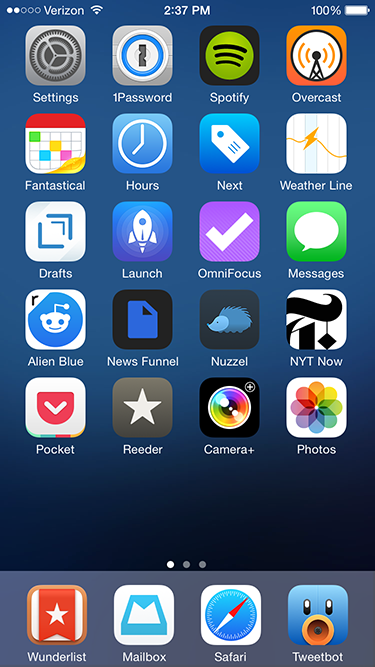
Alien Blue. My Reddit usage pales in comparison to other social media and news sources. I never comment, happy to scan a handful of design and gaming subreddits for links and general information. Thankfully, Alien Blue handles the browsing component well. It deserves special praise for its handling of image galleries and videos, both of which pop up frequently on Reddit threads.
News Funnel. Another plug for my self-built news site that lists top stories from Designer News and Hacker News. It sizes down effectively for the iPhone (and other mobile devices) so I can scan both sites easily.
Nuzzel. The app aggregates and lists the most linked to articles in your Twitter feed, ordered by popularity. There’s no faster way to see what’s trending among my Twitter friends. And via the “news from friends of friends” option, I usually discover some tech, film or gaming related articles I would have otherwise missed. I’ve tried many tools that build content off of my Twitter feed; none of have stuck the way Nuzzel has.
NYT Now. I was I was skeptical of the streamlined, simplified interface of NYT Now when it debuted earlier this year. Yet after a week of usage it secured a permanent slot on my phone’s home screen. At its core, NYT Now lists the full NYT app’s top stories, but adds larger imagery and helpful bullet point summaries for articles I don’t have time to read. It’s that smart use of bullet points that make all the difference on the go.
Reeder. I like having full control over my news aggregation, so for me there’s no substitute for RSS in the form of a Feedbin account. On the go, Reeder is my Feedbin reader of choice. There are other quality apps with Feedbin integration, but I find Reeder syncs faster than the competition. Also, the screen density of list items – dense but not too dense – matches my workflow. It’s about speed and sharing to other services like Pocket and Twitter, not lingering to read full stories.
Tweetbot. I check up on Twitter frequently, which makes a strong Twitter client essential. And while there’s been strong improvements on the official Twitter app lately, it still can’t match the speed and customization Tweetbot offers. Its timeline sync between devices is an especially nice touch.
Productivity
Hours. I like to keep track of how much I’m working on both my day job and side tasks. I first tried popular web based time tracking software like Harvest and Toggl. But both felt optimized around more complex, team based workflows, when I prefer a simpler system. Enter Hours. The app centers on an intuitive interface for me to start, stop, and switch timers easily. It could use a Dropbox or iCloud based backup, not to mention a more customizable export system. But those are small quibbles on an otherwise strong 1.0 product.
Mailbox. I generally shy away from email apps that try to add their own productivity features on top of my inbox. But Mailbox adds its extras elegantly; with swipe gestures to archive or delete messages, I’m able to move through my inbox much faster than previous mail clients (there’s no coincidence Apple added similar swipe functionality to Mail with iOS8.) Overall, Mailbox adds just enough functionality to add value, but not too much to distract from my inbox content.
Pocket. My one stop source for catching up on content I’ve saved elsewhere on the web and aforementioned news apps like Tweetbot and Reeder. Parsing has gotten better over the years and the clean, stripped down reader view is easier on the eyes than many original web sources.
Wunderlist. I dig Omnifocus as a task manager for complex work tasks, but it’s overkill for simple to-do lists I write for chores, tasks at home, and other miscellaneous work. I’ve previously bounced around and tried Clear and Todoist, but both ultimately lacked staying power. Clear has a cool minimalist interface driven by gestures, but it was too simplistic for my needs and I’d run into occasional iCloud sync delays between devices. Todoist provides a lot more power, but the additional filters and searches overlapped too much with Omnifocus. Wunderlist finds a middle ground between Clear and Todoist; its sync is rock solid and the shared lists are useful and easy to set up with family members.
Miscellany
Next. Like with aforementioned time tracking, my budgeting needs are simple, centered on daily spending for expenses like restaurants, drinks, apps, and electronics. Because I’m entering in new entries manually each day, a smart entry UI is critical, and Next nails this perfectly. I tap a large category button, enter the amount and I’m done.
Overcast. For years I used Instacast to listen to podcasts. But eventually the complexity of extra features I never used (e.g. sleep timers, individual podcast settings), combined with several periods of slow syncing let me to try other clients. Marco Arment’s new Overcast matches my podcast flow perfectly; its interface is stripped down and straightforward, syncing is extremely reliable, and I use both of the exclusive “smart speed” and “voice boost” features heavily. There’s also a few small design touches I appreciate, like the audio equalizer animation during playback and the use of Concourse for typography.
Rise. I first scoffed at the idea of a dedicated alarm clock given the utility of Apple’s Clock app. But Rise is beautiful and has custom alarms that can progressively rise in volume, which I find is a more relaxing, peaceful way to be woken up. Most importantly, its gesture interface makes setup very easy, an important consideration given how often I change my wakeup time slightly from day to day.
RunKeeper. I run several times a week, and while I like select features on Strava and other fitness apps, I’ve always come back to RunKeeper for GPS-based run logging. The app has a straightforward interface that’s easy to both interact with and read as you run. I also appreciate the high degree of customization for automated voice notifications on your distance, time and speed.
Weather Line. I feel like I’ve tried at least twenty weather apps over the years, but since I started using Weather Line a year ago, I’ve been hooked. Like a few other weather apps, it has Dark Sky integration, which I find essential (so much so I own the original Dark Sky app for extra detail during rainy weather.) But Weather Line has a unique line graph interface that’s easily scannable to see how the rest of the day or week will pan out. I haven’t found another app that’s quite as intuitive, especially for a quick glance.
New app icons for iTerm, Mailbox, nvAlt, Spotify, Sublime Text, and Tweetbot.
Yosemite’s most striking change to Mac OS X are its visuals, a nod to bring the OS more in line with iOS. That’s distilled in its new set of default system app icons. As John Siracusa writes in his Yosemite review:
Apple is trying to discipline the world of OS X icons. While one icon shape has been deemed insufficient, Apple believes three shapes should just about do it: circle, rectangle, and tilted rectangle…Visual simplification is the order of the day, and details that don’t read well at small icon sizes have been excised.
Unfortunately several apps I use heavily haven’t updated their icon and clash with Yosemite’s new look. In a sea of flat minimalism, bold colors, and thinner typography, a few icons that don’t follow trends can really stand out. So I hunted on Dribbble to find suitable replacements. Below I’ve provided a few direct links if you’re interested in grabbing them for yourself.
The default app icons.
If you haven’t replaced an app icon yet, it’s an easy process in Yosemite:
Right/command click on the app in Finder. Select “Get Info”. A dialog box will open.
In another Finder window, find the new replacement .icns file for the app. Click on the icns file and drag it over to the existing app Get Info dialog box. Release the file on top of the existing app icon at the very top of the dialog box.
In terms of my replacements:
iTerm isn’t far off the mark but I wanted a more minimal, flatter look that better paired with Apple’s Terminal icon. Jason Long’s take is a better match.
Mailbox overall looks great, but the “in construction” thin lines (albeit with good purpose to signify beta status) all over the Mailbox icon were distracting. Chris Jennings made a very clean replacement that goes well with Mailbox’s minimalist aesthetic.
nvALT has a clever icon with a small stack of sheets alongside a rocket ship taking off. But it’s busy in the context of Yosemite. So I went ahead and created my own amateur work in Sketch combined with Icon Slate for output. Download it here.
Spotify’s default icon already works with color and a circular shape. Yet I wanted something with a more subtle gradient, punchier color and more clearly defined edge to the icon. Sebastian de With’s Muir set was my first choice, but after using it for a few days the white coloring for the icon’s sonic waves felt off from Spotify’s black aesthetic. So I switched to Jean-François Goncalves’s work. It’s very similar, but with black instead of white accents.
The great Iconfactory put together Sublime Text’s “big button” style original icon, yet it never resonated with me; it was just a bit too “cute” for my tastes. I’ve used other replacements while on Mac OS 10.9, but for Yosemite I’ve settled on a simple tilted rectangle icon from Rafael Conde. I love the subtle cross hatching on the icon’s background.
Tapbots have always had a playful and original bent to their wonderful Tweetbot app; that gives some creative license away from Yosemite’s usual icon layout. But Ilja Miskov put together an option that plays better; it mirrors Tweetbot’s simpler iOS icon cropped to circular form for Yosemite.
The now shuttered Google Reader and many alternative feed readers (e.g. Feedly, Digg Reader, Feedbin) still have a lot of fans in the tech community: they make web browsing more efficient by aggregating content from a bunch of web sites under a single interface. But many argue feed readers are dated, that Twitter and other social media forms have “killed” the need for a dedicated feed reader.
I disagree. While the tech isn’t for everyone, I think much of the dismissiveness comes from those that setup a feed reader poorly. They add a bunch of high traffic, big name sites (e.g. The New York Times, The Verge, The Awl), get overwhelmed and quit in frustration.
Some can handle, even prefer this very high velocity setup, but I think it’s rare. There’s a better way to set up your feed reader. Start small, start wide, move through articles rapidly, and have an effective way to save the articles that are of interest.
Start small
When you set up a feed reader for the first time, keep the velocity – the rate of which new articles get aggregated to your reader – low. I like to start with a “10 by 10” rule: pick up to ten feeds that each post no more than ten times a day. Remember this is only a starting point; as you get use to your feed reader of choice you can always increase the velocity later.
Start wide
One of the strengths of a feed reader is its ability to pull content from sites you don’t pass through during your daily web browsing. To put it another way, effective feed readers widen the net. Keep that in mind when you’re picking your first set of feeds. A good rule I like to use is actively include content that’s different than what you normally are exposed to in your day job. Alternatively, focus on sources that give a unique spin on content you normally read elsewhere. For example, if you like politics, instead of adding feeds from big sites like Politico and Wonkette, subscribe to individual columnists you enjoy from smaller markets.
Move through articles rapidly
You can move slowly through articles one at a time in a feed reader, but I think this can be a flawed approach for several reasons. First, remember many sites truncate their feed content, which prevents a full article display within the reader. Second, feed readers are rarely optimized for reading; you often get a big list of unread items taking up significant screen real estate. Also, the article itself is cramped and there’s often a bunch of feed reader UI on screen that distracts from the content. Third, a slow approach means there’s a much better chance you’ll leave your feed reader with a lot of items unread.
I’d recommend configuring your feed reader into a “summary only” view where the focus is on scanning headlines, not full articles. Move quickly, and if any article sparks your interest, open it up in a new background tab or otherwise save for reading later (keyboard shortcuts can come in handy here.)
Have an effective way to save for later
After you process unread items in your feed reader, you’ll want a way to go back and read the titles that caught your attention. Generally there’s three ways to do this: flag the article with the feed reader’s built-in system (e.g. stars, flags, highlights, etc.), keep the article open in an external tab or save it in a dedicated “read it later” service like Pocket. I highly recommend relying on the latter two options only: new external tabs for quick items you’ll read immediately and a dedicated “read it later” service for everything else.
Overall, don’t shy away from feed readers due to their “power user” reputation. By following a few simple rules, almost anyone can benefit from adding a feed reader to their workflow.
Developers have clamored for a paid upgrade system since the App Store’s inception, but I’m worried Apple won’t offer this feature anytime soon. I’m far from alone – Instapaper developer Marco Arment also predicted Apple’s non-action on his latest podcast. Yet Marco and many others don’t think this is a problem, that the current à la carte system is “the future” of software publishing. They’re completely wrong.
Apple drags its feet on paid upgrades because Apple wants simplicity for their customers. A choice between a full product and paid upgrade muddles this philosophy. For now, all users get all app upgrades automatically. If you introduce optional, paid upgrades, certain updates only apply to select customers. This adds complexity for consumers and developers having to juggle and maintain multiple app versions on the store.
In addition, the lack of paid upgrades keep app purchase prices lower. This is simple economics: on the App Store, developers have to force a repurchase between major versions in the form of a new app. App prices will be driven lower to offset the much larger sticker shock between versions and to account for boosts in upgrade revenue (100% of the product cost instead of some smaller fraction.)
I don’t think this is a good economic model, especially for more expensive, professional level software, such as Omnifocus and Photoshop. But remember, Apple is not, at its core, a software company; they make money from selling iPhone and iPads. The cheaper the software, the greater the incentive we have to keep on buying Apple’s hardware.
Also it’s professionals and power users – both niche Apple consumers – that demand paid upgrades, not the core audience. Given how rarely Apple updates its pro products (e.g. Mac Pros, Aperture, Final Cut) in the last few years, we’re in for a serious wait before Apple takes any action here.
Marco defended Apple’s inaction on this week’s Build and Analyze podcast; I disagree with him. A lack of paid upgrades causes two main problems:
The absence of an incremental purchase kills a huge source of revenue for developers and publishers. Without both new software and upgrade streams, many publishers, from high end publishers like Adobe to independent studios like Delicious Monster and Panic have a hard time staying afloat. In economic terms, a lack of price discrimination between more receptive, existing customers and newcomers is a major problem.
Customers get angry and frustrated when they can’t upgrade. Naturally for apps under a few dollars, this issue doesn’t apply, given the small investment. Yet if you’re considering $40, $80, or hundreds more for a purchase, an upgrade by way of repurchasing the software is costly. It’s especially aggravating if the next big upgrade is launched soon after you buy the old version. This keeps potential buyers on the sidelines between major releases, exactly the time when many developers need revenue to keep going.
Apple needs a change in course here. A lack of paid upgrades is killing both developer revenue and consumer interest in a lot of great apps. It’s also watering down app quality, especially in the iPhone and iPad markets where there’s no App Store alternative.
In the iOS and Mac app stores, newcomer generalist apps are dead. Long live the new wave of hyperfocused apps.
This point was inevitable given both stores have reached a saturation point. There are so many calendars, text editors, todo lists, weather forecasts and photo editors – to name just a few categories – that it’s increasingly rare for any newcomer to stand out. Several success stories emerge early (e.g. Omnifocus and Todo for todo lists, Camera+ in the photo department) receive positive coverage, gain a user base and iterate. Meanwhile most competitors flounder and struggle.
Yet developers are opting out of this Darwinian cycle by going very deep, singular and focused with their app functionality. I wouldn’t use the term “minimal” because some are loaded with options and customization for power users. “Hyperfocused” fits better as each app’s direction is simple and straightforward. Where a generalist app might have ten features, a hyperfocused app has one, but executes that one feature with depth, polish, and well thought out design.
Not every app of this style can be a winner – their very focus makes them divisive – but a few have clicked well with my workflow: Drafts and Dark Sky for iOS and Take Five for the Mac.
Drafts
Unlike other more generalist text editors that expect a setup process for new documents, Drafts presents you with a blank document and keyboard on every launch. There’s no required taps for a new document location or file type; open the app and you’re ready to type with little lag. Drafts at its core feels like the default Notes app with a serious speed and UI upgrade and that alone should appeal to many.
But speed is only a fraction of Drafts full functionality. A tap of an icon below the document reveals a full action list. You can copy to the clipboard, email, send to a Dropbox folder, tweet the content and send the text to other iOS apps. I use it almost every day for ideas capture, drafting Tweets, sending interesting links to Dropbox and writing extended emails.
Dark Sky
For weather I’ve had the My-Cast app on my home screen for over a year. Its got plenty of information and accurate, but generally a bit sluggish and the visuals need serious work. Also before heading outside I have to tap through several screens just to determine if there’s rain in the immediate future.
Enter Dark Sky, an app that’s singular purpose is to tell you if it’s going to rain in the next hour. After starting the app you get a graph and text description that measures the severity and chance of rain. The app excels in its detail – the graph can convey at a glance when an incoming storm will peak or when short gaps in the rain will emerge. Text descriptions are highly descriptive (e.g. “light rain for 14 min”). If you want something more visual, a great looking radar is a tap away. The whole package is fast, accurate and reliable. It’s found a nice home on my second iPhone screen.
Take Five
I’m a heavy iTunes and Spotify user on my Mac, yet the UI of each app is cumbersome and bulky. The row based, options everywhere design works well for heavy lifting but 95% of the time I just want to know the details on what’s currently playing.
To address this UI bloat, several iTunes and Spotify mini player apps have popped up. I tried both Simplify and Bowtie, two popular options. Yet while both did the job, I wasn’t crazy about their memory footprint and occasionally rough visuals.
That led me to Take Five, an option by Iconfactory, the design shop responsible for Twitterrific, xScope, and Flare. It’s a now playing visualizer pared down to the essentials: album art, song, album, and artist. Yet in targeting such a simple feature set, IconFactory delivers a really well thought out experience. Its got best in class visuals with a cool blue and black color palette. Keyboard support extends to a show/hide hotkey for the music app you’re using, be it iTunes, Spotify, Rdio, or five other players. You can turn on a Growl-like auto notification that pops up the mini player briefly when the track changes (with Spotify’s often shoddy Growl integration this is an especially useful feature.) Take Five’s main ‘hook’ is in its pause functionality; with a keyboard shortcut or icon click you can pause your music and have it auto fade in after a set period (hence ‘Take Five’). It’s a cool perk for quick breaks.
“Save for later” apps – apps like Instapaper that capture and cleanly format text articles for later consumption – are essential to my workflow. I rely on them to read long form content for my job, for blog posts and just for fun almost every night. But last week there was a serious shakeup: Popular app Read It Later reinvented itself as Pocket. It aims to be a save later service for not just text articles but almost anything online, from videos to photos and mp3 clips. That’s ambitious, something I had to investigate further.
Thirty articles and a few days later with the app I’m hooked. Overall Pocket is an awesome app, albeit with a few rough patches. It’s a tool I’d recommend to almost anyone, especially to iOS newbies given its straightforward setup process. There are several things that Pocket does especially well:
A consistent experience across multiple platforms. A lot of other media apps provide a smart UI on both the iPhone and iPad. Yet it’s rare to see an app ecosystem work so consistently on the iPhone, iPad and the desktop. With Pocket there’s a uniform, drop down based navigation on each device that’s easy to use. Its grid based, Flipboard-esque layout works especially well on the iPad or web while remaining fully usable on the iPhone.
Visual design. Many apps dedicated to browsing or media discovery have a color scheme and layout that is heavy on contrast or overly skeuomorphic. It makes a strong first impression but can get a bit boring or distracting when you’re trying to browse through or read individual articles. Pocket avoids these problems by leveraging a light palette with subtle contrast and few gradients to maximize readability. This minimalist design looks borderline “non-native” to the iOS platform, but I think for Pocket it’s a smart move. The look feels fresh and distinctive, much in the same way the Twitter client Tweetbot distinguished itself visually with a chrome, metal and gradient heavy design.
App integration. This is where a lot of competition falls short; you can have an awesome reading experience, but that becomes meaningless if you can’t move articles in and out of your save for later app easily. That’s not a problem with Pocket. It uses the same API as Read it Later which has been around for years and consequently there’s huge app support.
Video integration. I’m a big film nerd, so naturally I capture a lot of clips, video essays and trailers. Pocket has native support for Youtube and Vimeo, which gives each saved video article a proper headline and thumbnail. With two taps I’m watching a video full screen on my device. Instapaper, Readability and other choices either can’t play video at all or add a lot of cruft around the video itself.
The setup process. Pocket goes out its way to make capturing content as easy as possible. On iOS devices it identifies other apps that are Pocket compatible and provides custom setup instructions for each. To add a web bookmarklet, an essential capture tool, its step by step tutorial is best in class.
Nevertheless Pocket isn’t perfect. The app’s filter for switching between text articles, images and videos is occasionally inaccurate; usually the articles view accidentally pulls in a few videos or vice versa. Also Pocket’s web site needs a bit for work on typography; its body text color is too light and it doesn’t offer the same font choices available on its iOS app. Finally while the default sans serif and serif options look nice, text customization (i.e. font choice, line height, margin size) lags behind what Instapaper provides.
So is Pocket better than Instapaper? Yes and no. If you trend toward content that’s graphic heavy, video based, or anything that strays from pure text, Pocket should be your first choice. For die hard readers of news articles, blog posts and other text-heavy content, stick with Instapaper.
I plan on using both: Instapaper for reading, Pocket for videos and everything else. I’ll detail in a future post exactly how I integrate both apps into my daily workflow.
What qualifies as a ‘great’ iOS app over the long run? For me it’s simple: It saves me time. It doesn’t have to have a great icon, a great design, sexy graphics or get lots of praise from tech bloggers. If any of those traits add to saving time (and they often do) great, but time and efficiency outweigh everything else.
I use Drafts because its simplicity and raw speed saves me a few seconds every time I have to capture an idea or reminder. IA Writer’s clean typography and lack of customization focuses my mind for longer form writing. Marsedit’s quick WordPress and browser integration saves me a few minutes for every linked list post I make. Omnifocus syncs effortlessly and reliably between my Macs and mobile devices; I spend little time worried about lost contacts or todos. With Reeder I can scroll through and consume a day’s worth of tech, design and film news on my subway commute home.
Paring down your app set to mostly those that increase efficiency or save time isn’t a groundbreaking idea, but it is easier said than done. Like many in the tech industry, I get a regular share of recommendations via Twitter and RSS. I use to always download what had buzz with the tech bloggers, what was ‘innovative’ and what just looked cool. Yet after playing with a hot new app for a few days, 95 percent of the time I’d delete it or move it to some back folder, never to be touched again.
Don’t let this be you. Make hard decisions on the apps and tools you use. Granted there’s always edge cases: Gaming apps by their very nature should be arguably something that takes more, not less of your time if it’s a fun experience. There’s also something powerful with occasional experimentation: I downloaded Clear knowing full well it wasn’t a tool for me. Yet just playing with the app for a buck and hour of my time gave me design inspirations for my day job. Not everyone has the same priorities either. With my mobile workflow, saving time is paramount; I want to get in, get my work done and get out as efficiently as possible. You might instead favor aesthetic beauty, or great icons, or other traits.
Whatever that app goal is, stay focused. Is that new app that’s new and noteworthy on the App Store really going to integrate well with your workflow? Is it really better than what you already have? Ask those questions before you download.
Video game consoles are still putting up great numbers seven years into their current generation. But why have their user interfaces remained so bad? I was reminded of this on a popular Giant Bombcast (gaming podcast) from two weeks ago; the hosts talked at length about the sad state of Microsoft’s latest XBox Live UI refresh. Microsoft largely sidelined avatar functionality, one of the rare bits of personalization and whimsy from an otherwise business-like UI. The Netflix interface was overhauled so poorly that the hosts had moved their film streaming needs to other platforms. Common actions now required more taps of the controller than in earlier XBox Live iterations.
Ironically, XBox Live is generally regarded as the premier console gaming network. It costs $50 a year and generates a lot of revenue for Microsoft, a cool billion two years ago. So why isn’t some of that money being plowed back into great UI design?
The XMB, Sony’s navigation interface for the PS3, doesn’t fare well in the UI department either. Among the Roku, Apple TV, Mac, iPhone, and Boxee, all of which I own or have played with heavily, PS3 has the worst user experience. There’s too many actions and layered menus to get more complex actions done. Software updates, large in size and not skippable, pop up frequently before gameplay. (Sony apparently never got the memo on auto background updates.)
Yet UI may be beside the point: clearly the healthy state of console gaming’s market derives from the games themselves. But that market is changing, growing up and moving more mainstream. XBox 360s are being used now more for streaming media than gaming. A “one box media center” for the living room could just as easily be an XBox as a Roku or an Apple TV. Media partners clearly see this; content providers from Amazon to ESPN and HBO are supporting consoles in full, often adding their services to the XBox and PS3 just as fast as other set top devices.
In addition, while a Xbox 360 or PS3 costs $150 more than an Apple TV, that a premium price tag delivers far more capable hardware. It’s hardware that powers more immersive games, along with more responsive and novel interfaces (e.g. the Kinect) than their cheaper counterparts. Beefier hardware also means getting cool tech features (e.g. Dolby Digital 5.1, 1080p) before the competition.
Yet as we’ve seen before, muscular tech, lots of money and media partners will only get you so far without a solid user experience; just ask RIM. Competition is heating up: Apple and the rest of the portable market is on one side, chipping away at consoles’ casual gaming segment. Smaller, cheaper and simpler boxes from the likes of Roku form the other wing, attacking consoles’ non-gaming features. Without a adjustment in UI and other consumer-friendly maneuvers, I fear gaming consoles could be effectively squeezed out in the middle.
I was initially as shocked as everyone else when I heard the news of Facebook spent $1 billion to pick up Instagram. But then it came together in my mind: Instagram’s purchase is major win for great mobile design, for online products with high engagement and fast code.
None of those things make sense at first glance. Instagram is a photo sharing app without a proven business model or positive revenue. A company of thirteen (!) employees who’s majority share of 30 million plus users are already Facebook members. A social network that at its core isn’t groundbreaking; sharing photos on a wide scale has been done with Flickr since 2004.
But the deal did happen, and there’s there’s several standout lessons here for designers and developers rooted in the reason why:
If you create a product with very high levels of engagement, you can be a threat to some of the largest tech companies out there. Facebook saw people shifting their mobile time away from Facebook to apps like Instagram and wanted in. Instagram just has a certain cache, or ‘stickiness’ with their app. For now at least, when influencers want a ‘cool’ way of sharing photos, Facebook and Flickr often aren’t their first choice. Instagram is.
Why? Great engagement derives from unique, emotionally driven design. Granted, part of Instagram’s engagement comes from marketing and sheer luck. Nevertheless, Instagram’s design is standout. For example, other apps use photo filters, but not with the same range, fun naming convention or ease of use to jump between them; Instagram makes post processing fun. It’s been one and a half years since Instagram’s debut, yet how many other apps can make that same claim?
High engagement levels can be retained with simple, straightforward design. Instagram was one of the first apps to make sharing to multiple social services so damn easy. It doesn’t take many more steps than your typical iPhone shot: capture, pick a filter, pick who to share to and you’re done in three taps.
High engagement is generally maintained only from a quick, responsive app or platform. This is where blazing performance at the development level comes in. Earlier in the year an in-house engineering blog post revealed some of Instagram’s tech under the hood. It’s straightforward, well thought out and was able to scale to 14 million in a year.
Nevertheless, a lot of positives about this deal can’t stop skepticism on my part. I don’t trust Zuckerberg’s claim that sharing with non-Facebook social networks will remain unaffected. Facebook has reneged on its promises repeatedly and likes a tightly controlled ecosystem. I’m thus also worried about the app’s “independent” future long term.
Overall, for a company of Facebook’s size, 1 billion isn’t crazy, “we’re in a bubble” cash. It’s a buy with stellar engagement levels and a mobile weapon to keep away from the other big tech players: Google, Amazon, and Apple. Given the stakes in this arms race between these four companies, don’t be surprised if the numbers only ramp up in upcoming years.
Sometimes the smallest of changes can deliver a huge impact. In my case, several weeks ago I switched away from the popular Mac text editor TextMate to Sublime Text 2, giving a significant boost to my productivity in the process.
Some context is necessary here: any web developer can tell you that, with the profession’s focus on coding, text editors are generally the most important tool at hand. For the last five years, TextMate was my editor of choice and I depended on it for effectively everything at work: HTML, CSS, Ruby on Rails, even extended emails and design notes. I loved the speed, the keyboard shortcuts and its slick bundling system – macros, commands and templates came together in a unified package.
But ever since Mac OS X Lion came out, TextMate’s lost a lot of its luster. The downward spiral began with the program’s incompatibilities with much of Lion’s new functionality; this only amplified the nagging suspicion TextMate would never receive a significant upgrade (its last significant release was version 1.5 back in January 2006.) The TextMate team unexpectedly announced a public alpha of TextMate 2 for release before the end of 2011, but I think it’s a case of too little, too late.