It’s sad to see Pocket, one of the best read it later apps, unceremoniously shut down by parent owner Firefox. The app deserved better. Read it later apps separate reading from browsing, providing a refuge from the attention economy and endless doomscrolling. They are practical tools that benefit almost everyone.
Originally, read it later apps were originally built to address poor mobile bandwidth and other tech constraints. Today they combat cluttered designs from sources like The New York Times, Bluesky, Reddit, and Semafor. Design patterns like infinite scroll, autoplay, and recommendation lists push users toward another article or video. This abundance drives engagement, which in turn drives revenue.
While this noisy design ethos helps us browse and gather news quickly, it rewards mindless consumption and information gathering on autopilot. When browsing, there is always another enticing piece of content that promises another dopamine hit. We feel pressure to skim articles, cut content short, or skip reading entirely to reach the next headline or short video. Deep reading and reflection suffer as a result.
The more I listen to podcasts, the more I find a good podcast app enhances my listening experience. I can save time by eliminating silences during playback. Fast search and discovery tools help me find more to listen to. And a reliable sync system smoothes transitions between clients. I like to experiment; I’ve dabbled in almost every major podcast app on the App Store. As of today, I’d recommend two: Overcast and Pocket Casts. Both have standout feature sets and are well maintained by their developers.
The right choice depends on your podcast listening habits. If you listen on platforms other than iOS (desktop, the web, Android), go with Pocket Casts. Likewise, if you have a more advanced listening workflow filled with custom playlists, filters, and subscriptions, Pocket Casts’ user interface is exceptional. In all other circumstances, stick with Overcast.
I use ColorSnapper most days to select and compare colors on web sites, Sketch files, and more. I’ve tried other color pickers, but this app remains my favorite. Version 2.0 adds a smarter magnifying glass, Alfred-style color export formats and other enhancements.
Wonderful to see the technology behind Slack’s Mac app get such a slick site and documentation from Github. Can’t wait to dive into this for side project work.
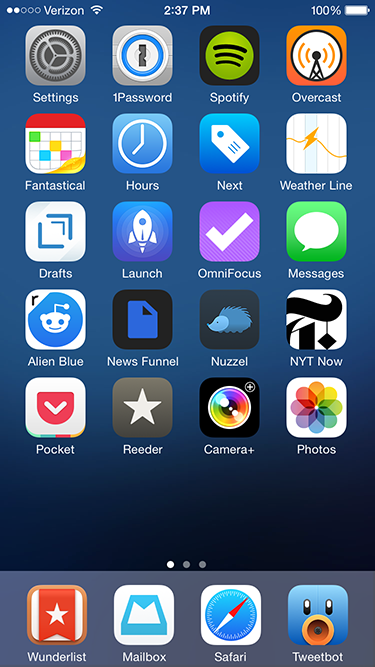
My iPhone app usage aligns with the 80-20 rule. Most apps I try are completely disposable; within a few days I delete them or relegate them to a folder off the home screen, for use only on rare occasions. Yet I use a handful of apps every day. They stand the test of time for months, if not years, of usage. As we wrap up 2014, I wanted to highlight my “must-haves”. Many are well known within tech circles, but there’s a few lesser known apps that are also worth your time.
News and Social media
Alien Blue. My Reddit usage pales in comparison to other social media and news sources. I never comment, happy to scan a handful of design and gaming subreddits for links and general information. Thankfully, Alien Blue handles the browsing component well. It deserves special praise for its handling of image galleries and videos, both of which pop up frequently on Reddit threads.
News Funnel. Another plug for my self-built news site that lists top stories from Designer News and Hacker News. It sizes down effectively for the iPhone (and other mobile devices) so I can scan both sites easily.
Nuzzel. The app aggregates and lists the most linked to articles in your Twitter feed, ordered by popularity. There’s no faster way to see what’s trending among my Twitter friends. And via the “news from friends of friends” option, I usually discover some tech, film or gaming related articles I would have otherwise missed. I’ve tried many tools that build content off of my Twitter feed; none of have stuck the way Nuzzel has.
NYT Now. I was I was skeptical of the streamlined, simplified interface of NYT Now when it debuted earlier this year. Yet after a week of usage it secured a permanent slot on my phone’s home screen. At its core, NYT Now lists the full NYT app’s top stories, but adds larger imagery and helpful bullet point summaries for articles I don’t have time to read. It’s that smart use of bullet points that make all the difference on the go.
Reeder. I like having full control over my news aggregation, so for me there’s no substitute for RSS in the form of a Feedbin account. On the go, Reeder is my Feedbin reader of choice. There are other quality apps with Feedbin integration, but I find Reeder syncs faster than the competition. Also, the screen density of list items – dense but not too dense – matches my workflow. It’s about speed and sharing to other services like Pocket and Twitter, not lingering to read full stories.
Tweetbot. I check up on Twitter frequently, which makes a strong Twitter client essential. And while there’s been strong improvements on the official Twitter app lately, it still can’t match the speed and customization Tweetbot offers. Its timeline sync between devices is an especially nice touch.
Productivity
Hours. I like to keep track of how much I’m working on both my day job and side tasks. I first tried popular web based time tracking software like Harvest and Toggl. But both felt optimized around more complex, team based workflows, when I prefer a simpler system. Enter Hours. The app centers on an intuitive interface for me to start, stop, and switch timers easily. It could use a Dropbox or iCloud based backup, not to mention a more customizable export system. But those are small quibbles on an otherwise strong 1.0 product.
Mailbox. I generally shy away from email apps that try to add their own productivity features on top of my inbox. But Mailbox adds its extras elegantly; with swipe gestures to archive or delete messages, I’m able to move through my inbox much faster than previous mail clients (there’s no coincidence Apple added similar swipe functionality to Mail with iOS8.) Overall, Mailbox adds just enough functionality to add value, but not too much to distract from my inbox content.
Pocket. My one stop source for catching up on content I’ve saved elsewhere on the web and aforementioned news apps like Tweetbot and Reeder. Parsing has gotten better over the years and the clean, stripped down reader view is easier on the eyes than many original web sources.
Wunderlist. I dig Omnifocus as a task manager for complex work tasks, but it’s overkill for simple to-do lists I write for chores, tasks at home, and other miscellaneous work. I’ve previously bounced around and tried Clear and Todoist, but both ultimately lacked staying power. Clear has a cool minimalist interface driven by gestures, but it was too simplistic for my needs and I’d run into occasional iCloud sync delays between devices. Todoist provides a lot more power, but the additional filters and searches overlapped too much with Omnifocus. Wunderlist finds a middle ground between Clear and Todoist; its sync is rock solid and the shared lists are useful and easy to set up with family members.
Miscellany
Next. Like with aforementioned time tracking, my budgeting needs are simple, centered on daily spending for expenses like restaurants, drinks, apps, and electronics. Because I’m entering in new entries manually each day, a smart entry UI is critical, and Next nails this perfectly. I tap a large category button, enter the amount and I’m done.
Overcast. For years I used Instacast to listen to podcasts. But eventually the complexity of extra features I never used (e.g. sleep timers, individual podcast settings), combined with several periods of slow syncing let me to try other clients. Marco Arment’s new Overcast matches my podcast flow perfectly; its interface is stripped down and straightforward, syncing is extremely reliable, and I use both of the exclusive “smart speed” and “voice boost” features heavily. There’s also a few small design touches I appreciate, like the audio equalizer animation during playback and the use of Concourse for typography.
Rise. I first scoffed at the idea of a dedicated alarm clock given the utility of Apple’s Clock app. But Rise is beautiful and has custom alarms that can progressively rise in volume, which I find is a more relaxing, peaceful way to be woken up. Most importantly, its gesture interface makes setup very easy, an important consideration given how often I change my wakeup time slightly from day to day.
RunKeeper. I run several times a week, and while I like select features on Strava and other fitness apps, I’ve always come back to RunKeeper for GPS-based run logging. The app has a straightforward interface that’s easy to both interact with and read as you run. I also appreciate the high degree of customization for automated voice notifications on your distance, time and speed.
Weather Line. I feel like I’ve tried at least twenty weather apps over the years, but since I started using Weather Line a year ago, I’ve been hooked. Like a few other weather apps, it has Dark Sky integration, which I find essential (so much so I own the original Dark Sky app for extra detail during rainy weather.) But Weather Line has a unique line graph interface that’s easily scannable to see how the rest of the day or week will pan out. I haven’t found another app that’s quite as intuitive, especially for a quick glance.
Wonderful mini tips roundup from teacher Paul Scrivens (Makers Cabin) on a tool I find myself turning to more and more. I’m doubt I’ll ever fully leave Photoshop entirely given the web’s remaining reliance on raster graphics, but it’s exciting to see a focused tool like Sketch gain so much momentum.
iOS gaming generally isn’t for me. I prefer deeper gameplay on the PS4 and on the go, between Pocket, Twitter and Reddit, I’m almost always preoccupied with reading material on my iPhone. But I have a few game standbys that serve me well, especially when I’m in San Francisco on business. Solebon for iOS is a perfect example. It blows away the hundreds of poor solitaire apps I see elsewhere. You get solid graphics, animation and gameplay, 50 solitaire varieties, full rulebooks, deck customization and more. Best of all, it’s updated for iOS 8 and the iPhone 6 display, the rare case of a game publisher sticking with a title for years. It’s well worth the $2 entry fee.
If there’s something I do frequently at work, it’s take screenshots and send them to coworkers. There is your usual stable of options like Cloud and Droplr, but my storage live mostly revolves around Dropbox, and I wanted to stay in-house. Enter this great workflow by “Carlos-Sz” on the Alfred forums. I run a simple global keyboard shortcut, take a screenshot, and it’s saved a public folder in Dropbox, along with an auto generated short bit.ly link copied to my clipboard.
Design Sagi Shrieber reviews why Sketch is his new “go to” choice for design work: plugins, fast version releases, background blurs and much more. I learned a useful keyboard shortcut too; Ctrl/Cmd+C brings up a color picker.
If you love the ultra-fast keyboard launcher Alfred like I do, it’s worth checking out this post to set up your theme to closely mirror the look displayed out of the box in the new OS X Spotlight. I ended up downloading the provided Yosemite theme as is, along with the Blur workflow. My only change was increasing the default text size slightly.