I love practical side projects that I’ll actively use, so I created a web site that shows trending stories from two resources I check daily: Designer News (DN) and Hacker News (HN).
Many designers and developers I know consider both news sources essential reading. They’re the source of engaging Pocket reads, solid tech ideas, and inspiration that helps my career. Yet I’m not fully satisfied by the layout of the original web sites, or with other extensions or apps that aggregate content from either source. So I created my own.
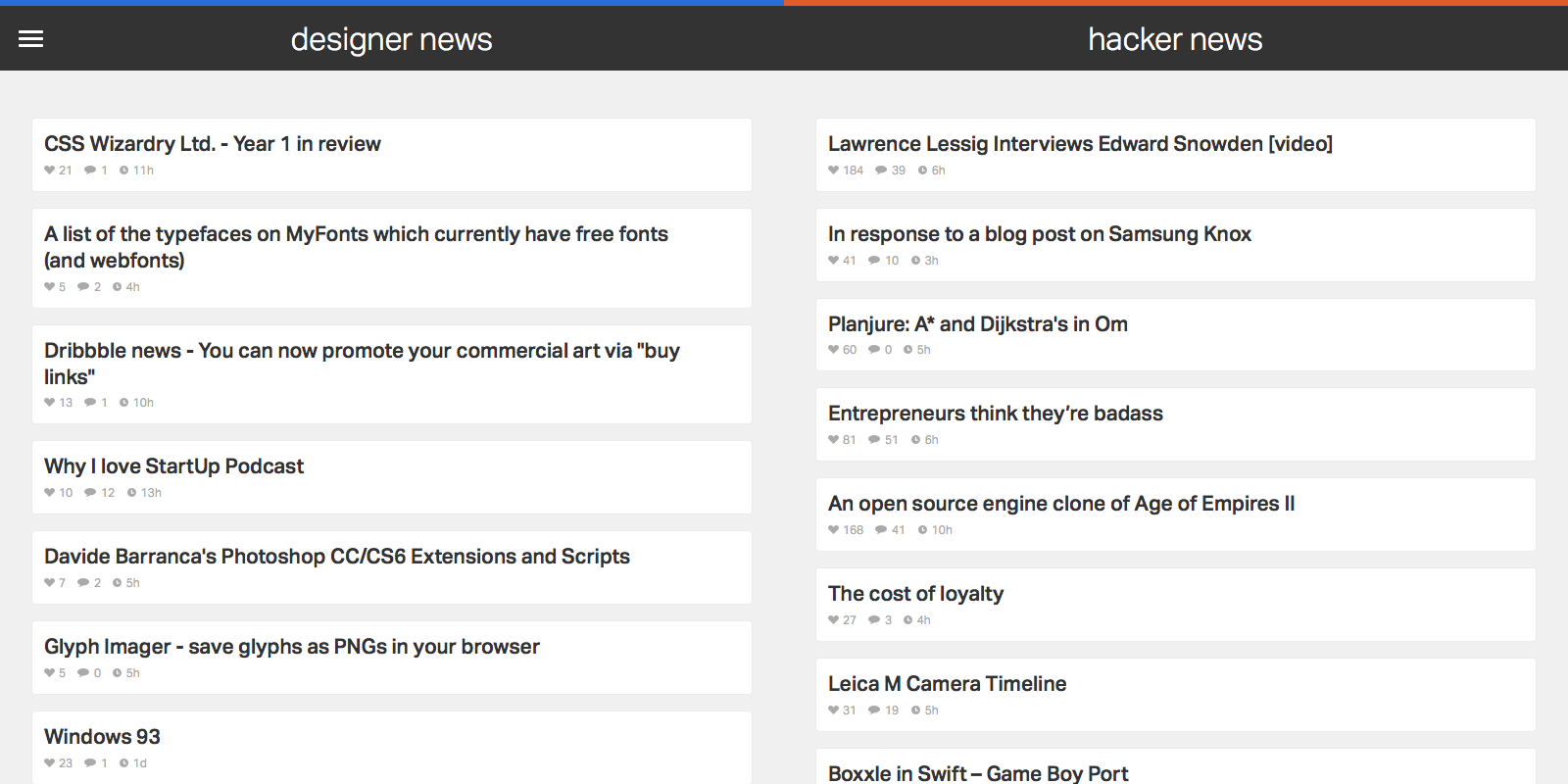
News Funnel has a rudimentary web scraper back end that feeds the 50 top ranked posts in from both Designer and Hacker News. It’s responsive and equally readable on phone, tablet, or desktop. But the site is less about development techniques and more about design exploration around how I use DN and HN. I don’t linger in either news source; it’s more jumping off point into an article or two to read or save for later via Pocket. I want content that I can browse as efficiently as possible.
An efficient design starts with typography. News Funnel is it its core a list of articles, so nailing the right font is a critical step. After researching many options in Typekit I settled on Dalton Maag’s Aktiv Grotesk as the app’s font. While I considered other, more distinctive or whimsical choices with higher contrast, Aktiv Grotesk is a grotesque that’s suited to the straightforward nature of the app. Yet it’s not the expected (and I’d argue, overused) Helvetica either. It’s cleaner, fresher, and more neutral, an effective cross between Helvetica and Univers. That neutrality is a good match for the diverse set of stories that trend on DN and HN. I also bumped up article title size and contrast more than other DN or HN aggregators; I prefer more discernible text over raw information density.
Because of how fast I move through both DN and HN, I wanted hit targets for my mouse clicks or finger taps that were large and obvious. That goal made for a logical match with the popular ‘card’ paradigm design. There’s one card or box per article, and a click or tap almost anywhere in the card opens it. For non-touch users, the border changes on mouseover to reinforce the action state. There’s also a large chat bubble icon with generous padding on each article’s right side to access the comments section.
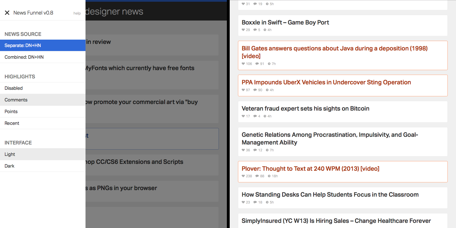
I often visit both DN and HN for various reasons and in a range of contexts, which made adding customization a natural choice. It’s all accessible in a single side menu. By default, wide displays show DN and HN side by side, while narrow displays allow you to toggle between either source. There’s also a special combined mode which pulls articles from both sources into a single column, alternating articles in ranked order. Especially on narrow width displays (e.g. smartphones) that makes it easy to scan through both sources with minimum effort and context switching between apps or web pages. Just scroll down and keep your eye trained on a single column.
I find ranking and title to be an occasionally insufficient indicator of what I should be noticing from either news source. So to keep relevant articles front and center, I added a simple highlights toggle in the side menu. You can choose to highlight stories that have a large number of comments, high point score, or those that reached the top 50 list quickly. There’s no substitution for opening an article, but flipping on highlights and running a quick scan through the app can draw attention to good content I would have missed otherwise.
Add highlights to articles based on the criteria of your choice.
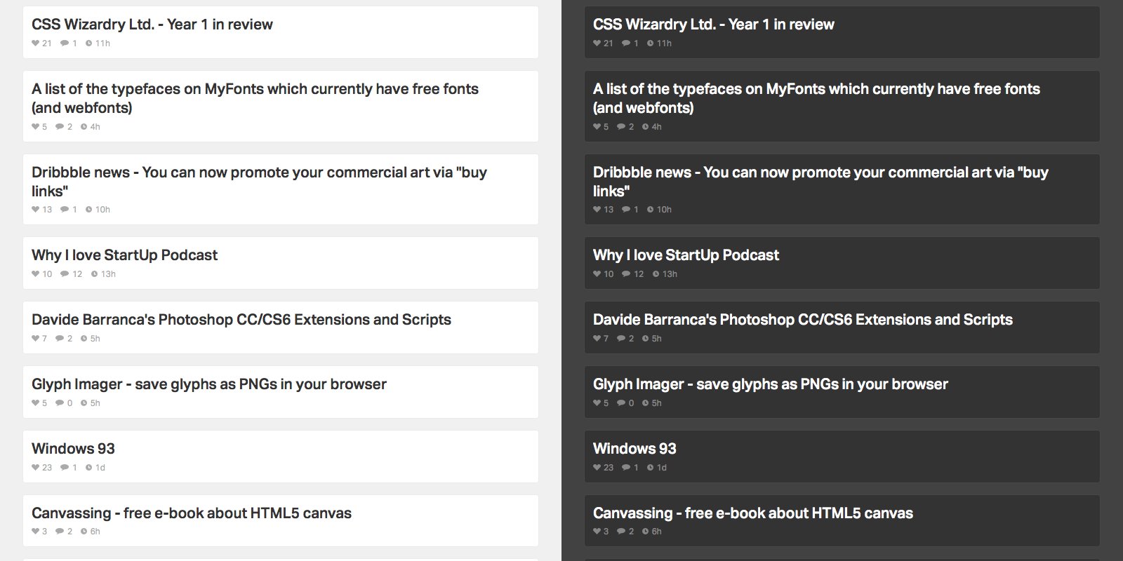
The context of where you access News Funnel matters as well. Much of that is taken care of with responsive web design so the list is readable on any device. But location and time of day is another key factor. I’m often scanning both news sources in low light scenarios, usually late at night on my Macbook or iPhone. To make it easier on the eyes, or for those that prefer a different look, I added a toggle to flip between light and dark color schemes.
Toggle between light and dark color schemes.
While I’m no aesthetic designer, I added a few visual touches to keep things simple and avoid distraction from the actual content. To start, animations are consistent. They run on the same easing scale and, for the exception of the side menu, are exclusively fade ins and outs. The reading color palette is monochrome. To add emphasis to clickable areas, hover states add punchier blue tones on DN content, orange on HN content (albeit toned down from the stronger “official” orange on the actual HN web site) and purple for combined content.
Overall, I designed News Funnel to be a concise way to check up on cool stories going on in the design, development, and the web. Feel free to check it out.
xScope is well trusted tool for many web designers, but I find it’s occasionally a bit more power than what I need for day to day design tweaks. So more recently I’ve been testing out Dimensions, a Chrome extension laser-focused on quick measurements between any elements in your browser. It’s fast, effective and worth a look.
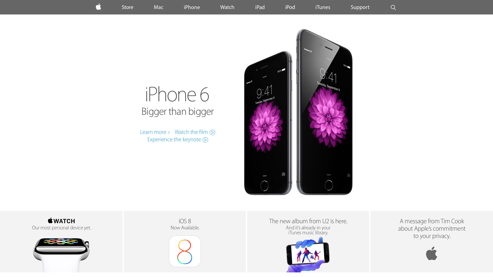
With the keynote announcement of the new iPhone and Apple Watch this month, select parts of apple.com have undergone a significant redesign. Curious to see how Apple stacked up against its competition, I researched the front end tech behind their new home page, iPhone 6 and Watch product pages. With only the web inspector as a guide, it’s an imperfect look, yet overall I’m impressed with how far Apple has come since their last major redesign.
CSS and JavaScript best practices: A-
Like most large companies with a big e-commerce presence, Apple has historically done well with CSS and JavaScript performance basics. They use global CDNs for their image assets and minify all CSS and JS references, ensuring their page weight is minimized.
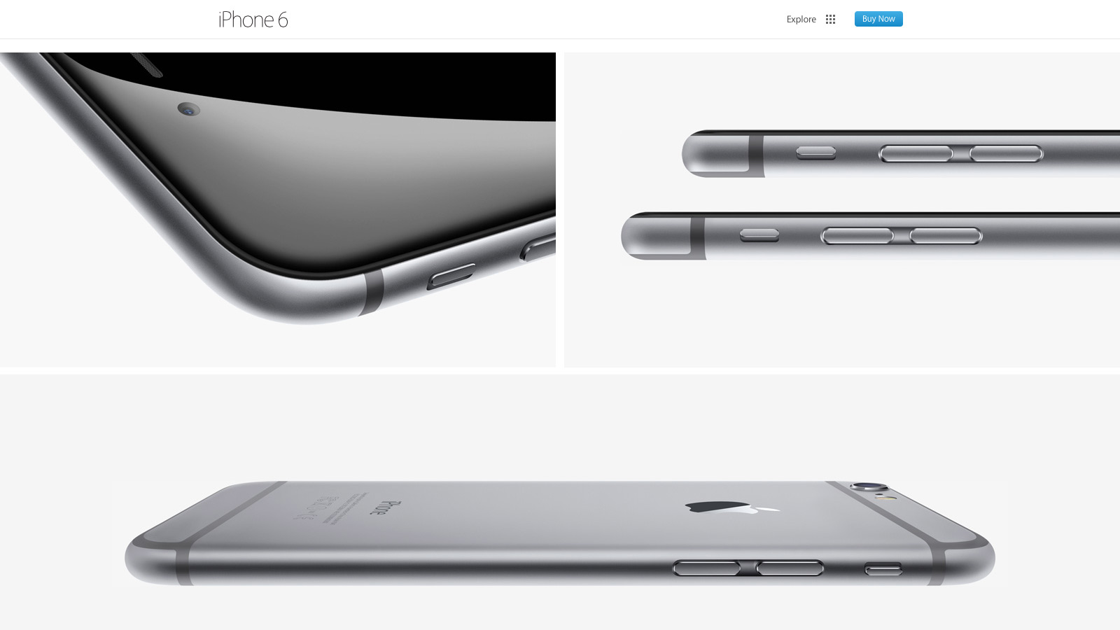
Much more was added with the September refresh. For the first time I spotted a Modernizr-like detection script that runs in the header. It illustrated Apple moving away from device specific styles and functionality (e.g. checking the browser user agent string to adjust content for iPad or iPhone) toward universal feature checks that adapt to whatever the browser supports. In addition, for both the iPhone 6 and Watch product pages, Apple delays select imagery from loading (Figure A) by a few seconds. This “lazy load” effect reduces page weight and increases page speed.
Figure A: images further down the iPhone 6 page load later to maximize page speed
There’s also smarter use of animation as the user scrolls down each product page. Apple added CSS3 animations all over the iPhone 5S product page a year ago, but their usage has expanded significantly since then. Animations are smartly limited to opacity and 3d transforms that stay fast by leveraging the computer’s GPU.
My only disappointment was the lack of sprites for some imagery, most notably the sub “explore” menu on the product pages. Arguably combining eight or more images into a single request won’t make a large difference, but it still feels like a missed opportunity.
Responsive web design: B
For the first time Apple relies heavily on media queries for a legit first class responsive web experience. Apple has used media queries in the past, but mostly for small tweaks like moving a product image from landscape to portrait orientation. Now there’s a major breakpoint to radically alter the site navigation and most imagery has fluid sizing to take full advantage of mobile device viewports. There’s also a custom responsive grid for aligning select elements. SVGs comprise the top navigation, a subtle nod that the usual 1x and 2x raster images won’t cut it for super HDPI devices like the iPhone 6 Plus.
The responsive design motif is a big step forward yet feels mildly safe: I wanted to see Apple exploit native responsive imagery (the picture element or srcset attribute of the img element), especially considering iOS8’s Safari supports srcset. Apple also uses device-width and device-height heavily in their major break points which seems unnecessary: if I navigate to apple.com with a slightly narrow browser on my laptop, it feels odd to just cut off content and add scrollbars when there’s a better optimized view available.
Typography: B
Unlike past designs that relied on occasional text images or web safe fonts, Apple has transitioned mostly to modern, custom web typography. Myriad Pro is deployed at several weights throughout the site and it’s a manageable (albeit a bit higher than I’d like) download at a bit over 300k.
Nevertheless, I wasn’t crazy about several paragraphs of product detail that use the thin Myriad Pro Light against a low contrast background (Figure B). It looks great on HDPI devices (e.g. Macbook Pros with Retina Displays, modern mobile devices) but can be a bit hard to read on lower resolution displays.
Figure B: Myriad looks great but can be harder to read on select product descriptions
Design and layout: A
Tech quibbles aside, Apple nailed their new design aesthetic for the home and product pages. They’ve done their homework in what’s common to modern design: generous white space, grid ratios, lots of vertical scrolling, “flat” layout that lacks depth and shadows, along with “full bleed” imagery that covers the entire browser viewport. Even carousels, controversial web elements that arguably lack engagement, are used well to highlight the Apple Watch. All carousel panes point to the same link and highlight the same product to avoid engagement issues. At the same time, the carousel’s huge imagery and slow transitions evoke a high-end, luxury vibe to match the aspirations of the Apple Watch itself.
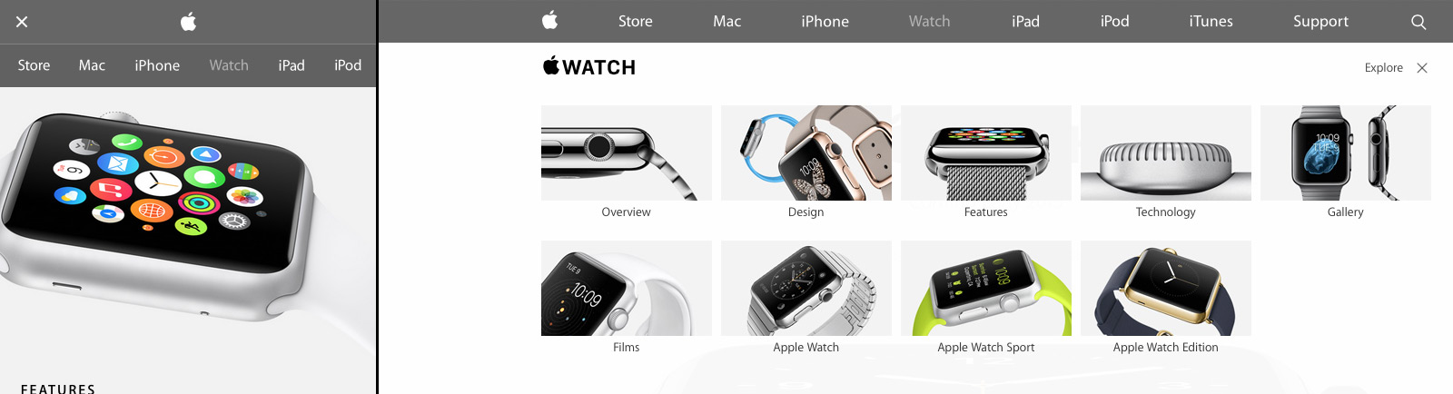
Apple’s new design isn’t just a nod to modern web trends either; Apple sets off in its own direction with a few small flourishes (Figure C). First there’s Apple’s spin on the now ubiquitous “hamburger” menu icon for narrow width browsers: Apple uses two lines, not three. Also when users open the mobile navigation, the pages display a lightweight, scrollable navigation menu. It’s a big deviation from the expected “off canvas” listing where navigation covers the viewport or slides the existing content off to one side. I didn’t care much for the menu design at first, but it’s growing on me and does succeed in setting Apple’s design apart. I also really liked the “explore” on the iPhone and Watch product pages. It’s functionally a mega menu but the extra imagery and large hit targets give a more breathing room and a high-end feel.
Figure C: Apple sets off in its own direction with a few small design touches
Overall: B+
Apple has come a long way since their last major refresh a year ago. Some issues with their responsive design decisions aside, they’ve finally caught up with most modern web practices. There’s even a few of their own “Apple-like” touches in their design to keep things fresh. Hopefully Apple will extend this design soon to other parts of the site, especially their support and e-commerce pages which are in serious need of a refresh.
Design Sagi Shrieber reviews why Sketch is his new “go to” choice for design work: plugins, fast version releases, background blurs and much more. I learned a useful keyboard shortcut too; Ctrl/Cmd+C brings up a color picker.
CSS Tricks‘ Chris Coyier wrote a nice little post going over some of his favorite Sass mixins. Sass is wonderful and I’d recommend it to anyone, but even for vanilla CSS users, do read his ‘centerer’ code snippet as well. Fairly brilliant way to basically center anything regardless of the outer container size, all with a simple transform property.
The fate of many startups depends almost entirely on one conversion point: When a visitor becomes a user.
All too often, this pivotal role falls on the shoulders of a pitifully generic “sign up” button that’s lucky to get even a minute of consideration during development.
If you take a moment to consider the wording of your signup button, you can drastically increase how many of your visitors turn into users.
One of those “why didn’t of this months ago” moments reading Gregoriy’s post. It may be interesting to experiment more with in my day job.
Designer Brent Jackson succinctly goes through the weaknesses of the hamburger menu; can’t say I completely agree with this more recent backlash against this now ubiquitous navigational choice, but Brent presents a strong argument.
Yesterday’s Google I/O keynote had it share of ups and downs but for me one clear highlight was their new “Material design” language for UX and the aesthetic look across web and Android. There’s a lot of interesting ideas here for the web, from well thought out typographic guidelines to a set of punchy color palettes to match the aesthetic.
Susan Robertson over at A List Apart wrote an excellent post detailing why style guides are important for web projects and how they can help maintain consistency for a project over the long run. It’s a solid intro for those new to the topic.