One of those Sublime Text packages that I should have installed a long time ago but never did. The package underlines or fills a CSS color with the actual represented color; no more reloading a web page unnecessarily or whipping out Photoshop to insert a hex value.
Guil Hernandez at Treehouse talks about some pretty awesome visual tricks you can pull with CSS on the latest modern browsers (usual candidates: Chrome, Safari). I’ve used the background blend mode as a simple trick to desaturate a CMS image to black and white.
I enjoyed reading this A List Apart post from Susan Roberton. Unlike a lot other CSS optimization articles, there’s a formalization to Susan’s breakdown of an “audit” that I appreciate. An audit isn’t about making direct code changes, it’s working through the entire CSS base and delivering an document that summarizes changes to make. I find most teams skip even informal auditing, instead preferring to just hack away on a CSS snippet they don’t like. In the process they miss larger, more important architectural changes.
I’ve been a firm believer in the Filament Group’s picturefill for months as the premier way add responsive imagery to any modern browser. It’s not just a tool for side projects either; I’ve implemented the latest 2.1 release on several of our externally facing corporate web pages at Pocket.
But that might be changing soon. For the last week I’ve been researching respimage, a new performance enhanced variant of picturefill that is just as easy to implement but performs, from my informal tests, noticeably faster than the original. As Scott Jehl, one of the contributors to respimage argues, respimage is “simply a picturefill on steroids”. I’ve already switched this site to respimage, and if the setup remains stable I’ll likely do the same over at Pocket.
Google recently published one of the best single tutorial resources I’ve seen that cover how to write both CSS and JS based animations on the web. It’s far more than just syntax; it’s recommendations on what timing and easing functions are the most appropriate in different situations. And with Google being Google, there’s some performance related pointers as well.
What defines an experienced web developer in 2014? Looking back on my own progress, I transitioned from entry level to senior roles and became “experienced”. Yet it was surprising to reflect on what skills and traits led me to that point.
Some experience stems from core programming knowledge: familiarity with HTML, CSS, and JavaScript syntax, along with optimization techniques for each language. And given how fast the web changes, experience can imply some web frameworks mastery. Today, popular examples include MVC frameworks (Angular, Ember), web components (Polymer) and responsive grid patterns (Foundation, Susy).
Programming chops also contribute; practically any position requires a baseline technical aptitude to sustain a team’s momentum. Yet as my career has gone on, I’ve found three traits outside of tech that usually separate the experienced from the entry level: wisdom, communication and “T-shaped” skills.
Wisdom is experience defined by long-term development cycles. It’s working through projects over months or years. For solo, agency and freelance developers, it’s defining a long term relationship with one or more clients for an extended period. Developers with high wisdom levels know how to work with other tech personnel. They quickly assess their team’s strengths, weaknesses, and who’s best to delegate for different aspects of the job. They also give assured estimates and know how to best integrate their tech skills into a larger team.
Communication centers on verbal and written skills. Part of that is back and forth with the rest of the tech team through succinct bug tickets and clear project status reports. And on most front end development projects, tight communication with the designers and project managers is essential. In addition, business staff often notice and gravitate towards developers with strong speaking and presentation skills, regardless of their technical aptitude.
T-shaped skills aren’t directly related to web development yet are helpful for the overall company. Aesthetic design, UX, analytics, marketing and business are common examples. T-shape skills are especially important for front end web developers, as they are often faced with many client-facing micro decisions due to lack of time or definition from other groups. For example, there may be a high fidelity spec for a new page design, but a few elements don’t quite match, so the developer adjusts some spacing and padding. Or a new web app is launching and a developer realizes select user actions aren’t being captured by analytics; he or she makes a quick correction. Many of these details aren’t noticed until well after a product is shipped but can have a cumulative benefit for users.
All three of these attributes have one thing in common: there’s rarely shortcuts. It takes time, earned from months and years of work within a team. When you run through an entire dev project cycle – tech assistance to early design iterations, developing a feature set, fixing QA bugs and launching the product – there’s invaluable knowledge gained that can’t be gleamed from a blog post or weekend workshop. Admittedly, some developers are naturally gifted communicators and are equipped with a T-shaped skill base by the time they reach their first web gig. Yet having worked with a large variety of web developers in my career, that’s rare.
So, some advice to those starting out: it’s ok to take a break from learning the hottest web framework to brush up on your speaking and writing skills. It’s also smart to ask questions and have interests in the rest of your business. And if you get the chance to work with well-respected, senior developers, do so. Be patient and take in everything you can. Experience takes time.
I’ve been a huge fan of running LiveReload via Gulp plugin to auto inject CSS and Sass into the page without forcing a reload. It significantly speeds up development and avoids me having to constantly remember to hit the reload action to ensure my changes take effect.
BrowserSync has the same mentality, but promises much more, most notably an “action sync” that mirrors scroll, clicking, and refresh actions across multiple browsers plugged into the same server.
A few overly broad generalizations aside, this brief post at Breaking the Mobile Web is a good overview of some of the largest changes that came along for the ride with the new iPhone 6 and iOS 8. Pay special note to the viewport differences and the big switch to a device pixel ratio of 3 for the iPhone 6 Plus.
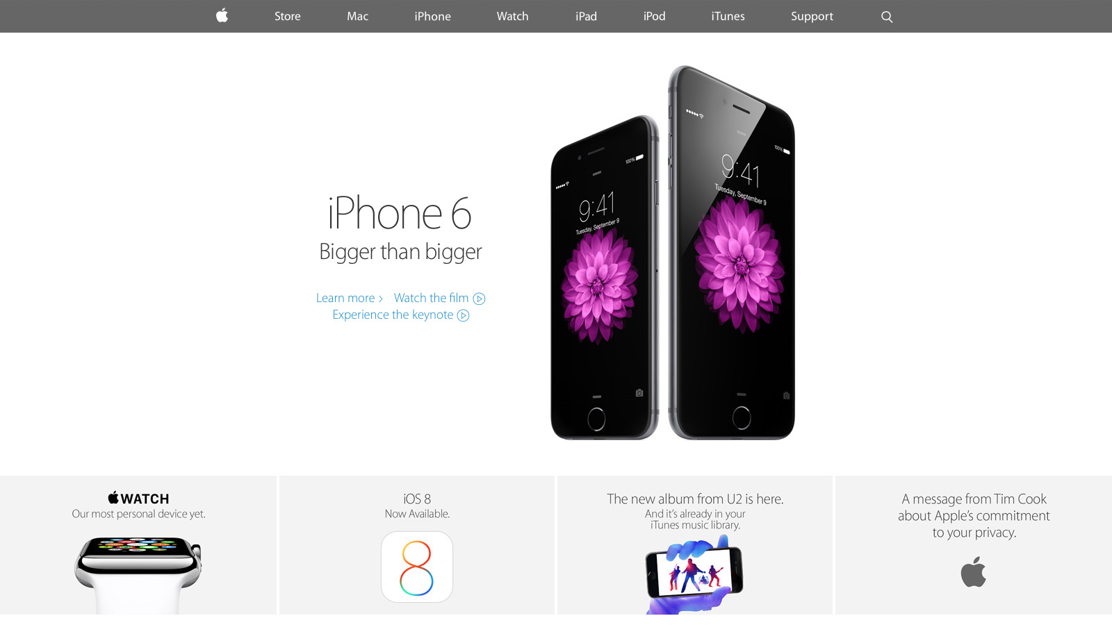
With the keynote announcement of the new iPhone and Apple Watch this month, select parts of apple.com have undergone a significant redesign. Curious to see how Apple stacked up against its competition, I researched the front end tech behind their new home page, iPhone 6 and Watch product pages. With only the web inspector as a guide, it’s an imperfect look, yet overall I’m impressed with how far Apple has come since their last major redesign.
CSS and JavaScript best practices: A-
Like most large companies with a big e-commerce presence, Apple has historically done well with CSS and JavaScript performance basics. They use global CDNs for their image assets and minify all CSS and JS references, ensuring their page weight is minimized.
Much more was added with the September refresh. For the first time I spotted a Modernizr-like detection script that runs in the header. It illustrated Apple moving away from device specific styles and functionality (e.g. checking the browser user agent string to adjust content for iPad or iPhone) toward universal feature checks that adapt to whatever the browser supports. In addition, for both the iPhone 6 and Watch product pages, Apple delays select imagery from loading (Figure A) by a few seconds. This “lazy load” effect reduces page weight and increases page speed.
Figure A: images further down the iPhone 6 page load later to maximize page speed
There’s also smarter use of animation as the user scrolls down each product page. Apple added CSS3 animations all over the iPhone 5S product page a year ago, but their usage has expanded significantly since then. Animations are smartly limited to opacity and 3d transforms that stay fast by leveraging the computer’s GPU.
My only disappointment was the lack of sprites for some imagery, most notably the sub “explore” menu on the product pages. Arguably combining eight or more images into a single request won’t make a large difference, but it still feels like a missed opportunity.
Responsive web design: B
For the first time Apple relies heavily on media queries for a legit first class responsive web experience. Apple has used media queries in the past, but mostly for small tweaks like moving a product image from landscape to portrait orientation. Now there’s a major breakpoint to radically alter the site navigation and most imagery has fluid sizing to take full advantage of mobile device viewports. There’s also a custom responsive grid for aligning select elements. SVGs comprise the top navigation, a subtle nod that the usual 1x and 2x raster images won’t cut it for super HDPI devices like the iPhone 6 Plus.
The responsive design motif is a big step forward yet feels mildly safe: I wanted to see Apple exploit native responsive imagery (the picture element or srcset attribute of the img element), especially considering iOS8’s Safari supports srcset. Apple also uses device-width and device-height heavily in their major break points which seems unnecessary: if I navigate to apple.com with a slightly narrow browser on my laptop, it feels odd to just cut off content and add scrollbars when there’s a better optimized view available.
Typography: B
Unlike past designs that relied on occasional text images or web safe fonts, Apple has transitioned mostly to modern, custom web typography. Myriad Pro is deployed at several weights throughout the site and it’s a manageable (albeit a bit higher than I’d like) download at a bit over 300k.
Nevertheless, I wasn’t crazy about several paragraphs of product detail that use the thin Myriad Pro Light against a low contrast background (Figure B). It looks great on HDPI devices (e.g. Macbook Pros with Retina Displays, modern mobile devices) but can be a bit hard to read on lower resolution displays.
Figure B: Myriad looks great but can be harder to read on select product descriptions
Design and layout: A
Tech quibbles aside, Apple nailed their new design aesthetic for the home and product pages. They’ve done their homework in what’s common to modern design: generous white space, grid ratios, lots of vertical scrolling, “flat” layout that lacks depth and shadows, along with “full bleed” imagery that covers the entire browser viewport. Even carousels, controversial web elements that arguably lack engagement, are used well to highlight the Apple Watch. All carousel panes point to the same link and highlight the same product to avoid engagement issues. At the same time, the carousel’s huge imagery and slow transitions evoke a high-end, luxury vibe to match the aspirations of the Apple Watch itself.
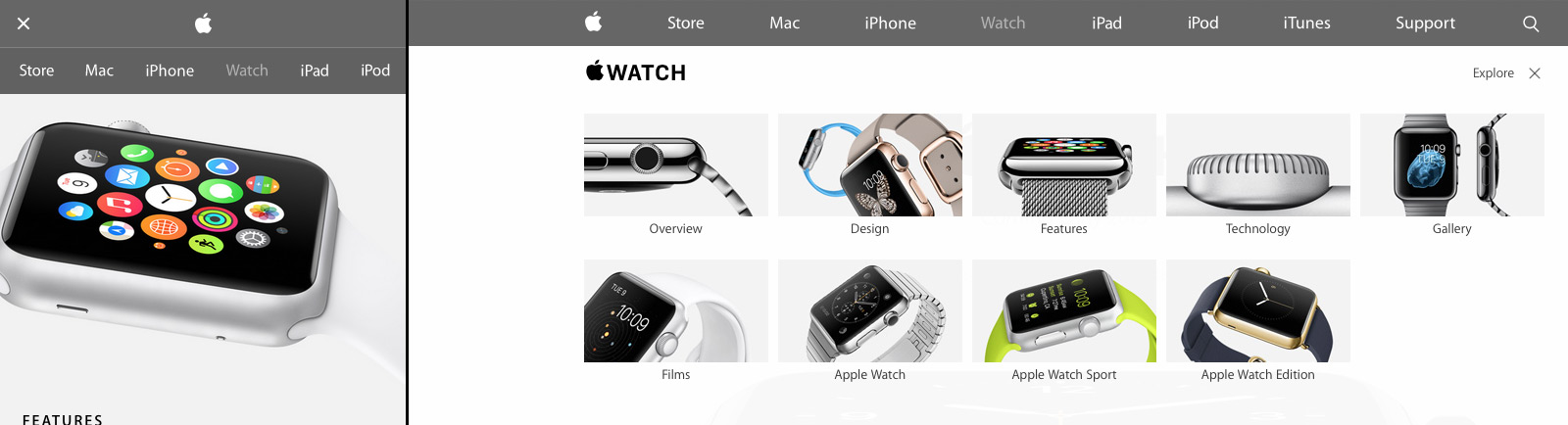
Apple’s new design isn’t just a nod to modern web trends either; Apple sets off in its own direction with a few small flourishes (Figure C). First there’s Apple’s spin on the now ubiquitous “hamburger” menu icon for narrow width browsers: Apple uses two lines, not three. Also when users open the mobile navigation, the pages display a lightweight, scrollable navigation menu. It’s a big deviation from the expected “off canvas” listing where navigation covers the viewport or slides the existing content off to one side. I didn’t care much for the menu design at first, but it’s growing on me and does succeed in setting Apple’s design apart. I also really liked the “explore” on the iPhone and Watch product pages. It’s functionally a mega menu but the extra imagery and large hit targets give a more breathing room and a high-end feel.
Figure C: Apple sets off in its own direction with a few small design touches
Overall: B+
Apple has come a long way since their last major refresh a year ago. Some issues with their responsive design decisions aside, they’ve finally caught up with most modern web practices. There’s even a few of their own “Apple-like” touches in their design to keep things fresh. Hopefully Apple will extend this design soon to other parts of the site, especially their support and e-commerce pages which are in serious need of a refresh.
Santiago Valdarrama writes for A List Apart about simple “prebrowsing” techniques to speed up web performance between pages. Browsers analyze patterns of a page a user is likely to go next, and utilize DNS prefetching, resource prefetching, and prerendering to help the process along.
Bonus points for a wonderful illustration by Kevin Cornell, one of my favorite ALA header graphics in months.