Guil Hernandez at Treehouse talks about some pretty awesome visual tricks you can pull with CSS on the latest modern browsers (usual candidates: Chrome, Safari). I’ve used the background blend mode as a simple trick to desaturate a CMS image to black and white.
HTML email has always been a major annoyance to code for given the wide range of CSS and support various email clients provide. So admittedly when I see a post boast about “responsive” HTML email, I usually chuckle and move on. Not so with web designer Benjy Stanton. I like how Benjy moves through his whole process from sketching a design to a starting point code framework (he digs Ink, a Foundation setup that I’ve used and liked in the past) to common debugging issues.
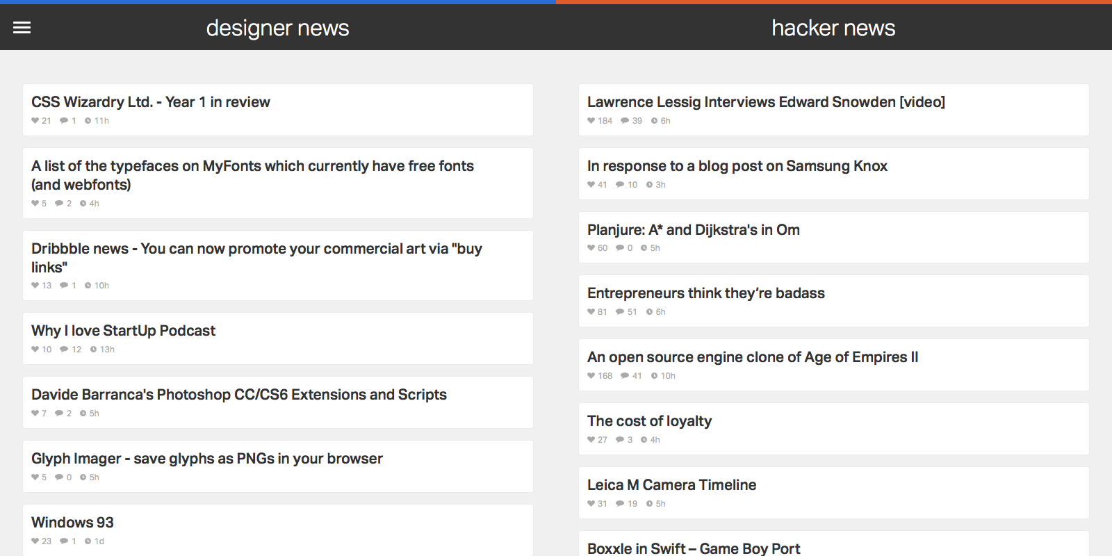
I love practical side projects that I’ll actively use, so I created a web site that shows trending stories from two resources I check daily: Designer News (DN) and Hacker News (HN).
Many designers and developers I know consider both news sources essential reading. They’re the source of engaging Pocket reads, solid tech ideas, and inspiration that helps my career. Yet I’m not fully satisfied by the layout of the original web sites, or with other extensions or apps that aggregate content from either source. So I created my own.
News Funnel has a rudimentary web scraper back end that feeds the 50 top ranked posts in from both Designer and Hacker News. It’s responsive and equally readable on phone, tablet, or desktop. But the site is less about development techniques and more about design exploration around how I use DN and HN. I don’t linger in either news source; it’s more jumping off point into an article or two to read or save for later via Pocket. I want content that I can browse as efficiently as possible.
An efficient design starts with typography. News Funnel is it its core a list of articles, so nailing the right font is a critical step. After researching many options in Typekit I settled on Dalton Maag’s Aktiv Grotesk as the app’s font. While I considered other, more distinctive or whimsical choices with higher contrast, Aktiv Grotesk is a grotesque that’s suited to the straightforward nature of the app. Yet it’s not the expected (and I’d argue, overused) Helvetica either. It’s cleaner, fresher, and more neutral, an effective cross between Helvetica and Univers. That neutrality is a good match for the diverse set of stories that trend on DN and HN. I also bumped up article title size and contrast more than other DN or HN aggregators; I prefer more discernible text over raw information density.
Because of how fast I move through both DN and HN, I wanted hit targets for my mouse clicks or finger taps that were large and obvious. That goal made for a logical match with the popular ‘card’ paradigm design. There’s one card or box per article, and a click or tap almost anywhere in the card opens it. For non-touch users, the border changes on mouseover to reinforce the action state. There’s also a large chat bubble icon with generous padding on each article’s right side to access the comments section.
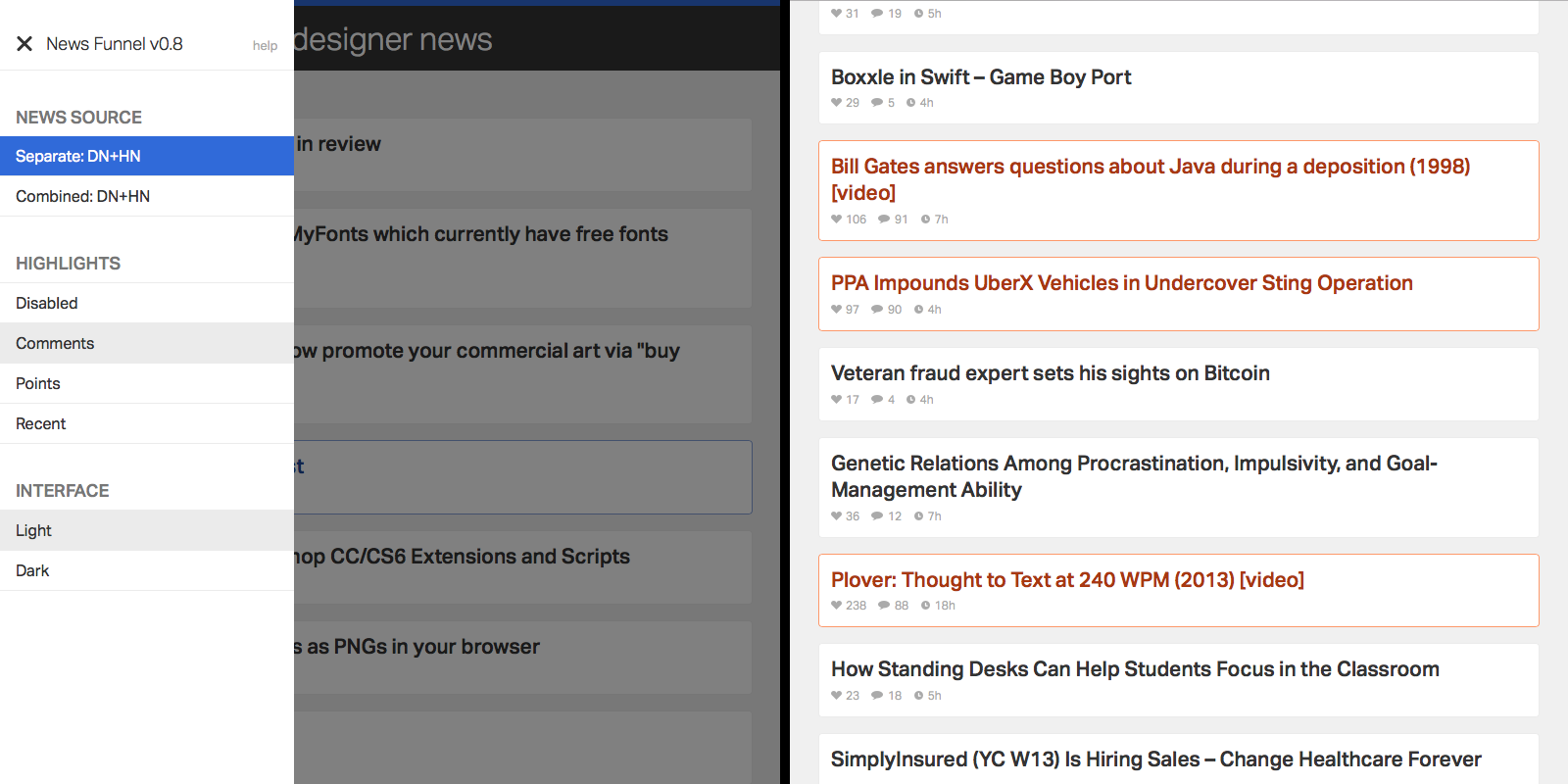
I often visit both DN and HN for various reasons and in a range of contexts, which made adding customization a natural choice. It’s all accessible in a single side menu. By default, wide displays show DN and HN side by side, while narrow displays allow you to toggle between either source. There’s also a special combined mode which pulls articles from both sources into a single column, alternating articles in ranked order. Especially on narrow width displays (e.g. smartphones) that makes it easy to scan through both sources with minimum effort and context switching between apps or web pages. Just scroll down and keep your eye trained on a single column.
I find ranking and title to be an occasionally insufficient indicator of what I should be noticing from either news source. So to keep relevant articles front and center, I added a simple highlights toggle in the side menu. You can choose to highlight stories that have a large number of comments, high point score, or those that reached the top 50 list quickly. There’s no substitution for opening an article, but flipping on highlights and running a quick scan through the app can draw attention to good content I would have missed otherwise.
Add highlights to articles based on the criteria of your choice.
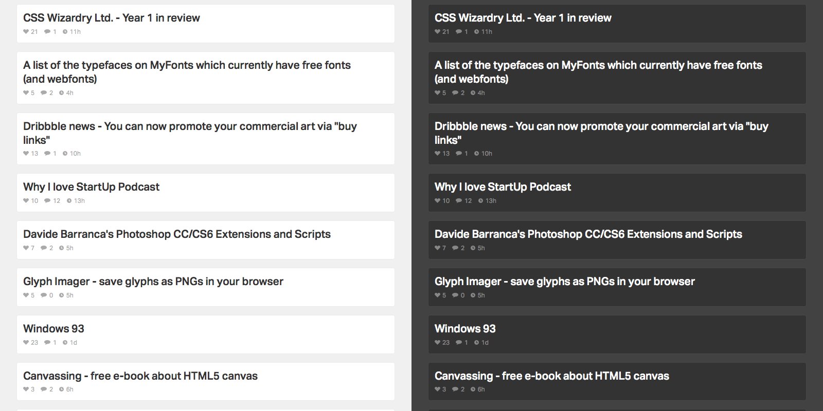
The context of where you access News Funnel matters as well. Much of that is taken care of with responsive web design so the list is readable on any device. But location and time of day is another key factor. I’m often scanning both news sources in low light scenarios, usually late at night on my Macbook or iPhone. To make it easier on the eyes, or for those that prefer a different look, I added a toggle to flip between light and dark color schemes.
Toggle between light and dark color schemes.
While I’m no aesthetic designer, I added a few visual touches to keep things simple and avoid distraction from the actual content. To start, animations are consistent. They run on the same easing scale and, for the exception of the side menu, are exclusively fade ins and outs. The reading color palette is monochrome. To add emphasis to clickable areas, hover states add punchier blue tones on DN content, orange on HN content (albeit toned down from the stronger “official” orange on the actual HN web site) and purple for combined content.
Overall, I designed News Funnel to be a concise way to check up on cool stories going on in the design, development, and the web. Feel free to check it out.
I enjoyed reading this A List Apart post from Susan Roberton. Unlike a lot other CSS optimization articles, there’s a formalization to Susan’s breakdown of an “audit” that I appreciate. An audit isn’t about making direct code changes, it’s working through the entire CSS base and delivering an document that summarizes changes to make. I find most teams skip even informal auditing, instead preferring to just hack away on a CSS snippet they don’t like. In the process they miss larger, more important architectural changes.
I’ve been a firm believer in the Filament Group’s picturefill for months as the premier way add responsive imagery to any modern browser. It’s not just a tool for side projects either; I’ve implemented the latest 2.1 release on several of our externally facing corporate web pages at Pocket.
But that might be changing soon. For the last week I’ve been researching respimage, a new performance enhanced variant of picturefill that is just as easy to implement but performs, from my informal tests, noticeably faster than the original. As Scott Jehl, one of the contributors to respimage argues, respimage is “simply a picturefill on steroids”. I’ve already switched this site to respimage, and if the setup remains stable I’ll likely do the same over at Pocket.
Google recently published one of the best single tutorial resources I’ve seen that cover how to write both CSS and JS based animations on the web. It’s far more than just syntax; it’s recommendations on what timing and easing functions are the most appropriate in different situations. And with Google being Google, there’s some performance related pointers as well.
What defines an experienced web developer in 2014? Looking back on my own progress, I transitioned from entry level to senior roles and became “experienced”. Yet it was surprising to reflect on what skills and traits led me to that point.
Some experience stems from core programming knowledge: familiarity with HTML, CSS, and JavaScript syntax, along with optimization techniques for each language. And given how fast the web changes, experience can imply some web frameworks mastery. Today, popular examples include MVC frameworks (Angular, Ember), web components (Polymer) and responsive grid patterns (Foundation, Susy).
Programming chops also contribute; practically any position requires a baseline technical aptitude to sustain a team’s momentum. Yet as my career has gone on, I’ve found three traits outside of tech that usually separate the experienced from the entry level: wisdom, communication and “T-shaped” skills.
Wisdom is experience defined by long-term development cycles. It’s working through projects over months or years. For solo, agency and freelance developers, it’s defining a long term relationship with one or more clients for an extended period. Developers with high wisdom levels know how to work with other tech personnel. They quickly assess their team’s strengths, weaknesses, and who’s best to delegate for different aspects of the job. They also give assured estimates and know how to best integrate their tech skills into a larger team.
Communication centers on verbal and written skills. Part of that is back and forth with the rest of the tech team through succinct bug tickets and clear project status reports. And on most front end development projects, tight communication with the designers and project managers is essential. In addition, business staff often notice and gravitate towards developers with strong speaking and presentation skills, regardless of their technical aptitude.
T-shaped skills aren’t directly related to web development yet are helpful for the overall company. Aesthetic design, UX, analytics, marketing and business are common examples. T-shape skills are especially important for front end web developers, as they are often faced with many client-facing micro decisions due to lack of time or definition from other groups. For example, there may be a high fidelity spec for a new page design, but a few elements don’t quite match, so the developer adjusts some spacing and padding. Or a new web app is launching and a developer realizes select user actions aren’t being captured by analytics; he or she makes a quick correction. Many of these details aren’t noticed until well after a product is shipped but can have a cumulative benefit for users.
All three of these attributes have one thing in common: there’s rarely shortcuts. It takes time, earned from months and years of work within a team. When you run through an entire dev project cycle – tech assistance to early design iterations, developing a feature set, fixing QA bugs and launching the product – there’s invaluable knowledge gained that can’t be gleamed from a blog post or weekend workshop. Admittedly, some developers are naturally gifted communicators and are equipped with a T-shaped skill base by the time they reach their first web gig. Yet having worked with a large variety of web developers in my career, that’s rare.
So, some advice to those starting out: it’s ok to take a break from learning the hottest web framework to brush up on your speaking and writing skills. It’s also smart to ask questions and have interests in the rest of your business. And if you get the chance to work with well-respected, senior developers, do so. Be patient and take in everything you can. Experience takes time.
xScope is well trusted tool for many web designers, but I find it’s occasionally a bit more power than what I need for day to day design tweaks. So more recently I’ve been testing out Dimensions, a Chrome extension laser-focused on quick measurements between any elements in your browser. It’s fast, effective and worth a look.
I’ve been a huge fan of running LiveReload via Gulp plugin to auto inject CSS and Sass into the page without forcing a reload. It significantly speeds up development and avoids me having to constantly remember to hit the reload action to ensure my changes take effect.
BrowserSync has the same mentality, but promises much more, most notably an “action sync” that mirrors scroll, clicking, and refresh actions across multiple browsers plugged into the same server.
A few overly broad generalizations aside, this brief post at Breaking the Mobile Web is a good overview of some of the largest changes that came along for the ride with the new iPhone 6 and iOS 8. Pay special note to the viewport differences and the big switch to a device pixel ratio of 3 for the iPhone 6 Plus.