Ruining the movie experience: progress bars

As more and more people watch film in ways different from the “traditional” formats of the theaters and DVDs, the progress bar, a indicator that shows exactly how far into a film the viewer is, has become commonplace. While instinctively it’s a great device to help navigate back and forth through a movie, I’ve got serious problems with the device, as it can completely kill the enveloping effect of a movie.
Time and the Moviegoing Experience
Obviously a film’s plot, acting, script, and cinematography are all critical elements to a moviegoing experience. However, I’d argue it’s a film’s pacing and story arc that helps “glue” all these disparate elements together. Some films go with a slow burn, building and building methodically until a sudden explosion of activity in the final moments that pull the film together. Some keep the plot moving at a steady pace throughout, only slowing down in the final moments.
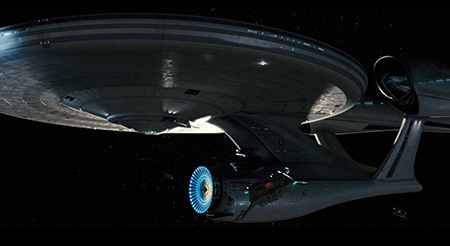
 Star Trek: Go go go
 Repulsion: Slow burn
Two I’ve seen recently, 2009’s Star Trek remake and Roman Polanski’s thriller “Repulsion” exemplify a great handle on runtime and pacing, albeit in very different ways. Star Trek is an already solid movie with its big budget special effects, but to me what seals the deal is its great pacing: The movie’s story moves at a relentless pace, with almost every mise en scene basically an action set piece. The pacing hides the film’s weaknesses (questionable plot devices, a few clunkers of dialogue) and focuses on the strengths (crazy ass frantic space battles with cool editing) In contrast, Repulsion, like most effective psychological thrillers, takes its time, building and building the growing insanity of the main character until a sudden, horrific release of action at the film’s close.
Enter the Progress Bar
Unfortunately, regardless of the editing and pacing choices, once the viewer sees that damn progress bar appear, in a split second any sense of anticipation or suspense is killed. Viewers immediately compare where they mentally “thought” they were in a film with the actual runtime in the progress bar. That alone can cause unfair disappointment or surprise (e.g. “There’s over 45 minutes left? Really?”) It also “cheats” the viewer into knowing what may unfold next. In particular, if there’s a lot of runtime left, viewers that may have expected a quicker wrap up now understand there’s a lot more of a “third act” than originally anticipated. Conversely, if the progress bar shows little time left, the viewer knows the conclusion is near.
Returning to the two film examples I provided, if I pause Star Trek during a climatic battle and see there’s 10 minutes left, it doesn’t take a genius to say this is the “the big one”: we’re going to see the final face off, good begets evil, and everyone goes home. If I pause Repulsion and see I’m only a half hour through a two hour movie that so far has been mostly slow dialog and atmospherics, I might begrudge the remaining runtime.
Progress Bars are good but…
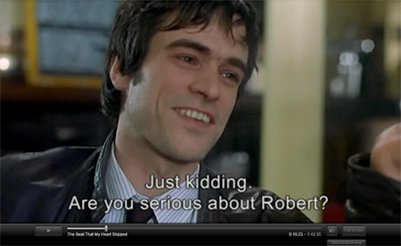
 The Netflix streaming progress bar doesn’t go away unless you’re in full screen mode.
Don’t get me wrong, progress bars have their merit. A scroll bar is a classic user interface device, and if I need to navigate back and forth, it’s very useful. But does it have to be so obtrusive, especially for first time film watchers? Most newer film formats show a progress bar when pausing the film, and in many online formats like iTunes and Netflix, the progress bar has a constant presence at the bottom of the screen that can’t be hidden. I’d just prefer an option to have the progress bar appear only with an additional action. For example, when a viewer pauses the film, he or she only sees a pause symbol. Only another separate button click brings up the toolbar.