How we get from one TV episode to the next on your streaming service of choice requires finesse. The right design pattern saves time through less menu navigation once you reach the end of an episode. But too aggressive of a yank to the next show generates a hurried feel, giving you barely a breath to process what you watched before zooming off to the next show.
The services I subscribe to today – Netflix, Amazon Prime, Disney Plus, Apple TV Plus – take different approaches to this next episode design challenge. All but Disney Plus have an algorithm that detects when you’ve finished an episode, generally the moment the closing credits begin to roll. At that point, UI appears to suggest moving on to the next show. This feature ensures I get the correct episode when I pick back up the series later.
Disney has no next episode detection and no corresponding UI at the episode’s natural endpoint. Continuing the “latest” episode of a show usually drops me midway through the previous episode’s credits. The net effect means I have to manually browse to get to the next episode.
For engineers building user interfaces, I find there’s heavy emphasis on technical chops and little to none on design comprehension. Yet a subset of design skills can distinguish great from merely good UI engineers.
I’d term these skills “pre-visualization”: understanding design specifications before writing any code, and at a level beyond what designers formally deliver. A big part of pre-visualization is the ability to break down specs into reusable components. You discern visual patterns from existing parts of your app, site, or larger OS, and apply them to a designer’s work. In many, if not most cases, much of the spec maps cleanly to what came before. Common UI patterns like buttons, form elements, and navigation generally repeat themselves. Some will not.
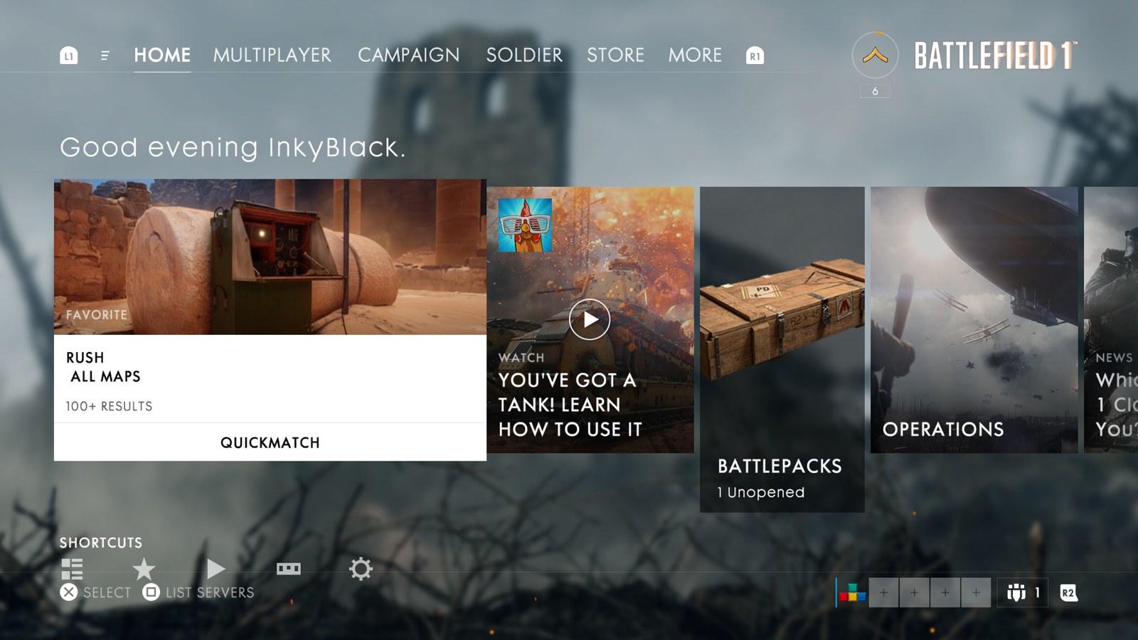
Battlefield 1 has received praise for its gritty WWI gameplay, but its pre and post-game user interface need serious work. They are too cluttered and confusing for casual players.
Let’s focus on BF1’s main menu:
Arriving after BF1’s otherwise stellar prologue, the menu is a momentum killer. There are six areas of functionality fighting for attention on this screen. Players can browse game modes and other recommended content in three interactive rows. Each has a different layout and visual aesthetic. There’s also information on profile, party, rank, and a legend to clarify button actions in the screen corners.
I like design teams built around collaboration and transparency with outsiders, especially engineers. Yet that openness has to be balanced against productivity. Even with formalized designer-engineer connections, I still structure meetings to give designers as much uninterrupted time as possible.
An open structure largely derives from designer/engineer ratios. Across technology, from hot startups to well established brands, designers are almost always heavily outnumbered. And given it’s a fairly young industry, design is often underrepresented in company leadership. Granted, with “design thinking” surging in popularity, that’s changing. But across many companies, it’s still an uphill battle. If you box your design team in, you’ll stack the deck against you.
Fallout 4 relies on a classic RPG feedback loop. Venture out and discover. Aquire loot and experience from combat and finishing quest lines. Improve your character, equip cool weapons and armor. Repeat. But thanks to an unwieldy user interface, part of Fallout 4’s feedback loop is broken. It’s increasingly problematic for me as I advance through the game’s main narrative.
Admittedly, that’s not a factor during most of my playtime thanks to Fallout 4’s superb open world design. There’s always something new to explore, little of which feels like filler content. The art direction and detail on most locations is impressive. Map layout is intuitive and influenced by real world constraints. Many terminals and safes add to a location’s backstory and the characters that populate it. It all adds to a breadth and unpredictability to Fallout 4 that I haven’t encountered in any other game this year.
Yet solid open world exploration and interesting loot only get you so far. Once you’re back at home base, Fallout 4 strains during character improvements and management. I’ve burned long stretches of time micromanaging inventory, encumbrance, and crafting items.
Once Apple Music’s free trial ended, I deleted all my files and resubscribed to Spotify Premium. The turnaround was surprising; this is Apple we’re talking about here. From Macs, to an iPhone, an iPad, and an Apple TV, I’m a convert. But after several weeks of heavy Apple Music usage, I was done with the service.
I’m not alone on this turnaround. Though 11 million subscribers (in a free trial period) is a decent start, I’ve seen many across, tech and design migrate elsewhere. There’s several reasons why:
I could recommend this post to almost any designer who works with front end web developers. It’s surprising how many designers I’ve worked through over my career that have little knowledge of what’s mentioned here, especially this:
It is the nature of the web to be flexible, and with this flexibility comes a degree of letting go of control. The first step in this process is to leave behind the idea of pixel perfection.
German culture site Freunde Evon Freunden runs an extensive interview with the legendary designer at home:
One of his home’s main attractions is his two-story bookshelf, mostly filled with titles pertinent to his profession and only accessible by the seated pulley system Spiekermann developed for one of his favorite leisure activities – browsing his massive library and getting lost in his passion for words and images. “It’s almost like a safety net having all my books here. I have a lot of cool stuff that other people don’t have, and I love browsing and discovering books I’ve had 50 years. I’d love to spend time just browsing through my bookshelves. Every time I go to look for something I find something else, you get totally stuck.”
Apple Music shares a lot of the same DNA as other streaming platforms. There’s a huge music catalog, the ability to save a collection offline, curated playlists, and radio stations. Yet its UX feels distinct, more segmented and compartmentalized compared to its streaming peers. That’s a plus for streaming newbies and more casual users. But it comes at the the cost of comprehension and cohesion in the long run.
It’s easiest to cover Apple Music’s UX shortcomings through example. Say you browse through playlists in New on iTunes, and then jump into the For You segment to browse further. At this point, there’s no way to jump back chronologically into your previously accessed playlists. Each segment has a separate state and history. Or you want to find the source (e.g. album, playlist, radio station) of the currently playing track. It’s often awkward if not impossible to do so. Even search adds a binary toggle between My Music and Apple Music to further separate results.
Very solid design (with an unusual color palette) to a free 5-week email course. As author Jarrod Drysdale writes:
The Tiny Designer is a course about the big (monumental, even) design that we can make together. Non-designers will learn the important parts of design, so that you can understand what designers do, achieve your goals, and better communicate your ideas. Designers: learn to teach and guide others through your design process so they’ll better appreciate what you do.
I’ve written previously (and given a webinar) about team relationships and how important collaboration is. This course looks like it could share some helpful, related advice.