Battlefield 1 needs UI help
Battlefield 1 has received praise for its gritty WWI gameplay, but its pre and post-game user interface need serious work. They are too cluttered and confusing for casual players.
Let’s focus on BF1’s main menu:
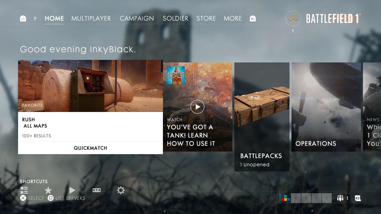
Arriving after BF1’s otherwise stellar prologue, the menu is a momentum killer. There are six areas of functionality fighting for attention on this screen. Players can browse game modes and other recommended content in three interactive rows. Each has a different layout and visual aesthetic. There’s also information on profile, party, rank, and a legend to clarify button actions in the screen corners.
The clutter feels like the byproduct of design by committee. EA wanted to give a nod to newcomers, so they packed tutorial videos and blog posts in a home “strip” of box content at screen center. Battlefield veterans got a row of shortcut icons on the bottom. Stat trackers have the rank and level marker in the top right. And for those who frequently game with friends, there’s profile detail at bottom right.
By trying to please everyone, EA ends up with only lukewarm functionality for any one group. A handful of tweaks would improve the situation.
Cut down content
An effective launchpad shouldn’t be a laundry list. Pare down to what’s essential, and push off extra complexity to other menus. I’d drop the shortcut icons, the profile detail area, and the legend.
The home strip should dynamically change to serve up my “favorite” game modes. That makes the static shortcut option row unnecessary. System menus on a PS4 or Xbox One already surface party detail. And the legend surfaces well established Xbox One and PS4 menu conventions.
Simplify and rename section navigation
More limited functionality on the home page will push players into other menus. That in turn makes the naming and organization of sections in the top row (e.g. Home, Multiplayer, Campaign) especially important.
I’d rename Campaign to Single Player. Granted, “campaign” is common gaming parlance, especially among first person shooter veterans. But it’s confusing placed alongside Multiplayer, given that Campaign can imply both single and multiplayer experiences. The change also adds flexibility for any potential single player DLC down the road.
Next, remove the confusing fly out menu option that opens to the left of Home:
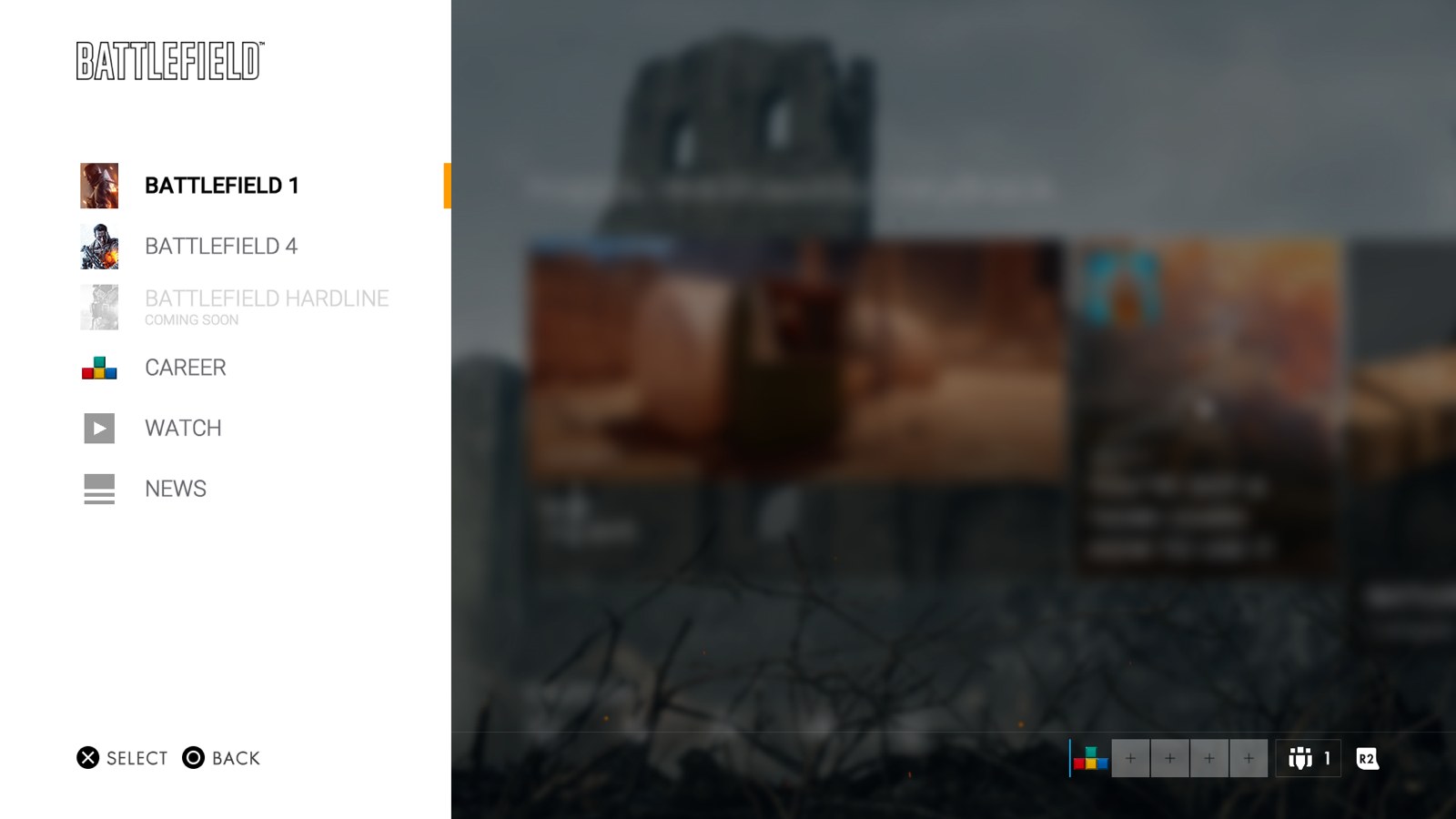
Its icon clashes with the remaining text options and has limited utility; I doubt many players need to bounce between multiple Battlefield titles at a moment’s notice. It’s more intuitive to use the system UI to do the job. And in an especially baffling move, BF1 assigns a common button press – circle on PS4 – to toggle the fly out menu. It’s easy to accidentally tap this button and get pulled out of UI content.
I’d also shift the Solider option (with player stats, weapon and item unlocks) to fall under More. It’s given too much prominence as top line navigation. I suspect it pales in usage compared to Home, Multiplayer, and Single Player options. One could make similar arguments about Store. Yet given EA’s revenue model, a DLC and microtransactions source will remain front and center.
Replace home strip content
The current home strip is formulaic and static. Every time I visit I see a “favorite” game mode that I’m rarely interested in, followed by several generic video clips and news posts. The home strip needs more content tailored to a player’s changing interests and skill level.
I’d have the first two items be the player’s most played and last played game modes (e.g. campaign, rush quick match). For item three, display a single tutorial video that changes based on player behavior and skill. The video selection algorithm could start simple, like pulling a random option that matches the last played game mode. Over time it would find player weaknesses and match videos accordingly. There’s serious potential with this feature; the right set of videos can help casual players gain skill and stick with the game longer.
To round things out, I’d have the fourth item be an “alternative” game mode recommendation. It’s one the player rarely plays, but might suit their tastes to extend the game’s longevity. It’s akin to a “if you like X, you’ll like Y” auto recommendation common to services like Netflix and Spotify. I’d cap items there; by keeping the experience down to only a few items, the home strip is easier to digest quickly.
In rare cases I’d also squeeze in a news post or two if it significantly affects gameplay, like a major patch or DLC release. They need better readability than their current form:
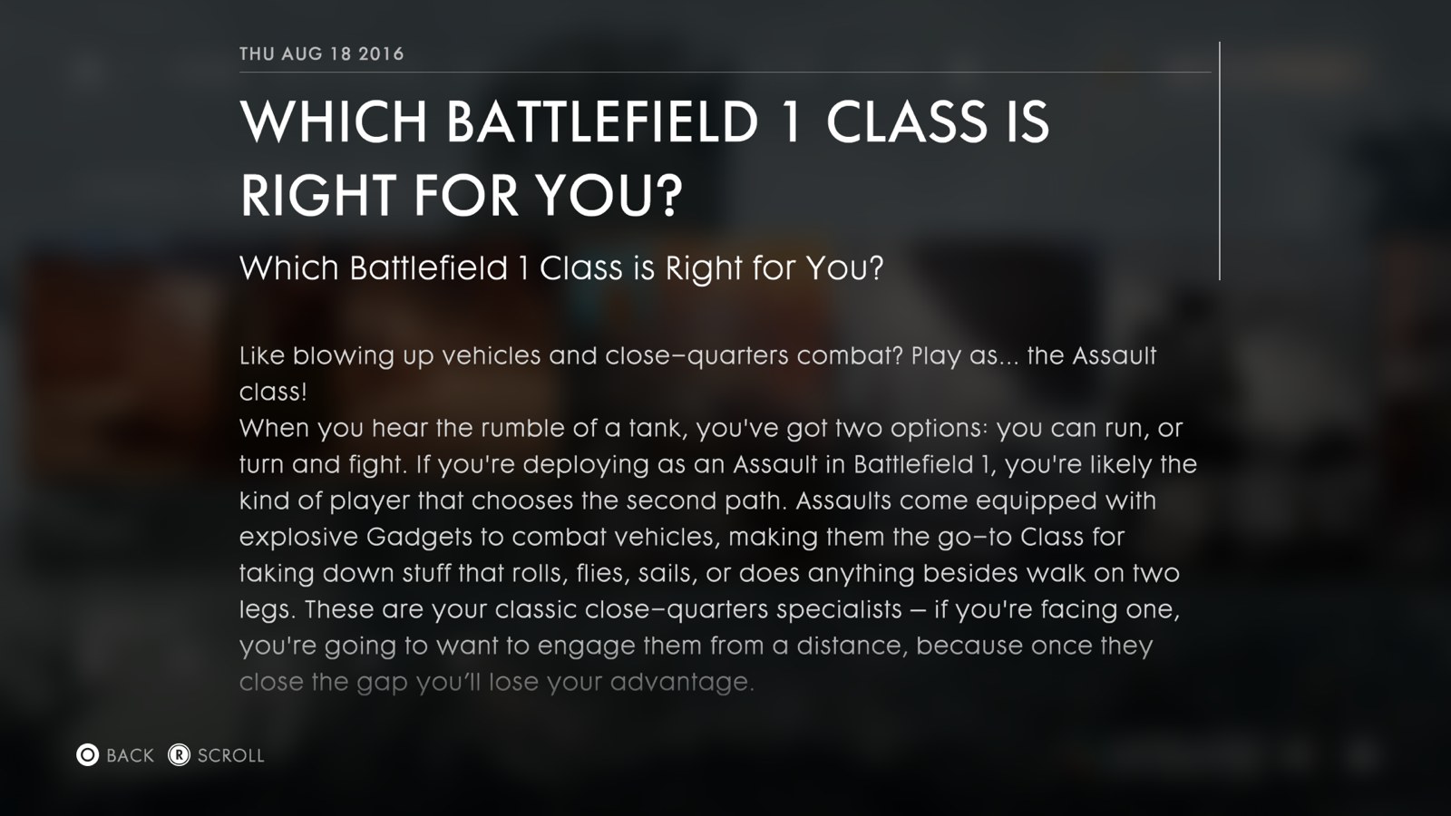
There’s a single column of body text that’s too large, with line length too long, and little separation between paragraphs. There’s no imagery to break up the text or keep the visuals fresh. Posts need a slightly smaller font, a narrower column, and proper paragraph spacing, with a clean image in the header.
Bringing it together
Game menu UI is underrated; you’re forced to reconcile with it before, after, and during gameplay. BF1’s isn’t great, but when you’re a veteran to the shooter genre it’s possible to move around the shortcomings. Yet with a bit of cleanup on their main home menu, it would be much better. The right contextual advice would ease the learning curve for new players and shortcuts to well-matched game modes will keep all gamers playing longer and happier.