Grid Based Web Design Works
Grid based design has been taking the web design world by storm. As evidenced from the sheer amount of resources and conferences with big name designers extolling its benefits in the past year, it may be reaching its zenith of influence. I’ve become a firm believer in a grid based approach to web design, and it’s my hope that with the opinions and resources I’ve compiled below, you will be too.
?The more modular and simple, the more flexible and easier to recombine later. Use the 960 grid.?
Web guru Jeff Zeldman at An Event Apart Chicago, 10/12/09
Grid systems: Basics and history
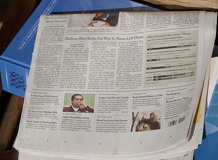 Every time you pick up the Times, you’re looking at grid based design. Just look at those columns. (Photo: http://www.flickr.com/photos/ari/ / CC BY-NC-SA 2.0)
For those of you somewhat in the dark, the grid system is a loosely defined philosophy of placing elements onto a two dimensional framework with spaced columns and rows consistent from page to page. It’s a system that started to catch on in the print and graphic design world after World War II and was adapted by most publications, especially newspapers, by the 1970s.
Surprisingly web designers didn’t catch the grid system bug until very recently, though web design as a serious discipline has been going for over a decade. Many theories abound why this happened, but the perception of a large (and vocal) group of web designers of the print world as alternatively the enemy or hopelessly outdated certainly didn’t help.
Benefits
So, why should you start designing with a grid in mind? For me, it comes down to several key advantages:
Consistency.
Knowing that the header nav takes up X columns and the sidebar Y every time shouldn’t be constraining, but rather liberating. As a designer and developer, I know that as I move from page to page the layout of content will cascade in the same place, which lets me focus more on content and technology. Khoi Vinn’s and Mark Boulton’s influential Grids are Good presentation put it best: Constraints are the mother of design invention.
Speed.
When you can only place that navigational element in only one to four columns, vs. anywhere on screen you save time. No more of the endless 5px nudge or padding, check, rinse and repeat. While there are several good reasons for breaking out of the grid during the design/development process, less options plus less changes equals less time. Keep the ball moving forward, and worry about the pixel perfect details later.
Think cohesively, not in isolation.
A very underrated benefit that really sells itself on large projects with diffuse resources or conversely very small projects (e.g. a solo combined developer and designer.) Often in web design we can fall in a trap of obsessing over a single important detail on a few pages, such as the comment entry section on a blog. However, when that detail is added to the overall design, it just doesn’t fit, visually or proportionally. In contrast, when we start design with a grid, we have to “play by the rules.” All elements have to work universally, not in isolation.
A “common language” between designers and developers.
History abounds with examples of misunderstanding between the “tech” development team and the graphic design side of the equation. Grids simplify: It’s a lot easier to debate location in terms of columns (usually 16-24) instead of 960 pixels. Designers are already use to aligning their PSDs on set grids or guides. Developers have their CSS frameworks to make the transition to the web easy.
Examples
A lot of great websites have made the transition to grid based design with visually stunning results. Here’s a few of my favorites, from largest to smallest in scope:
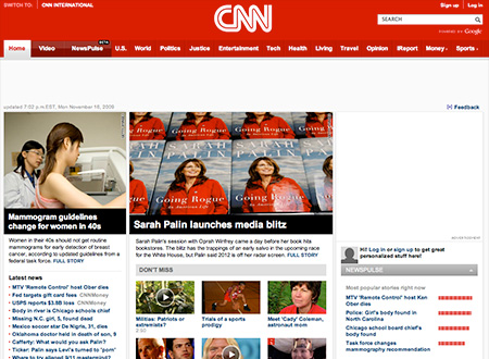
News: CNN.com
Much has been written about CNN’s recent redesign. The most noticeable change I found to be a stricter allegiance to a wide, more spaced out grid design. This extra spacing gives the content heavy site much easier to read and navigate, a major factor that I believe puts the site’s design a cut above their major competitors.
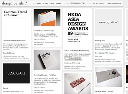
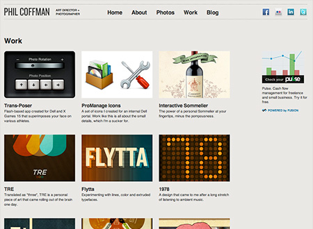
Art/Design: Silnt, Phil Coffman
While Silnt and Phil’s personal site have different intentions and target audiences, by incorporating a clear cut grid design, they keep the focus on what matters: Art and content. Silnt’s design is intentionally more sprawling which adds an element of fun while still emphasizing the breadth of the studio’s experience. Phil keeps things more straightforward with lots of padding to emphasize a more calm, organized approach.
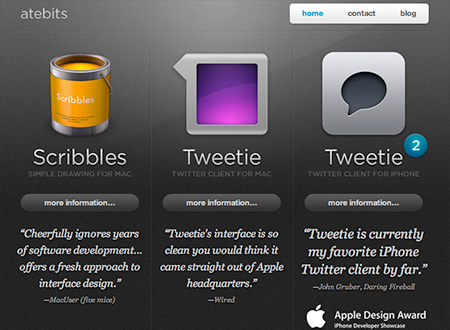
Software Development: Atebits
Personal obsessions with Tweetie aside, this site really embodies this very small Mac dev shop’s focus on clean, minimal applications. Three columns, three applications. Simple.
Web Portfolio: Things That Are Brown
Yes, the color palette and simplicity is striking enough, but the glue that really holds this design together is the grid. I especially like how the left column (“Who. What. How.”) takes up double the size of the remaining two columns to the right (“Hire Us”, “On Twitter”) which adds a sense of proportion and visual balance to the page.
CSS Grid Frameworks to Try
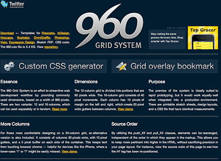
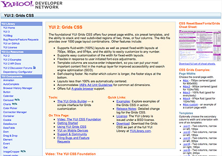
My personal allegiance of late sides a bit more with the 24-column variant of 960, but the three below are all excellent, browser friendly options.
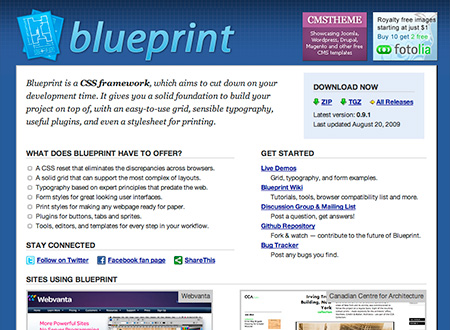
Blueprint
960
Yahoo YUI
More resources
Still have more questions? There’s plenty of great material available elsewhere.
Design By Grid
TheGridSystem.org
Smashing Mag: Designing with Grid Based Approach
Smashing Mag: Grid based Design, Six Creative Column Techniques
A List Apart: Setting Type to a Baseline Grid
A List Apart: Thinking Outside the Grid
A List Apart: Fluid Grids
