Polygon and the pitfalls of ‘scroll heavy’ design
There’s a lot of gamers, myself included, very curious about Polygon, the soon-to-be-launched gaming web site from Vox. Vox is the team that brought us tech site The Verge, which overall is a pretty slick site. Yet Paragon’s teaser website is atrocious. It’s a site guilty of shoving all relevant content on one very long page in a poor manner. That design paradigm – what I call ‘scroll heavy’ – probably sounded cool in design meetings but falls apart entirely in execution.
Just look at this:
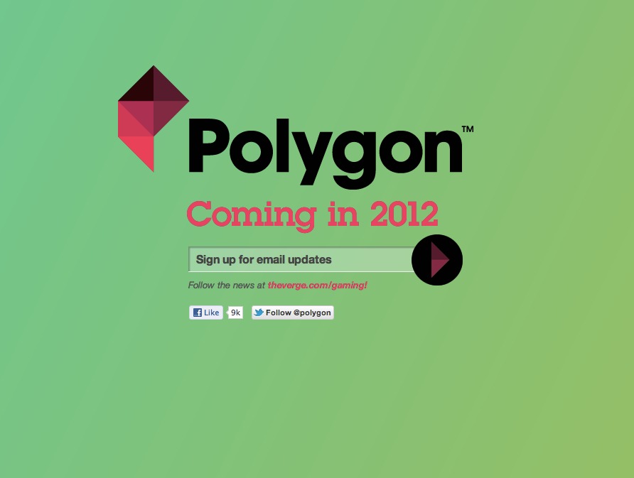
Do you have any damn clue at all that’s there’s more content below this email form? Granted, there’s a scroll bar. Yet given how impatient and click happy most web users are these days, it’s unlikely one would scroll down out of sheer curiosity.
It’s unfortunate, because far below the page there’s a Twitter listing of many respected game journalists all across the industry that are now part of the Polygon team. For those “in the know”, the exact “core” gaming audience Polygon should be interested in, this is a pretty big deal. It’s a total lost opportunity.
So if you’re a web designer who’s on ‘scroll heavy’ design duty, be careful. Look out for the following pitfalls:
- Navigation or content that fails to imply what’s below. If you’ve got a clear navigation area at the top that scrolls or jumps to content below, you’re probably in decent shape. But if you’re going very minimal and navigation isn’t prominent, be sure a bit of ‘teaser’ content will be viewable at the bottom of most users’ browsers (if in doubt about that bottom point, I’d start with 700 pixels from the page top.)
-
Inconsistent design among page sections. I’ve seen some designs throw together otherwise eclectic pages together on one scrollable area because it ‘looks cool’; it doesn’t. If anything, scroll heavy design demands more attention to design consistency, not less. Users who don’t notice a site’s cohesiveness between page refreshes are far more likely to clue in when different sections are a few hundred pixels above or below each other.
-
Too much high bandwidth page content. With all the extra code and content now on a single page, site performance becomes especially relevant; slower connections and processors can choke on a scroll heavy page’s sheer complexity. Minimize http requests by cutting down the number of separate images and/or videos that are part of initial page load. Streamline the HTML and CSS code.
If you’re still having trouble, one example of great scroll heavy design is the Kaleidoscope file comparison app website. It’s clean with bold colors, strong copy and clear divisions between major content areas. Designer Ethan Marcotte’s home is also well thought out with a more subtle color scheme.