Blue Drop: A new minimal weather web app
I’m pleased to launch a little project I worked on over the weekend. I called it Blue Drop, and it’s a colorful, simple weather app that’s accessible anywhere you have a web browser. It looks best on an iPhone, iPad, or Webkit (e.g. Safari, Chrome) browser on your desktop. It’s far from revolutionary, but it matches my needs and may match yours as well. On this post I want to break down how it came together and my development workflow.
To give a bit of background info, the idea of a self written weather web app or page had been ruminating in my brain for weeks. I’ve been extremely disappointed by options on the web store. Most weather apps are poorly designed, hard to read at a glance (small text is the common culprit) filled with ads, and tend to provide either too much or too little information. Then a breakthrough came last week – I spotted Degreees, a clever, CSS3 powered web app that relies on geolocation to report local temperature. I knew this was exactly the kind of direction I wanted to go in, but with my own personal spin.
Before I started designing mockups, I jotted down in iA Writer a few attributes of what an ideal weather app would have. It should be reliable and get its weather information from a great source. I’ve always been a fan of Weather Underground’s data so they were a logical choice. Their api is free for developers to try out as long as your daily query size is small. I also wanted a pared down app that gave me quick information at a glance. No maps, no extended forecasts. Just the temp, conditions, and a quick forecast of the near future. Finally, I was heavily inspired by the Windows Phone Metro style UI: big typography, big iconography and a sparse color palette.
I next used Sketch for mockups and wireframes. Based on some searching I settled on Adam Whitcroft’s gorgeous Climacons for icons, and the well tested Gill Sans for typography. Helvetica is a more readable choice but I wanted a mildly warmer and more humanist font. Development was done locally on my Macbook Air with my usual tools: Sublime Text 2, Kaleidoscope and SnapRuler.
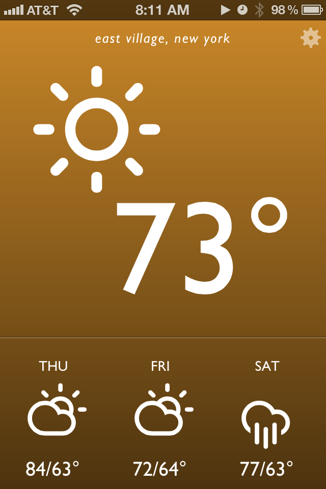
The finished app has a few small touches that I think both add personality and increase its usability. First the background gradient changes color depending on both the time of day and the weather conditions. Sunny days have an orange hue, clouds and rain get blues and grays, and thunderstorms are purple. Daytime has bright, punchy colors while saturation and darkness decrease during the evening. The interface is also intentionally simpler than most iPhone apps – this made development and QA more straightforward as well. Everything essential is presented on app launch, and a single tap or click on one of four regions (the top conditions area and the three daily weather icons below) toggles additional detail.
There are still a few rough issues; they mostly deal with the size and space of several icon related items that I expect to touch up in upcoming weeks. For now, feel free to check it out and pass along any feedback.