I thought I’d move past linking to more Gone Girl articles, but here we are; it’s that strong of a film. DP Jeff Cronenweth talks about Fincher’s preferred visual style:
I think that, for the most part, the camera is never in a position that would be a typical shot. There are no shots that are ever taken for granted. There’s a purpose behind everything — without getting crazy; obviously certain situations allow you a lot more freedom than other situations, but it always intrigues me that it’s slightly not normal, or not traditional, rather. The camera tends to stay lower; we’re always looking at people in an observational way that allows you, really, to study them and give them an opportunity to express whatever turmoil’s going on in their heads that then reflects in their performances. The camera has movement but nothing is ever moving for the sake of movement, you know? There’s purpose for everything, as opposed to filling in a void in content or our energy by deciding to make some interesting camera moves. The camera moves have a reason.
HTML email has always been a major annoyance to code for given the wide range of CSS and support various email clients provide. So admittedly when I see a post boast about “responsive” HTML email, I usually chuckle and move on. Not so with web designer Benjy Stanton. I like how Benjy moves through his whole process from sketching a design to a starting point code framework (he digs Ink, a Foundation setup that I’ve used and liked in the past) to common debugging issues.
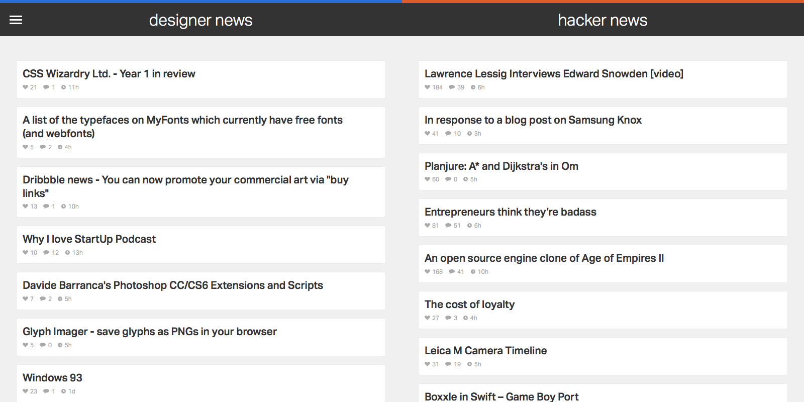
I love practical side projects that I’ll actively use, so I created a web site that shows trending stories from two resources I check daily: Designer News (DN) and Hacker News (HN).
Many designers and developers I know consider both news sources essential reading. They’re the source of engaging Pocket reads, solid tech ideas, and inspiration that helps my career. Yet I’m not fully satisfied by the layout of the original web sites, or with other extensions or apps that aggregate content from either source. So I created my own.
News Funnel has a rudimentary web scraper back end that feeds the 50 top ranked posts in from both Designer and Hacker News. It’s responsive and equally readable on phone, tablet, or desktop. But the site is less about development techniques and more about design exploration around how I use DN and HN. I don’t linger in either news source; it’s more jumping off point into an article or two to read or save for later via Pocket. I want content that I can browse as efficiently as possible.
An efficient design starts with typography. News Funnel is it its core a list of articles, so nailing the right font is a critical step. After researching many options in Typekit I settled on Dalton Maag’s Aktiv Grotesk as the app’s font. While I considered other, more distinctive or whimsical choices with higher contrast, Aktiv Grotesk is a grotesque that’s suited to the straightforward nature of the app. Yet it’s not the expected (and I’d argue, overused) Helvetica either. It’s cleaner, fresher, and more neutral, an effective cross between Helvetica and Univers. That neutrality is a good match for the diverse set of stories that trend on DN and HN. I also bumped up article title size and contrast more than other DN or HN aggregators; I prefer more discernible text over raw information density.
Because of how fast I move through both DN and HN, I wanted hit targets for my mouse clicks or finger taps that were large and obvious. That goal made for a logical match with the popular ‘card’ paradigm design. There’s one card or box per article, and a click or tap almost anywhere in the card opens it. For non-touch users, the border changes on mouseover to reinforce the action state. There’s also a large chat bubble icon with generous padding on each article’s right side to access the comments section.
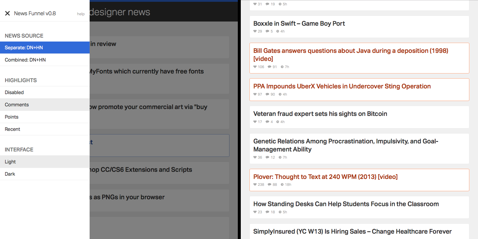
I often visit both DN and HN for various reasons and in a range of contexts, which made adding customization a natural choice. It’s all accessible in a single side menu. By default, wide displays show DN and HN side by side, while narrow displays allow you to toggle between either source. There’s also a special combined mode which pulls articles from both sources into a single column, alternating articles in ranked order. Especially on narrow width displays (e.g. smartphones) that makes it easy to scan through both sources with minimum effort and context switching between apps or web pages. Just scroll down and keep your eye trained on a single column.
I find ranking and title to be an occasionally insufficient indicator of what I should be noticing from either news source. So to keep relevant articles front and center, I added a simple highlights toggle in the side menu. You can choose to highlight stories that have a large number of comments, high point score, or those that reached the top 50 list quickly. There’s no substitution for opening an article, but flipping on highlights and running a quick scan through the app can draw attention to good content I would have missed otherwise.
Add highlights to articles based on the criteria of your choice.
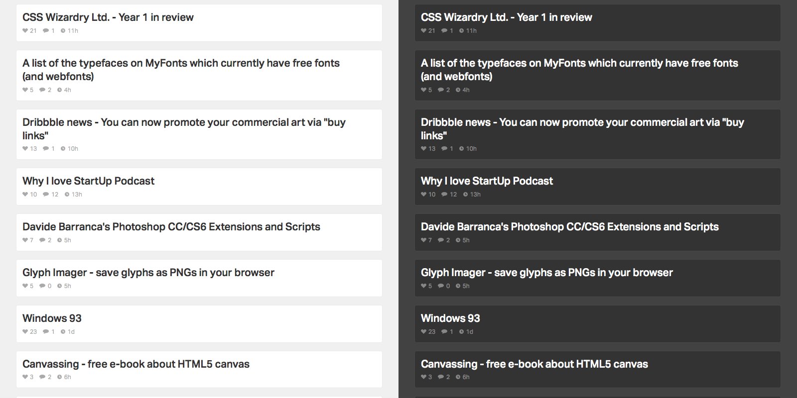
The context of where you access News Funnel matters as well. Much of that is taken care of with responsive web design so the list is readable on any device. But location and time of day is another key factor. I’m often scanning both news sources in low light scenarios, usually late at night on my Macbook or iPhone. To make it easier on the eyes, or for those that prefer a different look, I added a toggle to flip between light and dark color schemes.
Toggle between light and dark color schemes.
While I’m no aesthetic designer, I added a few visual touches to keep things simple and avoid distraction from the actual content. To start, animations are consistent. They run on the same easing scale and, for the exception of the side menu, are exclusively fade ins and outs. The reading color palette is monochrome. To add emphasis to clickable areas, hover states add punchier blue tones on DN content, orange on HN content (albeit toned down from the stronger “official” orange on the actual HN web site) and purple for combined content.
Overall, I designed News Funnel to be a concise way to check up on cool stories going on in the design, development, and the web. Feel free to check it out.
I was worried when I saw the feature title; was The Dissolve stooping to cheap listicle work for page hits? Turned out to be a false alarm – the entire Dissolve staff trades off for analysis of how each music snippet works so well within a film’s context. There’s almost always a Youtube clip to accompany each selection as well.
Only disappointment: The Big Lebowski’s “Just Dropped In (To See What Condition My Condition Was In” should have ranked higher.
I enjoyed reading this A List Apart post from Susan Roberton. Unlike a lot other CSS optimization articles, there’s a formalization to Susan’s breakdown of an “audit” that I appreciate. An audit isn’t about making direct code changes, it’s working through the entire CSS base and delivering an document that summarizes changes to make. I find most teams skip even informal auditing, instead preferring to just hack away on a CSS snippet they don’t like. In the process they miss larger, more important architectural changes.
Words to consider by Giant Bomb’s Patrick Klepek, especially in light of the very splashy Destiny release:
Now, we may be seeing the rise of games that ditch single player entirely. It’s not a great PR message. Many are going to be reluctant to actually pull the trigger. But that may be a disservice to everyone involved. Players go into the game thinking they can get something they can’t, and developers are forced to compromise a gameplay experience, knowing it’s not what they’re truly building. That’s a lose-lose.
I’ve been a firm believer in the Filament Group’s picturefill for months as the premier way add responsive imagery to any modern browser. It’s not just a tool for side projects either; I’ve implemented the latest 2.1 release on several of our externally facing corporate web pages at Pocket.
But that might be changing soon. For the last week I’ve been researching respimage, a new performance enhanced variant of picturefill that is just as easy to implement but performs, from my informal tests, noticeably faster than the original. As Scott Jehl, one of the contributors to respimage argues, respimage is “simply a picturefill on steroids”. I’ve already switched this site to respimage, and if the setup remains stable I’ll likely do the same over at Pocket.
The Dissolve’s Matt Singer writes a David Fincher essay that’s thankfully not another think piece on misogyny within Gone Girl (there been many excellent pieces, but it feels done to death at this point.) Instead Matt takes a broader look at the director’s entire career:
Perhaps the most compelling rebuke to the idea that Gone Girl isn’t worthy of Fincher, or that he has no authorial stake in the material, is the fact that Flynn’s story—about the exceedingly nasty fallout of an unhappy marriage—lets Fincher finally foreground one of the most persistent background themes in all his work: the inherent incompatibility of men and women, and the inevitability of an unhappy ending in almost every relationship.
Another OS release, another great review by John Siracusa. Some might find John’s depth maddening (the review’s word count is probably larger than most other OS reviews online combined), but I think that’s exactly why it’s so essential. Treat it like a small novella: have a drink, sit on the couch and parse through the whole thing for a few hours on a low key night. If you love tech, it’s great entertainment.
Ars Technica’s Kyle Orland writes on the state of the PS4, Xbox One and Wii U now that we’ve seen some system updates, lots of game releases and had some long term impressions. As he concludes:
The choice between the Xbox One and PS4 remains an especially tough one. Microsoft has the edge in big-name exclusives, and it no longer costs 25 percent more than the competition. Sony has enough interesting indie titles to stand out itself, and its console boasts the best technical performance on a number of cross-platform games. You can make a good case for either system over the other on those differences. But if you’re going to choose, all we can really recommend is that you take a look at which of those exclusive games, including those coming in the future, best appeals to your tastes.
I’ll likely touch on this subject as part of my retrospective of owning the PS4 in an upcoming post.