Battlefield 1 has received praise for its gritty WWI gameplay, but its pre and post-game user interface need serious work. They are too cluttered and confusing for casual players.
Let’s focus on BF1’s main menu:
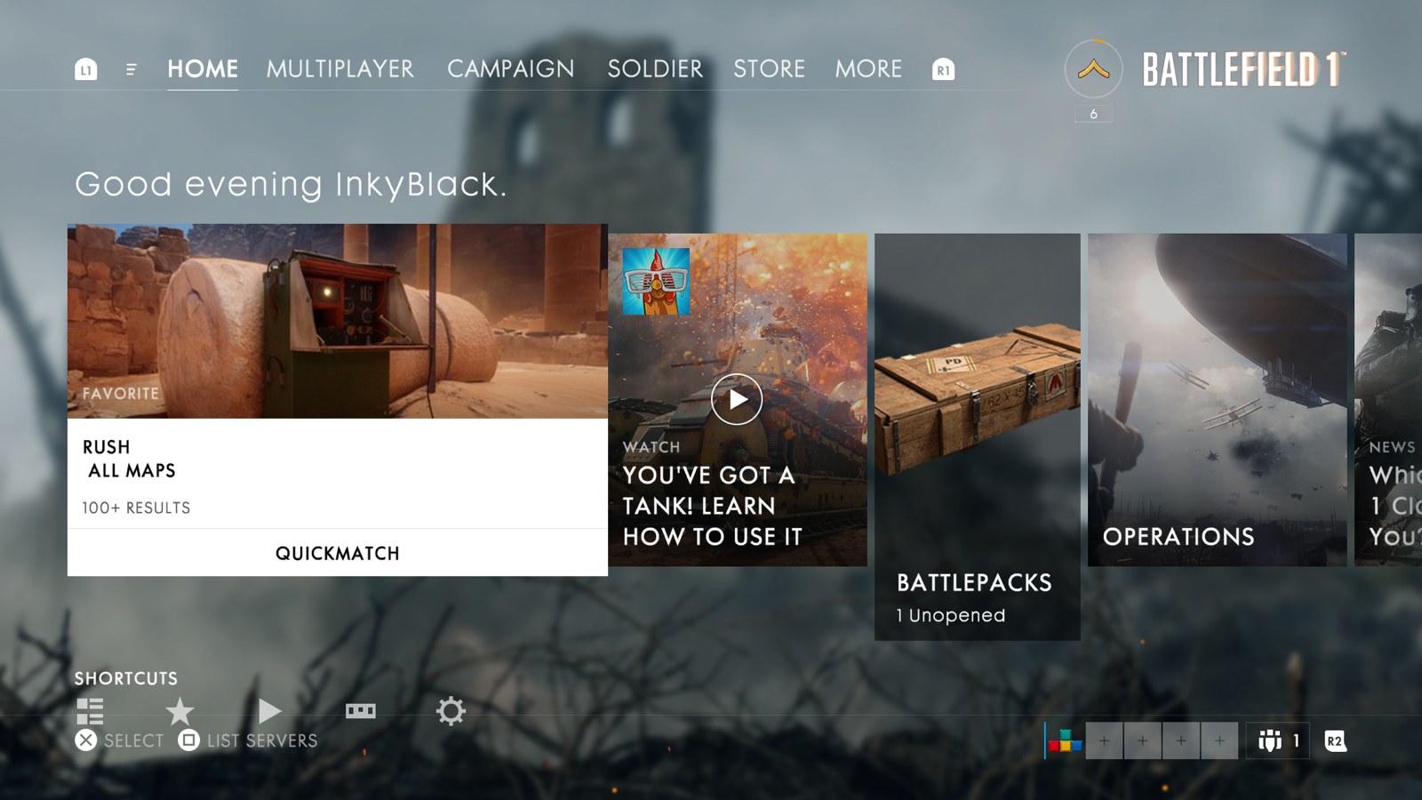
Arriving after BF1’s otherwise stellar prologue, the menu is a momentum killer. There are six areas of functionality fighting for attention on this screen. Players can browse game modes and other recommended content in three interactive rows. Each has a different layout and visual aesthetic. There’s also information on profile, party, rank, and a legend to clarify button actions in the screen corners.
Never count Nintendo out. Few others can rival their first party games; Mario Kart 8, Splatoon, and others made big impressions well beyond Wii U’s user base. And as the Switch reveal suggests, Nintendo can still deliver innovative hardware.
I’m intrigued that the Switch combines a home and portable console into a single device. It’s practical and catering to a wide range of gameplay. Game output should increase with developers no longer having to pick between two Nintendo platforms. And it’s less gimmicky than the Wii or Wii U.
The Switch’s convertibility may also be its greatest liability. Combining home and portable forces the Switch to make compromises. Likely we’ll see reduced horsepower, input control options, and battery life. All this makes competing against well entrenched rivals, both at home and on the road, that much harder.
Two of the Macbook Pro’s most hyped improvements – the Touch Bar and more compact profile – have little benefit to many professionals. I’m worried Apple is increasingly hawking consumer level tech that’s missing the high end market.
At least half of the developers and designers I know work primarily with a Macbook Pro hooked to an external display and paired with an external keyboard and mouse. Ergonomics improve with both displays at similar height and distance. It’s more efficient to scan and drag content given the screens’ proximity. And by driving the setup through a laptop, you still get the flexibility of a portable device for meetings or work on the go.
Therein lies the rub with the Macbook Pro’s Touch Bar. With the aforementioned setup, the Macbook’s distance makes the Bar out of reach and hard to see. Ironically, a setup for serious work nullifies the Bar’s purported productivity benefits. And based on Apple’s pricing segmentation, we’re paying a premium for it as well.