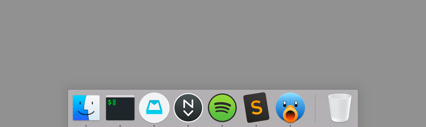
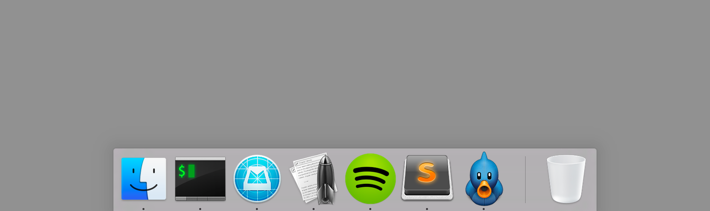
New app icons for iTerm, Mailbox, nvAlt, Spotify, Sublime Text, and Tweetbot.
Yosemite’s most striking change to Mac OS X are its visuals, a nod to bring the OS more in line with iOS. That’s distilled in its new set of default system app icons. As John Siracusa writes in his Yosemite review:
Apple is trying to discipline the world of OS X icons. While one icon shape has been deemed insufficient, Apple believes three shapes should just about do it: circle, rectangle, and tilted rectangle…Visual simplification is the order of the day, and details that don’t read well at small icon sizes have been excised.
Unfortunately several apps I use heavily haven’t updated their icon and clash with Yosemite’s new look. In a sea of flat minimalism, bold colors, and thinner typography, a few icons that don’t follow trends can really stand out. So I hunted on Dribbble to find suitable replacements. Below I’ve provided a few direct links if you’re interested in grabbing them for yourself.
The default app icons.
If you haven’t replaced an app icon yet, it’s an easy process in Yosemite:
Right/command click on the app in Finder. Select “Get Info”. A dialog box will open.
In another Finder window, find the new replacement .icns file for the app. Click on the icns file and drag it over to the existing app Get Info dialog box. Release the file on top of the existing app icon at the very top of the dialog box.
In terms of my replacements:
iTerm isn’t far off the mark but I wanted a more minimal, flatter look that better paired with Apple’s Terminal icon. Jason Long’s take is a better match.
Mailbox overall looks great, but the “in construction” thin lines (albeit with good purpose to signify beta status) all over the Mailbox icon were distracting. Chris Jennings made a very clean replacement that goes well with Mailbox’s minimalist aesthetic.
nvALT has a clever icon with a small stack of sheets alongside a rocket ship taking off. But it’s busy in the context of Yosemite. So I went ahead and created my own amateur work in Sketch combined with Icon Slate for output. Download it here.
Spotify’s default icon already works with color and a circular shape. Yet I wanted something with a more subtle gradient, punchier color and more clearly defined edge to the icon. Sebastian de With’s Muir set was my first choice, but after using it for a few days the white coloring for the icon’s sonic waves felt off from Spotify’s black aesthetic. So I switched to Jean-François Goncalves’s work. It’s very similar, but with black instead of white accents.
The great Iconfactory put together Sublime Text’s “big button” style original icon, yet it never resonated with me; it was just a bit too “cute” for my tastes. I’ve used other replacements while on Mac OS 10.9, but for Yosemite I’ve settled on a simple tilted rectangle icon from Rafael Conde. I love the subtle cross hatching on the icon’s background.
Tapbots have always had a playful and original bent to their wonderful Tweetbot app; that gives some creative license away from Yosemite’s usual icon layout. But Ilja Miskov put together an option that plays better; it mirrors Tweetbot’s simpler iOS icon cropped to circular form for Yosemite.
Designer/developer/speaker Harry Roberts of CSS Wizardry isn’t generally a big extend fan:
Let me start by saying that I would generally advise never to use @extend at all. It is something of a Fool’s Gold: a feature with a lot of promise and twice as many caveats.
Compared to Harry I’m a Sass newbie, but I always found the extend call, much like nesting, mildly discomforting. This post helped me understand exactly.
From the moment I first saw the Destiny beta, from the UI to the art direction and even the main ‘feel’ of the game, I knew there was something distinctly different about its game design. So props to the design blog Betterment for laying out some of the biggest hooks Bungie’s epic first person shooter/MMO have to offer. As many reviewers have noted, even with a severe lack of content and repetitive mission nature, there’s something supremely addictive about its gameplay. To quote Betterment author Jason Amunwa:
Destiny uses multiple systems to tease our brain’s pleasure center with anticipation of a reward, combined with activating our nucleus accumbens by making the reward variable at every level. It’s essentially commandeering players’ anticipation – whether it’s getting loot, exchanging Engrams, or what-have-you – and using it as an itch to motivate just one more play.
Our feeble brains’ pleasure centers never stood a chance.
I’ve bounced between web design and development for years. As someone who has never had a formal instruction in visual design, Erik Kennedy’s primer on this Medium post isn’t a bad start for those new. I especially like his thought processes behind rule three: double your white space. Might be a bit overkill compared to what’s absolutely necessary, but it’s one of the first mistakes I see from design newbies, especially developers starting to dabble in design work.
Here is the gigantic, crucial difference between piracy and streaming. In piracy, we don’t have listening numbers: we don’t know if an album downloaded for free was listened to 100 times or 0. A download might represent a lost sale or it might represent a listener adding to an endless collection or sampling one album among dozens, as if hearing the song on the radio. We really have no idea. But with streaming, we absolutely know. The statistics are right there. And artists should be paid accordingly: maybe not $10 a fan, but definitely more than a few pennies.
There’s a cold ratio at play here: the less popular a band is, the more money they need to generate per fan to reach a break-even point. However, the more popular a band is, the more ways they have of generating money per fan — and often they can generate more money per fan anyway, with deluxe packages at shows and branding opportunities, especially if you consider corporations to be people, as the Supreme Court does. It is a fundamentally unfair marketplace that privileges the already successful, which is rarely the path to innovation — or interesting art.
Another great find that I heard from a speaker at Sass Summit. It’s a really ingenious methodology to write a running style guide for your work in your source Sass or CSS directory. Basically by writing souped up comments direct in your CSS with a mixture of HTML and Markdown, you can run a ruby process and autogenerate a great looking style guide to the destination of your choice.
For Gulp fans, there’s a simple plugin as well as an alternative to the Ruby gem.
Writer Shawn Blanc on smart custom perspectives in Omnifocus:
In short, you should create your own custom perspective for “Today”. And let that list show you all the tasks which are either Due today or which are Flagged. When you are doing your daily review and scrubbing your list, don’t think about what’s due — because it should already be given a proper due date — instead, just flag the tasks you want to get done that day. Then, go to your Today perspective and now you’ve got a list of items which are both urgent (i.e. due today) and important (i.e. flagged).
Bingo. When I started using Omnifocus, virtually everything had a strict due date, which became maddening after time. When everything is “due”, it’s hard to manage what is really important. Overall, be less aggressive with real due dates unless it’s really due.
A node.js based library tool to collect CSS statistics on any web site. It’s also easy to install via npm locally to run against any stylesheet you have. There’s even grunt and gulp integration; I can see this hooking into some sort of regression testing for my work in the long run to get a wider picture of how the code is evolving.
Meanwhile, we add tons of weight to our pages, levelling the field and making the experience in modern browsers worse as a result of attempting to make the experience in older browsers better. There’s a problem with this fallacy, though. People using older browsers are not expecting the newest features. They’re content with what they have. That’s the whole reason why they’re using an older browser in the first place. Instead of attempting to give those users a better experience (and usually failing miserably), you should enable features only if they’re currently available on the target browser, instead of creating hacks around those limitations.
There’s many other aspects to recommend about Matthew Butterick’s wonderful book, but one of my favorites is this section, where Butterrick breaks down how to apply typographic principles to presentations. Given I teach courses part time, it really helped improve the quality of my work.