Great web projects don’t succeed on good design or development chops alone. Communication and collaboration among both designers and developers is just as important.
I’ve seen firsthand otherwise solid designers and developers botch a project just from miscommunication. And those poor relationships persisted beyond the life of the project. I’ve also seen novice designer-developer teams work in unison and deliver amazing results. They resolved potential pitfalls early, delivered their projects on time, and iterated quickly. Coordination isn’t just for projects either; a well coordinated team is a happier team. There are less misunderstandings and less tension if tasks aren’t going as planned.
The collaboration between design and development teams becomes critical in responsive web design (RWD) projects. There are now many devices to account for. Fixed, “pixel perfect” design is exchanged for fluid ratios and proportions. There are also extra image assets to optimize for different device sizes and resolutions.
In short: with RWD, there are more variables, more deliverables and more obstacles. Here are several techniques to overcome these hurdles in any RWD project.
Focus on “extreme” viewport sizes first
Most designs start from a static perspective. You pick a viewport width and height, then sketch or mockup from there. What do you focus on first with the dev team? What should be the first high-fidelity deliverables to hand off? Which devices get considered early for technical constraints?
I usually recommend to start designing with the smallest and largest common device sizes. When in doubt, base your range on general 2015 web analytics. 320px by 568px, the iPhone 5 in portrait, is a good choice for the small end. Apple’s older flagship is still popular yet small compared to other modern smartphones. For the large end, I like 1600px by 1000px, the size of a large browser on a desktop. Your audience may be different: skewed more towards mobile devices or desktop/laptop users. Check your analytics and change the range as appropriate.
You’re forced to make hard choices when you start with the smallest viewport size. You have to decide on the most important features in your design due to limited space. With the large end viewport, opposite considerations come into play. How much content is too much? Are text columns going too wide, affecting readability in a negative way? Should select elements receive extra white space? And addressing viewport extremes isn’t just about sizing, it’s also for different input methods. The smallest viewports generally use touch, while the largest rely on mouse and keyboard.
Discuss content layout between breakpoints
It’s easy to forget RWD is a fluid platform given the design attention on static wireframes and comps. Most of your audience won’t see the exact view as your static design. Instead these will tend to be a bit larger or smaller. So consider the layout adjustments necessary between different breakpoints and static comps you design. For example, when sizing down, text content may shrink in size. Image assets can drop into a single column.
Avoid making assumptions about what those adjustments will be with your development team. Be proactive: bring up adjustments before your developers are too deep in their work. For complex layout changes, create another wireframe or sketch to illustrate them. Where specificity is less important, a discussion or an email describing transitions can suffice.
Have an image asset strategy early
A common stumbling block between designers and developers is image formats and sizes. Smaller elements and icons might be PNGs, JPGs, icon fonts, or SVGs. There’s no one right answer; it depends on the content and resources available. But it’s important to agree on one format and stick with it. Also, you’ll likely develop patterns for common image sizes as your web project progresses.
Yet for modern RWD, that’s just the starting point. You’ll need at least two assets for raster formats (JPGs). One will be for normal displays and the other for high resolution ones. Advanced responsive image techniques need more assets to optimize for different viewport sizes.
Avoid leaving decisions on responsive image formats to the end of a project. At the bare minimum, have a strategy for display density. Read up on srcset and polyfills like Picturefill to ensure good cross-browser support. If it feels overwhelming, start small. Just altering a few image elements with the srcset attribute is a good first step. See how the process goes and grow from there.
Think atomic, modular design
My RWD workflow is influenced by Brad Frost’s thoughts on Atomic Web Design and Jonathan Snook’s SMACSS. Both frameworks rely on reusable, small components as the basis for strong web architecture.
So for developer handoffs, I like to concentrate on small and reusable components first. Smaller components generally keep the same UX and visuals across different devices. That consistency can be easier to digest for the development team. To boot, small components tend to be more reusable between pages on your design. So if you design an effective solution, it’s that much easier to re-apply it later on.
Imagine you’re designing a signup page with a headline, large graphic, and signup form. Depending on the device, these elements may shift around or change in size. Early on, focus on the smaller details of the signup form with the dev team. How does it look? What kind of validation is appropriate? How may a form component change with touch input versus mouse and keyboard?
Bring in developers for visual and UX feedback
Some designers shield developers from product meetings, usability sessions, and other opportunities for feedback. There’s a kickoff meeting, a handoff meeting, and little else. That’s a mistake. Remember that experienced developers are often an underrated knowledge base. They could have intimate knowledge of the product, especially if they worked on it for an extended period of time.
The skills of front end developers and designers also often overlap. Designers are starting to write their own code. Developers are learning about rapid prototyping, wireframing and aesthetic design. RWD has only exacerbated this trend. A developer can bring strong design insights without a formal “designer” title.
Granted, there’s still value in a separation of roles and responsibilities. Yet small steps toward inclusion can significantly assist the design of the final product. So for your next usability test, bring in a developer to discuss the outcome. Or if you’re on a design brainstorm, consult your developers for a second opinion.
Collaboration matters
All these techniques need planning and buy-in from others. With so much attention on launching products and hitting deadlines, that can be hard. But designer-developer relations are often underrated, especially for RWD projects. A small investment at the onset can have an exponential payoff for your team.
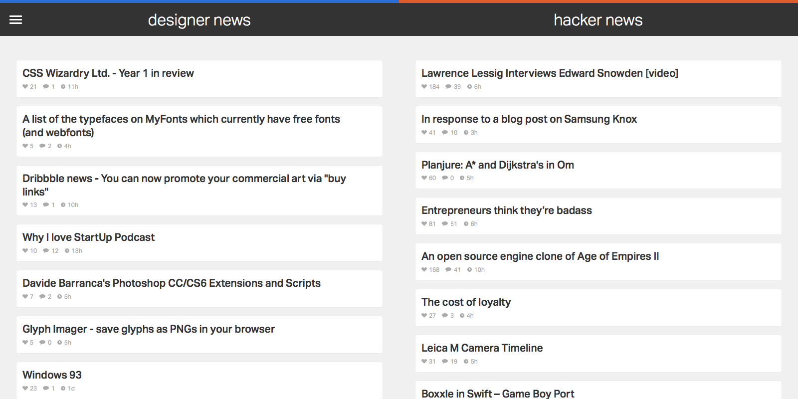
I love practical side projects that I’ll actively use, so I created a web site that shows trending stories from two resources I check daily: Designer News (DN) and Hacker News (HN).
Many designers and developers I know consider both news sources essential reading. They’re the source of engaging Pocket reads, solid tech ideas, and inspiration that helps my career. Yet I’m not fully satisfied by the layout of the original web sites, or with other extensions or apps that aggregate content from either source. So I created my own.
News Funnel has a rudimentary web scraper back end that feeds the 50 top ranked posts in from both Designer and Hacker News. It’s responsive and equally readable on phone, tablet, or desktop. But the site is less about development techniques and more about design exploration around how I use DN and HN. I don’t linger in either news source; it’s more jumping off point into an article or two to read or save for later via Pocket. I want content that I can browse as efficiently as possible.
An efficient design starts with typography. News Funnel is it its core a list of articles, so nailing the right font is a critical step. After researching many options in Typekit I settled on Dalton Maag’s Aktiv Grotesk as the app’s font. While I considered other, more distinctive or whimsical choices with higher contrast, Aktiv Grotesk is a grotesque that’s suited to the straightforward nature of the app. Yet it’s not the expected (and I’d argue, overused) Helvetica either. It’s cleaner, fresher, and more neutral, an effective cross between Helvetica and Univers. That neutrality is a good match for the diverse set of stories that trend on DN and HN. I also bumped up article title size and contrast more than other DN or HN aggregators; I prefer more discernible text over raw information density.
Because of how fast I move through both DN and HN, I wanted hit targets for my mouse clicks or finger taps that were large and obvious. That goal made for a logical match with the popular ‘card’ paradigm design. There’s one card or box per article, and a click or tap almost anywhere in the card opens it. For non-touch users, the border changes on mouseover to reinforce the action state. There’s also a large chat bubble icon with generous padding on each article’s right side to access the comments section.
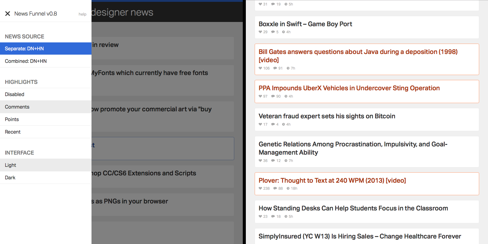
I often visit both DN and HN for various reasons and in a range of contexts, which made adding customization a natural choice. It’s all accessible in a single side menu. By default, wide displays show DN and HN side by side, while narrow displays allow you to toggle between either source. There’s also a special combined mode which pulls articles from both sources into a single column, alternating articles in ranked order. Especially on narrow width displays (e.g. smartphones) that makes it easy to scan through both sources with minimum effort and context switching between apps or web pages. Just scroll down and keep your eye trained on a single column.
I find ranking and title to be an occasionally insufficient indicator of what I should be noticing from either news source. So to keep relevant articles front and center, I added a simple highlights toggle in the side menu. You can choose to highlight stories that have a large number of comments, high point score, or those that reached the top 50 list quickly. There’s no substitution for opening an article, but flipping on highlights and running a quick scan through the app can draw attention to good content I would have missed otherwise.
Add highlights to articles based on the criteria of your choice.
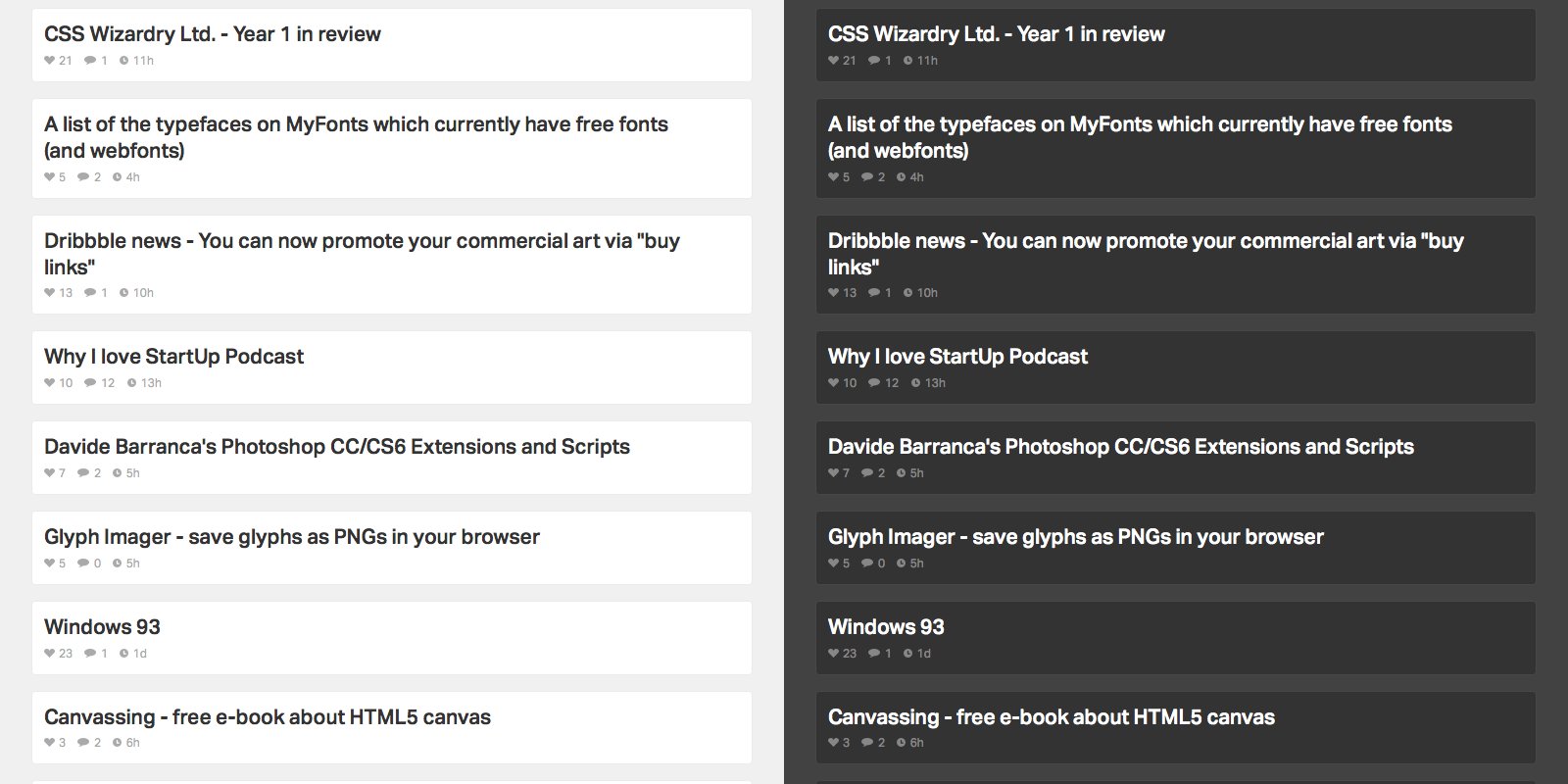
The context of where you access News Funnel matters as well. Much of that is taken care of with responsive web design so the list is readable on any device. But location and time of day is another key factor. I’m often scanning both news sources in low light scenarios, usually late at night on my Macbook or iPhone. To make it easier on the eyes, or for those that prefer a different look, I added a toggle to flip between light and dark color schemes.
Toggle between light and dark color schemes.
While I’m no aesthetic designer, I added a few visual touches to keep things simple and avoid distraction from the actual content. To start, animations are consistent. They run on the same easing scale and, for the exception of the side menu, are exclusively fade ins and outs. The reading color palette is monochrome. To add emphasis to clickable areas, hover states add punchier blue tones on DN content, orange on HN content (albeit toned down from the stronger “official” orange on the actual HN web site) and purple for combined content.
Overall, I designed News Funnel to be a concise way to check up on cool stories going on in the design, development, and the web. Feel free to check it out.
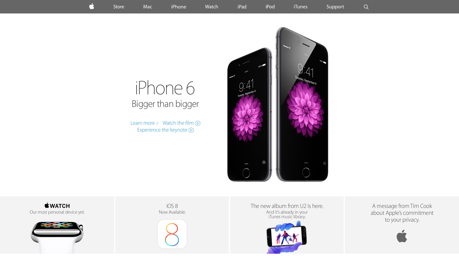
With the keynote announcement of the new iPhone and Apple Watch this month, select parts of apple.com have undergone a significant redesign. Curious to see how Apple stacked up against its competition, I researched the front end tech behind their new home page, iPhone 6 and Watch product pages. With only the web inspector as a guide, it’s an imperfect look, yet overall I’m impressed with how far Apple has come since their last major redesign.
CSS and JavaScript best practices: A-
Like most large companies with a big e-commerce presence, Apple has historically done well with CSS and JavaScript performance basics. They use global CDNs for their image assets and minify all CSS and JS references, ensuring their page weight is minimized.
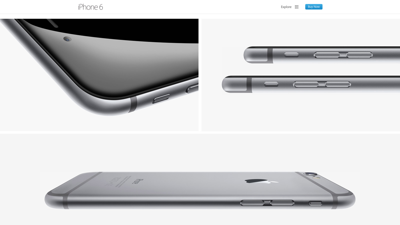
Much more was added with the September refresh. For the first time I spotted a Modernizr-like detection script that runs in the header. It illustrated Apple moving away from device specific styles and functionality (e.g. checking the browser user agent string to adjust content for iPad or iPhone) toward universal feature checks that adapt to whatever the browser supports. In addition, for both the iPhone 6 and Watch product pages, Apple delays select imagery from loading (Figure A) by a few seconds. This “lazy load” effect reduces page weight and increases page speed.
Figure A: images further down the iPhone 6 page load later to maximize page speed
There’s also smarter use of animation as the user scrolls down each product page. Apple added CSS3 animations all over the iPhone 5S product page a year ago, but their usage has expanded significantly since then. Animations are smartly limited to opacity and 3d transforms that stay fast by leveraging the computer’s GPU.
My only disappointment was the lack of sprites for some imagery, most notably the sub “explore” menu on the product pages. Arguably combining eight or more images into a single request won’t make a large difference, but it still feels like a missed opportunity.
Responsive web design: B
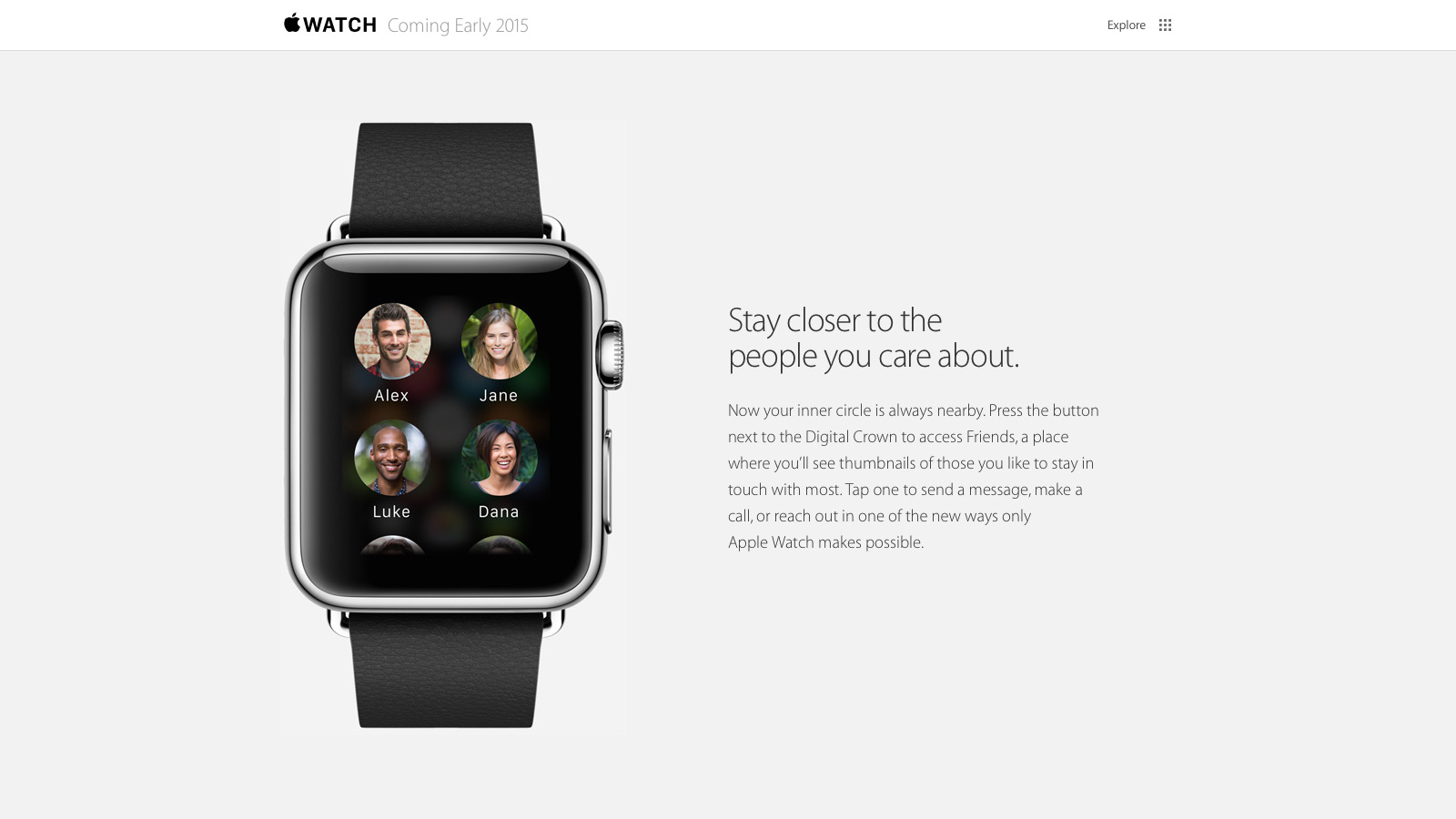
For the first time Apple relies heavily on media queries for a legit first class responsive web experience. Apple has used media queries in the past, but mostly for small tweaks like moving a product image from landscape to portrait orientation. Now there’s a major breakpoint to radically alter the site navigation and most imagery has fluid sizing to take full advantage of mobile device viewports. There’s also a custom responsive grid for aligning select elements. SVGs comprise the top navigation, a subtle nod that the usual 1x and 2x raster images won’t cut it for super HDPI devices like the iPhone 6 Plus.
The responsive design motif is a big step forward yet feels mildly safe: I wanted to see Apple exploit native responsive imagery (the picture element or srcset attribute of the img element), especially considering iOS8’s Safari supports srcset. Apple also uses device-width and device-height heavily in their major break points which seems unnecessary: if I navigate to apple.com with a slightly narrow browser on my laptop, it feels odd to just cut off content and add scrollbars when there’s a better optimized view available.
Typography: B
Unlike past designs that relied on occasional text images or web safe fonts, Apple has transitioned mostly to modern, custom web typography. Myriad Pro is deployed at several weights throughout the site and it’s a manageable (albeit a bit higher than I’d like) download at a bit over 300k.
Nevertheless, I wasn’t crazy about several paragraphs of product detail that use the thin Myriad Pro Light against a low contrast background (Figure B). It looks great on HDPI devices (e.g. Macbook Pros with Retina Displays, modern mobile devices) but can be a bit hard to read on lower resolution displays.
Figure B: Myriad looks great but can be harder to read on select product descriptions
Design and layout: A
Tech quibbles aside, Apple nailed their new design aesthetic for the home and product pages. They’ve done their homework in what’s common to modern design: generous white space, grid ratios, lots of vertical scrolling, “flat” layout that lacks depth and shadows, along with “full bleed” imagery that covers the entire browser viewport. Even carousels, controversial web elements that arguably lack engagement, are used well to highlight the Apple Watch. All carousel panes point to the same link and highlight the same product to avoid engagement issues. At the same time, the carousel’s huge imagery and slow transitions evoke a high-end, luxury vibe to match the aspirations of the Apple Watch itself.
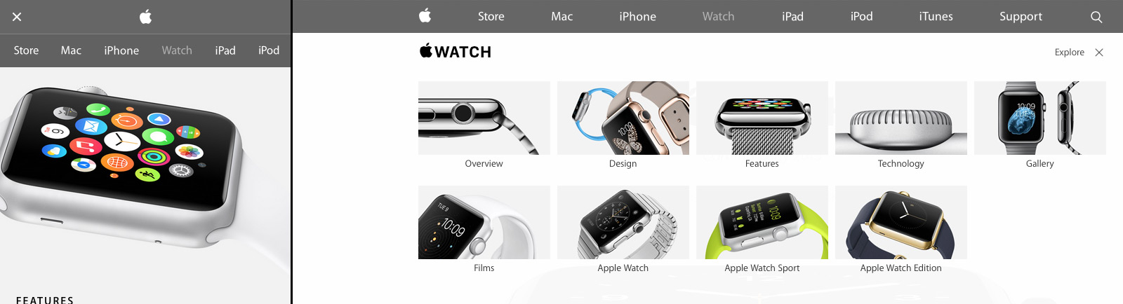
Apple’s new design isn’t just a nod to modern web trends either; Apple sets off in its own direction with a few small flourishes (Figure C). First there’s Apple’s spin on the now ubiquitous “hamburger” menu icon for narrow width browsers: Apple uses two lines, not three. Also when users open the mobile navigation, the pages display a lightweight, scrollable navigation menu. It’s a big deviation from the expected “off canvas” listing where navigation covers the viewport or slides the existing content off to one side. I didn’t care much for the menu design at first, but it’s growing on me and does succeed in setting Apple’s design apart. I also really liked the “explore” on the iPhone and Watch product pages. It’s functionally a mega menu but the extra imagery and large hit targets give a more breathing room and a high-end feel.
Figure C: Apple sets off in its own direction with a few small design touches
Overall: B+
Apple has come a long way since their last major refresh a year ago. Some issues with their responsive design decisions aside, they’ve finally caught up with most modern web practices. There’s even a few of their own “Apple-like” touches in their design to keep things fresh. Hopefully Apple will extend this design soon to other parts of the site, especially their support and e-commerce pages which are in serious need of a refresh.
The New York Times recently launched their first major redesign in eight years. That’s an eternity on the web, so it’s impressive to see the NYT largely catch up with modern web design and development principles so well. New pages have a responsive design framework to work well across smartphones, tablets and laptops. Articles embrace a “content first” design with less distractions from the main text. And management got the message that good performance is good design with average page weights dropping and faster speeds across the board.
Trends and tech standards aside, even casual readers will find the new NYT article layout a redesign highlight. Content is all on a single page with endless scrolling for navigation. It makes reading easier and is a clear nod to the fluid designs of native mobile design. The improvement is especially noticeable on long form articles; my reading flow was frequently interrupted with content previously broken into many pages my reading flow was frequently interrupted.
Article design is clean and sparse, especially as you move further down the page. Often it’s borderline minimal with little more onscreen than the article text itself and a top aligned navigation bar. Even other suggested articles don’t appear until you reach the article’s bottom. Attention stays refreshingly on the article text. This makes for a more pleasurable reading experience than what I find on most news sites. Also article images and videos are expandable into large, full screen lightboxes. It’s a cool addition given our much higher expectations for web media since the last NYT refresh.
The NYT’s modern design sensibility extends to article comments as well. Instead of adding a chronological thread of commentary below article content, comments are hidden by default and optionally brought in alongside the article (It’s akin to more experimental designs over at Medium and Gawker Media.) The use of real estate makes it easy to refer back to article passages as you’re scanning reader feedback. To help sort through what’s important, comments can be organized chronologically, by reader votes and by direct editor picks. Overall the comments design is such an improvement that I’m reading them regularly; I rarely did with the previous design.
Most NYT pages are now also responsive with navigation and content optimized for the display you’re on. For the first time I’m able to browse through much of the site on an iPad or iPhone (which occurs frequently when I dive into NYT links on Twitter and RSS) without feeling hampered. Interestingly, the NYT developers didn’t use a traditional responsive method where CSS media queries make alterations on the fly to page markup. Instead there’s an upfront check for the general boundaries of your device at which point custom CSS and HTML are generated dynamically. It’s unorthodox, but the NYT has an very diverse audience to support. An out of the box solution is justified.
The much touted new universal navigation works as promised. It makes it easier to jump from one paper section to another without having to scroll significantly or bounce back to the home page. It’s a logical extension of the “content first” approach to the NYT’s article design: stay out of the way yet remain readily accessible.
On the other hand, the more time I spend with the NYT redesign away from viewing and reading the articles, the more I see missed opportunities for change. Foremost is the home page, whose design still feels, like many newspapers online, muddled. There’s just too many levels of hierarchy that blend together. Take the two leftmost columns: there’s a narrower column with larger, italicized headlines and then a wider column to its immediate right with smaller headlines. Given the styling change I expected two different sets of content from different newspaper sections. I was wrong. Stories “wrap” from the first to second column according to chronology and editor preference.
The “Inside Nytimes.com” section further down are smartly curated deep dives that don’t fall under traditional breaking news. Unfortunately, the horizontal carousel navigation is slow, dated, and there should be more articles to choose from. Moving further down you get the common top set of stories from each section of the paper (e.g. World, Business Day, Opinion). It’s well placed in relation to the top stories above but the area needs more white space and a larger font size to improve legibility.
There’s also inconsistent, puzzling navigational choices throughout the site. The smaller “micro sites” like Dealbook, the Bits blog, and the Opinion section often differ the order and placement of the main links (sections, home, search) at top. Moving down into article content also changes the top nav bar actions: options and user account settings links disappear, replaced by share and comments icons. In reality, at least the share and comments icons – the most relevant actions within an article – should be accessible regardless of my location on the page. The NYT instead pushes these actions out of the way in favor of home delivery links and a corner ad. Yet there should be a way to keep both the ad and delivery push alongside comment and share options without the space feeling cramped. It’s annoying to scroll down into an article just to share easily or see if there are any comments.
Likewise, while the new nav bar with a list of related articles at article top is useful, it needs some behavior adjustments. It appears inconsistently: it’s natural for it to appear when you’re at the top of an article, but odd that only a quick scroll up makes it appear otherwise. To mirror native mobile experiences, any scroll up should make the article nav bar appear. Alternatively the NYT should remove the “scroll to appear” behavior outright. There’s a few animation and spacing problems with the nav bar as well. The animation that slides individual articles in from right to left can distract from article text; I’d prefer something subtler. Also the global side navigation is hard to navigate with touch. Slightly larger hit targets on the styling for narrower width devices would solve this.
All in all, the good news about the NYT design deficiencies is that they’re correctable, unlike some of the more fundamental problems I see with the web editions of papers elsewhere. When looking at the news competition (e.g. Washington Post, USA Today) I’m reminded of the widening web design and development gap between younger, online only journalistic companies and their older counterparts rooted in print. Compare Pitchfork to Rolling Stone, The Verge to Wired and Gawker to People. Post redesign, the NYT is a rare exception to that gap.
As designer Oliver Reichenstein wrote years ago, 95% of web information is text. Text has to look good, and the right font face is a big part of that. But given the virtually infinite set of web fonts to pick from, where do we start? Here’s a few recommendations from what I’ve learned.
Decide on a font face for dominant content first
I split web typography into three categories: body, headline and accent text (i.e. everything that doesn’t fit neatly into a standard headline plus paragraph flow.) In the early stage of web design one category tends to dominate overall textual content; in almost all cases it’s the body text. Decide the right font face for this category first. This decision makes the rest of your font selections easier; by then you’ve already settled on a font on a your users will interact with the most.
The body font trumps readability above all else
Great web text is aesthetically pleasing and matches the creative style of the site or application behind it. None of that matters if the body font face, the workhorse of web text, is hard to read. Check out body text samples on multiple browsers, multiple devices. How is the font hinting? Be sure to check out samples on IE8 and IE9, where poorly hinted fonts often fall apart. Generally when I’m stuck between two body font faces I’ll go with the more readable option.
Single font face web designs are underrated
There’s a reason many very well designed sites and apps stick with one font; multiple font faces need to contrast against each other to play well. Also every font you add has to match the site’s mood or style. That can generate a lot more research and testing. When in doubt, or if design time is limited, stick with a single font face and play with font weights for proper contrast.
There is no one “proper” base font size
I still see web guides recommending a single font size as a base for body text like 12px or 14px. Times have changed: there’s a huge range (desktop, tablet, phone) in web connected devices, some of which appreciate a slightly bumped up font size. Custom font faces often look best one or two pixels bigger or smaller than you might first expect. Experiment. When debating between several sizes, pick one that fits roughly 45 to 75 characters per line (including spaces) to maximize readability.
Ask almost any web developer: a strong suite of development apps and plugins is central to our productivity. However, finding the right apps can be a frustrating experience because of the app selection has grown dramatically over the past year thanks to the Mac App Store, as well as the spread of GitHub and app news resources like Hacker News, Dribbble and Twitter.
To cut through the clutter, I thought it would be helpful to go over the most important tools to my daily web development workflow. Note that app usage stems from personal, idiosyncratic decisions; what works for me may not work for everyone else. Yet this is a solid toolbox and if you’re at all considering trying something new, consider an option from the list below.
Sublime Text 2
A good text editor is arguably the most important app in a web developer’s toolkit; you’re only as good as your code, and you code in a text editor. I was a die hard TextMate fan for years, but TextMate’s development has reached a dead end. I had to look at alternative options, and while I toyed around with Espresso and BBEdit, Sublime Text 2 emerged as a clear choice. I love the editor’s speed, even with huge directories open, the TextMate-like Cmd+P fuzzy file search and the multiple selection mode. It also has full compatibility with TextMate bundles and themes which made the transition away from TextMate seamless.
Emmet – version 2.0 of the popular web developer plugin Zen Coding – is a revelation. I was admittedly bearish on the initial Zen Coding plugins; something about the syntax never clicked with me. But Emmet is different. It’s faster and far more refined than older Zen Coding tools. With the plugin’s HTML snippets and slick CSS resolver, I can code most HTML and CSS much faster. Even if you’ve been dissuaded by some Zen Coding quirks in the past, give Emmet a try over the course of a coding day; most developers should see a difference after just a few hours of use.
Any web developer who also designs or works off design comps has to frequently deal with alignment and size issues among images and HTML elements. I’ve seen coworkers try ad hoc measurements by using the top edge of an app window to measure alignment, or taking an actual ruler against the screen to compare the relative size of two elements. Don’t do this; there are far more accurate and faster dedicated measurement apps out there.
The most popular pixel measurement tool is inarguably IconFactory’s xScope. It’s an excellent app, but its separate mini tools never meshed well with my personal workflow. Instead I prefer Snap Ruler, an app that only focuses on tools I use heavily: a loupe and an on screen ruler. You can size elements and export CSS code in three clicks. It’s fast, lightweight and has solid keyboard shortcut support.
I bought ScreenFloat on a lark. It was on sale for $2 and I needed something simple to float a web page. Little did I know at the time how awesome this app is for web development. I use ScreenFloat almost exclusively for floating Photoshop comps and wireframes on top of the web browser as I write code. ScreenFloat’s secret weapon is its adjustable transparency; I combine mouse wheel movement to adjust comp transparency along with a global keyboard command to hide or show the comp entirely. These quick shortcuts allow me to focus on just the code instead of fiddling with the comp itself. Overall, the app greatly increases my development speed and accuracy, especially with high precision “pixel perfect” comps.
If you work with CSS, you need accurate, consistent hex colors in code to match your ideas and graphical comps. It’s true that you can generate hex colors via screenshots and the Photoshop eyedropper. Yet this workflow requires a lot of unnecessary clicks and Photoshop is a heavy app to keep open for just this purpose. Instead, get a dedicated hex color picker; there are many good ones on the App Store, but I like ColorSnapper the most. It couldn’t be easier to use: I click on an onscreen color with the app and a corresponding hex color gets pasted to my clipboard. It’s also retina display friendly and I can easily switch the code color format from hex to other popular options (e.g. rgb).
If you do any sort of file comparisons you owe it to yourself to try out Kaleidoscope. The app was originally developed by (the now Facebook owned) Sofa but is updated and maintained by Black Pixel. These are two crack design and development shops and the pedigree shows. There are many other file comparison apps out there, but I find none have the level of polish that Kaleidoscope has. I use it every day as a simple Git diff tool before my code checkins or rebases.
Over the course of a full day of coding, the Refresh button on a web browser can turn into an annoying time sink. You’re constantly saving work, switching over to the web browser and tapping refresh to get your web content up to date. LiveReload takes that action out of your hands: HTML changes auto-reload the page when you save while CSS changes take their effect instantly, no reload necessary. It also can auto-compile pre-processor code like SASS and LESS automatically in the background. Note CodeKit tends to be the more popular auto-refresh app choice with its cleaner UI and extra customization options, but I found LiveReload to be a slightly faster experience overall.
Alfred is a bit of a cheat falling on this list given it isn’t really a web targeted app. Yet it’s such a productivity booster that I can’t imagine my Mac without it. Alfred is a keyboard ‘launcher’ app: hit a keyboard shortcut and a text box pops up where you can quickly launch applications, run shortcuts, search the web and much more. The Verge ran a great introduction to the app last month if you want more of a primer before diving in.
Social news site Hacker News has come a long way from its modest roots in 2007. It has diversified its subject matter (though tech and startups still dominate) and in the process has become essential reading for developers, designers and entrepreneurs. I scan HN headlines regularly, at least once every day. Unfortunately, the site’s design is a total eyesore. There’s inadequate line spacing, poor use of typographic hierarchy, little contrast, and comments that stretch out too much – it’s better on the eyes to read on narrower columns.
A simple Chrome or Safari extension that restyles HN’s look is an obvious choice and there are many popular options out there. Yet few address how I tackle HN so I decided to create my own: You can download the Chrome variant at the Chrome Web Store and the Safari extension is available as a direct download on Cloud. You can find downloads and source code for both at my GitHub.
I like to make Hacker News as scannable as possible; I usually ignore comments, point totals and other article stats. To emphasize this I adjusted typography; headlines are bumped up to 24px Helvetica. All other text is secondary and set to 14px or smaller.
Many other extensions are minimal to a fault; there’s little contrast or division between headlines. That cuts down on scan speed as you scroll down a web page. So instead I went in the opposite direction: I added extra white space between articles along with soft gradients to emphasize splits between headlines. I also shifted HN’s color palette away from sepia and oranges to neutral, soft whites. Branding aside, neutrals are just more comfortable to browse through for longer periods.
Note that while I’m not so much into HN article stats, they do help measure “hotness” and article popularity. It’s a lot easier to scan these stats visually instead of deciphering HN’s default view with several tiny numbers crammed next to a headline. To achieve this I swapped out the numbers and replaced them with multi-colored, CSS3 based bar graphs. They automatically appear when mousing over an article and display points (red), comments (yellow) and article age (green). To get a quick snapshot of what’s hot you can tap ‘s’ to turn all article graphs on at once.
Overall, my extension is a slightly different slant on Hacker News than what’s already out there. It’s not for everyone, but if you read HN I encourage you to check it out.
Like many web developers, rapid CSS development is an integral part of my office workflow. I spend a large part of my day in “CSS tweak mode” where the focus is on smaller changes: alignment, IE bugs, consistency. Yet, as any developer can tell you, little CSS problems can drive you crazy and become a major time sink. You’re staring at a page and can’t figure out why that one element keeps dropping down in IE8. Or you’ve got a nested navigation that on mouse over pushes one element out of alignment by a few pixels.
As I’ve matured as a web developer over the years, I’ve moved faster through the tweak period thanks to my growing CSS experience. Yet often the right technique can be just as important.
I call one of my favorite techniques the magenta test. I open up the web inspector and add a custom CSS property of background: #f0f to adjacent misaligned CSS elements. Magenta blocks pop up on screen and in many cases, the root problem jumps out right away. I’ll usually make a quick edit on one of the elements until the magenta blocks line up. Problem solved. In more complex issues I’ll find the parent container of the magenta block elements and set its custom background as well, albeit to a different color.
This approach is often much faster than your usual use of the web inspector, where mouse clicking and scrolling predominate. Inspectors place the basic metrics (e.g. width, padding, margin) in one area, with the raw CSS attributes usually far away; either you’re forced to scroll to the top (Chrome, Safari) or flip to another inspector tab (Firefox) multiple times. This problem is compounded when comparing multiple elements; an inspector places a highlight box around only one element at a time.
Compare this with the magenta test. Adding custom properties so that they are in one place in the web inspector. You select an element, add the attribute (for even faster results, copy and paste the background: #f0f snippet), and repeat for all remaining elements. There’s no thought process, no scrolling and no tabbing–it’s just drawing a few magenta boxes. It’s also cross browser friendly. Web inspectors in Chrome, Safari and Firefox have a slightly different layouts, but since adding a magenta background is so quick, a context switch between browsers is pretty painless.
Bonus technique: Buy a measurement tool, assign to keyboard
The magenta test is slick for big, fairly obvious alignment problems. But when you are making that last pass for polish, it’s hard to pinpoint elements off by a pixel or some other tiny amount. Go to the Mac App Store, and buy a measurement tool like SnapRuler or xScope (which is a suite of web design tools; you’ll be using the dimensions tool.) Assign a keyboard shortcut to toggle the tool on and off. Draw a measurement between items–I like going from edge to edge of boxes or the baseline of two text elements. You’ll see a misalignment immediately.
With modern web development, pages should degrade gracefully. Different browsers aren’t expected to display a website identically; modern browsers get what the latest HTML5 and CSS3 has to offer (e.g. box shadows, animations, semi-opaque backgrounds) while legacy browsers get the functional basics without all the beauty.
We’ve reached a turning point where that philosophy has gotten serious buy-in by many designers and clients. That’s a big win for front end developers. But questions arise: as CSS3 gets used more heavily, how do we best degrade for legacy browsers? Is it a CSS hack? Extra javascript? Also, when does a lack of CSS3 “beauty” turn into a usability problem for legacy browsers?
Put another way, I can pump out CSS3 for the latest Webkit and Gecko based browsers with little worry. It’s degrading that CSS for IE8 and IE9 – on both a technical and aesthetic level – that can drive me crazy. On this post I’ll address that problem. I’ll break down the most common CSS3 enhancements and recommend ways to handle them on legacy browsers. I’ve also intentionally organized the CSS3 enhancements from easiest to hardest to degrade. But first…
Use Modernizr
You’ll see in several of the examples below that I lean heavily on the popular Javascript library Modernizr to help me out. While there are many graceful degradation techniques sans Modernizr, it often helps significantly to have it installed. Check out their documentation for more details.
Border-radius
The border-radius attribute adds rounded corners to an element. It’s an extremely popular technique used heavily in the context of dialogs, buttons, and other call to actions. Legacy browsers require no fallback CSS to handle the border-radius attribute; elements just revert back to hard corners.
It’s rarely a serious issue if rounded corners don’t show up for legacy browsers. In case it is:
If your element has a fixed size, legacy browsers should receive a background png with rounded corners. One extra image, one more CSS rule with a single line of code. Simple.
Avoid flexible elements that require rounded corners on legacy browsers. You have to add four extra HTML elements that are either direct corner images or have a corner image as a background. Each corner image’s position “overwrites” the default hard edge. It’s often tricky getting the corner images and CSS border to match perfectly. Bottom line, avoid whenever possible.
Opacity
Semi-opaque elements are all over modern web designs, especially in overlays and fade animations. You have two options for legacy browser fallback:
Use the Microsoft-specific filter. It’s as simple as filter: alpha(opacity=X), where ‘X’ is a number from 0 (not visible) to 100 (opaque). An alpha opacity filter doesn’t hurt performance too much (unlike other filter techniques; see below). However, there can be occasional strange font rendering issues, especially when a font transitions between 95% and 100% opacity.
Skip the filter and substitute a different image or color. This can’t work as a workaround for most fade animations. However, if you’re dealing with a faded border, font or image on a plain background, picking a different image or hex color can substitute well. For example, take a pure black headline on a pure white background that should be at 80% opacity. For browsers that can’t resolve CSS3, using the alpha filter can make the font very pixelated and harder to read. It’s easier to switch the font to a much lighter color to give the illusion of a faded look.
Box shadow
CSS3-based box shadows are useful to highlight elements or give an element a raised or 3D look. They also take up minimal code and don’t change the alignment or position of an element. Like with border-radius, legacy browsers safely ignore the box-shadow attribute. But because box shadows distinguish elements from each other, you almost always want a good legacy substitute.
Add a simple border on the sides where the box shadow would normally appear. This can be tricky for elements where dimensions are constrained, but if visual parity is important then it’s worth the tradeoff. Use a lighter or less obtrusive color on the fallback than what’s used for the box shadow (borders have distinctly hard edges that can’t be blurred.) Likewise when in doubt favor a smaller border width.
Don’t use the Microsoft-based image transform for shadow (DXImageTransform.Microsoft.Shadow). It does avoid the spacing issues of a real border, but I don’t like the performance or its visual appearance; Microsoft-based shadows have a pretty hard edge that can’t touch the quality of a blur effect on a modern box shadow.
Text shadow
Text shadow effects are tricky to reproduce in legacy browsers. You can’t throw a simple border on a block of text, and often text shadows are deployed with such a fine touch that a fallback isn’t worth the work.
If the shadowed text is not a headline or especially large (e.g. larger than 20px), fallback code isn’t necessary. I generally see text-shadow deployed on smaller text to help it stand out against a busy background or give text an embedded or etched look. The former can be an issue – hand check the text in legacy browsers and either change the background or text color to maximize readability. Cosmetic effects like embossing can usually be ignored in legacy browsers.
Large standout text should be replaced with images if the shadow is critical to the aesthic look. I admit that replacing text with images is a bit scary; it’s poor semantics and a lot harder to maintain the code. However, because CSS3-based text effects are so hard to reenact via CSS hacks or Javascript, image solutions can work best.
RGBA colors
Rgba colors are one of my favorite and most heavily used CSS3 effects. They are great for button and icon inset effects – you can throw on an rgba(0,0,0,0.2) or rgba(255,255,255,0.2) for a really cool effect that blends well regardless of the base icon or button color you’re applying it on. For legacy browsers:
If the rgba effect appears only on a single flat color with no other visual detail beneath it, substitute the rgba with a simple hex color. If you write rgba with best practices you should be doing this anyway. For example, a border-color: rgba(0,0,0,.25) can be preceeded with a border-color: #343434 property.
If the rgba effect has a clearly viewable transparency effect underneith (most of the time this happens with rgba background colors) experiment with overall element opacity. Reducing opacity also reduces the opacity of all child elements so this works best when rgba keeps things mostly opaque (e.g. rgba(0,0,0,0.95)). It’s also best where there are minimal amounts of child elements and text (text that drops to a semi-transparent state turns into a usability problem).
If reducing opacity looks bad, add a new element with a reduced opacity and place it underneith the rgba element. This may sound complex, but it’s simple to implement. Add an extra div or span in your html code. Set its position to absolute, have it mirror the size and position of the target element and make sure its z-index is lower. Give the new element a reduced opacity and appropriate background color, while making sure the original rgba element has a transparent background.
Gradients
We’re long past the Web 2.0 “gradients gone mad” era, but gradients are still used heavily on modern UI design. Thankfully for legacy browsers, Microsoft provides a reliable fallback:
Use the DXImageTransform filter to handle gradients on IE7 through IE9. Syntax is straightforward but there are several limitations. First, DXImageTransform overrides any hover selector treatment. That’s a pretty severe limitation for interactive UI elements. Rounded corners are also ignored; the gradient ends up “poking through” any rounded borders. The filter also doesn’t support color stops and gradient positions.
If the gradient isn’t critical to either the usability or aesthetic of the element, fallback with a flat, simple hex color. As with the rgba example given above, you should always back up your gradient CSS backgrounds with hex color backgrounds anyway. To pick an appropriate fallback color, I tend to visually test out both the lightest and darkest colors of a gradient and just pick what looks better. If both don’t look great, I’ll start testing out color values midway between the two end points.
If the previously noted options are a problem, fallback with an actual background image that represents the gradient itself. I prefer simple flat colors over the image route to both save the extra http request and to avoid the extra production work.
However, if you do go the image route, I recommend making the actual image be a good 5 or 10px taller (in the case of a vertical gradient) or wider (for horizontal gradients), and using repeat-x (vertical gradient) or repeat-y (horizontal gradient) for the background-repeat property. This ensures that if later you slightly adjust the width or height of the element it will still look passable without any gaps (though in the long run, you should recut the image.)
Conclusion
If it wasn’t already clear from the technical details noted in this article, legacy CSS fallback is rarely fun, glamorous work. Good degradation also requires a lot of hard choices. As you’ve seen here, there’s almost never one definitive technique – sometimes the solution is technical, sometimes it’s aesthetic. Yet, jumping into legacy browser issues early and head on will help you grow significantly as a web developer. Rise to the challenge.
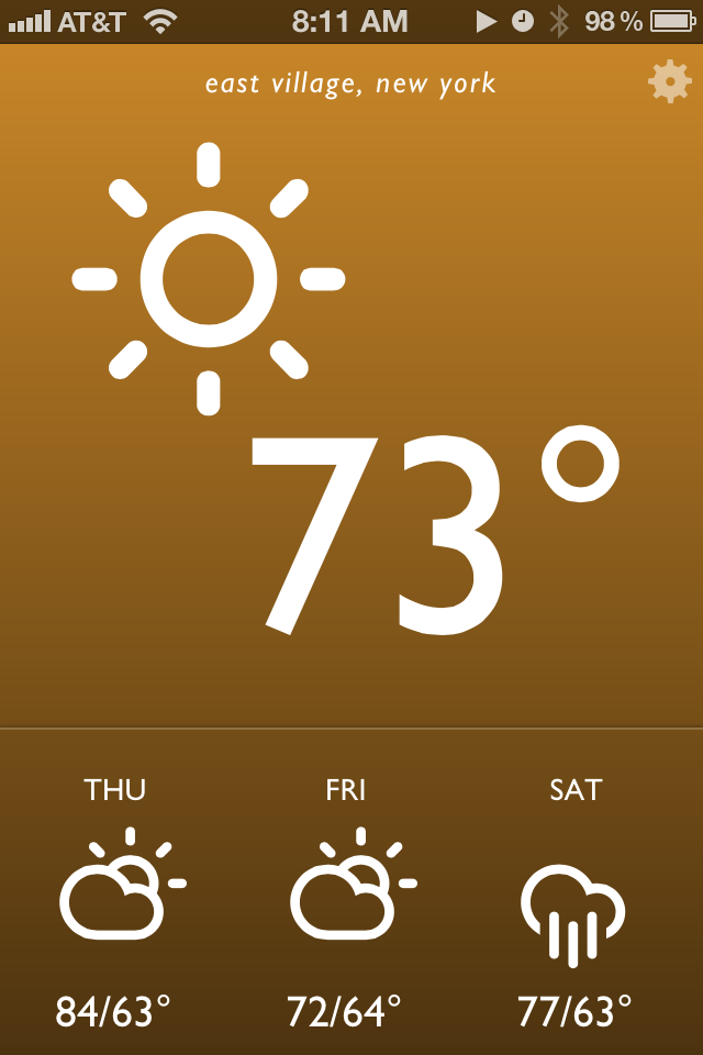
I’m pleased to launch a little project I worked on over the weekend. I called it Blue Drop, and it’s a colorful, simple weather app that’s accessible anywhere you have a web browser. It looks best on an iPhone, iPad, or Webkit (e.g. Safari, Chrome) browser on your desktop. It’s far from revolutionary, but it matches my needs and may match yours as well. On this post I want to break down how it came together and my development workflow.
To give a bit of background info, the idea of a self written weather web app or page had been ruminating in my brain for weeks. I’ve been extremely disappointed by options on the web store. Most weather apps are poorly designed, hard to read at a glance (small text is the common culprit) filled with ads, and tend to provide either too much or too little information. Then a breakthrough came last week – I spotted Degreees, a clever, CSS3 powered web app that relies on geolocation to report local temperature. I knew this was exactly the kind of direction I wanted to go in, but with my own personal spin.
Before I started designing mockups, I jotted down in iA Writer a few attributes of what an ideal weather app would have. It should be reliable and get its weather information from a great source. I’ve always been a fan of Weather Underground’s data so they were a logical choice. Their api is free for developers to try out as long as your daily query size is small. I also wanted a pared down app that gave me quick information at a glance. No maps, no extended forecasts. Just the temp, conditions, and a quick forecast of the near future. Finally, I was heavily inspired by the Windows Phone Metro style UI: big typography, big iconography and a sparse color palette.
I next used Sketch for mockups and wireframes. Based on some searching I settled on Adam Whitcroft’s gorgeous Climacons for icons, and the well tested Gill Sans for typography. Helvetica is a more readable choice but I wanted a mildly warmer and more humanist font. Development was done locally on my Macbook Air with my usual tools: Sublime Text 2, Kaleidoscope and SnapRuler.
The finished app has a few small touches that I think both add personality and increase its usability. First the background gradient changes color depending on both the time of day and the weather conditions. Sunny days have an orange hue, clouds and rain get blues and grays, and thunderstorms are purple. Daytime has bright, punchy colors while saturation and darkness decrease during the evening. The interface is also intentionally simpler than most iPhone apps – this made development and QA more straightforward as well. Everything essential is presented on app launch, and a single tap or click on one of four regions (the top conditions area and the three daily weather icons below) toggles additional detail.
There are still a few rough issues; they mostly deal with the size and space of several icon related items that I expect to touch up in upcoming weeks. For now, feel free to check it out and pass along any feedback.