On Friday a Kotaku forum member leaked what looks like a legit orientation manual for new employees at Valve, the gaming company behind Half Life, Portal and the Steam network.
Anyone who works at a technical firm should check this out. There’s a lot of philosophies here that are really smart. For instance, keeping a flat corporate hierarchy:
Hierarchy is great for maintaining predictability and repeatability. It simplifies planning and makes it easier to control a large group of people from the top down, which is why military organizations rely on it so heavily. But when you’re an entertainment company that’s spent the last decade going out of its way to recruit the most intelligent, innovative, talented people on Earth, telling them to sit at a desk and do what they’re told obliterates 99 percent of their value. We want innovators, and that means maintaining an environment where they’ll flourish.
Or on working sensible hours:
While people occasionally choose to push themselves to
work some extra hours at times when something big is
going out the door, for the most part working overtime for extended periods indicates a fundamental failure in planning or communication. If this happens at Valve, it’s a sign that something needs to be reevaluated and corrected. If you’re looking around wondering why people aren’t in “crunch mode,” the answer’s pretty simple. The thing we work hardest at is hiring good people, so we want them to stick around and have a good balance between work and family and the rest of the important stuff in life.
Kill Screen writers Jamin Warren and Michael Thomsen debate the game review process and the importance of finishing games. I found both sides of their argument strong, especially this point by Mike on why finishing games prior to writing a review is so important:
I compare it to taking an assignment to climb Mount Everest. Nobody wants to read about me getting to the base camp. There’s Into Thin Air; there’s a long history of people writing very well about failure. But if you take the game as Everest, the review should be an account of getting to the top of Everest. What did it cost you; was it an easy hike not in terms of difficulty, but in terms of your own creative endurance? How quickly were you bored with it; how quickly did it become rote and repetitive; how much of a surprise was there in the ending; how much meaning came out of the boredom?
I’m not a huge iOS gamer, but when I do I gravitate toward word games. One of the best in the genre is David Gage’s SpellTower. It’s fun, simple, and has four game variations to keep things interesting. Works well on both iPhone and iPad, and there’s Bluetooth connectivity included for competitive multiplayer.
It’s on sale right now for a buck only for the next 24 hours, so go get it (Cool web site as well.)
Video game consoles are still putting up great numbers seven years into their current generation. But why have their user interfaces remained so bad? I was reminded of this on a popular Giant Bombcast (gaming podcast) from two weeks ago; the hosts talked at length about the sad state of Microsoft’s latest XBox Live UI refresh. Microsoft largely sidelined avatar functionality, one of the rare bits of personalization and whimsy from an otherwise business-like UI. The Netflix interface was overhauled so poorly that the hosts had moved their film streaming needs to other platforms. Common actions now required more taps of the controller than in earlier XBox Live iterations.
Ironically, XBox Live is generally regarded as the premier console gaming network. It costs $50 a year and generates a lot of revenue for Microsoft, a cool billion two years ago. So why isn’t some of that money being plowed back into great UI design?
The XMB, Sony’s navigation interface for the PS3, doesn’t fare well in the UI department either. Among the Roku, Apple TV, Mac, iPhone, and Boxee, all of which I own or have played with heavily, PS3 has the worst user experience. There’s too many actions and layered menus to get more complex actions done. Software updates, large in size and not skippable, pop up frequently before gameplay. (Sony apparently never got the memo on auto background updates.)
Yet UI may be beside the point: clearly the healthy state of console gaming’s market derives from the games themselves. But that market is changing, growing up and moving more mainstream. XBox 360s are being used now more for streaming media than gaming. A “one box media center” for the living room could just as easily be an XBox as a Roku or an Apple TV. Media partners clearly see this; content providers from Amazon to ESPN and HBO are supporting consoles in full, often adding their services to the XBox and PS3 just as fast as other set top devices.
In addition, while a Xbox 360 or PS3 costs $150 more than an Apple TV, that a premium price tag delivers far more capable hardware. It’s hardware that powers more immersive games, along with more responsive and novel interfaces (e.g. the Kinect) than their cheaper counterparts. Beefier hardware also means getting cool tech features (e.g. Dolby Digital 5.1, 1080p) before the competition.
Yet as we’ve seen before, muscular tech, lots of money and media partners will only get you so far without a solid user experience; just ask RIM. Competition is heating up: Apple and the rest of the portable market is on one side, chipping away at consoles’ casual gaming segment. Smaller, cheaper and simpler boxes from the likes of Roku form the other wing, attacking consoles’ non-gaming features. Without a adjustment in UI and other consumer-friendly maneuvers, I fear gaming consoles could be effectively squeezed out in the middle.
An extended interview with Al Lowe, the funny, profane, and quirky creator of the cult 80s adventure game Leisure Suit Larry. Reading it made me nostalgic for Sierra, a powerhouse gaming studio in the late 80s and early 90s best known for the Kings Quest and Space Quest series.
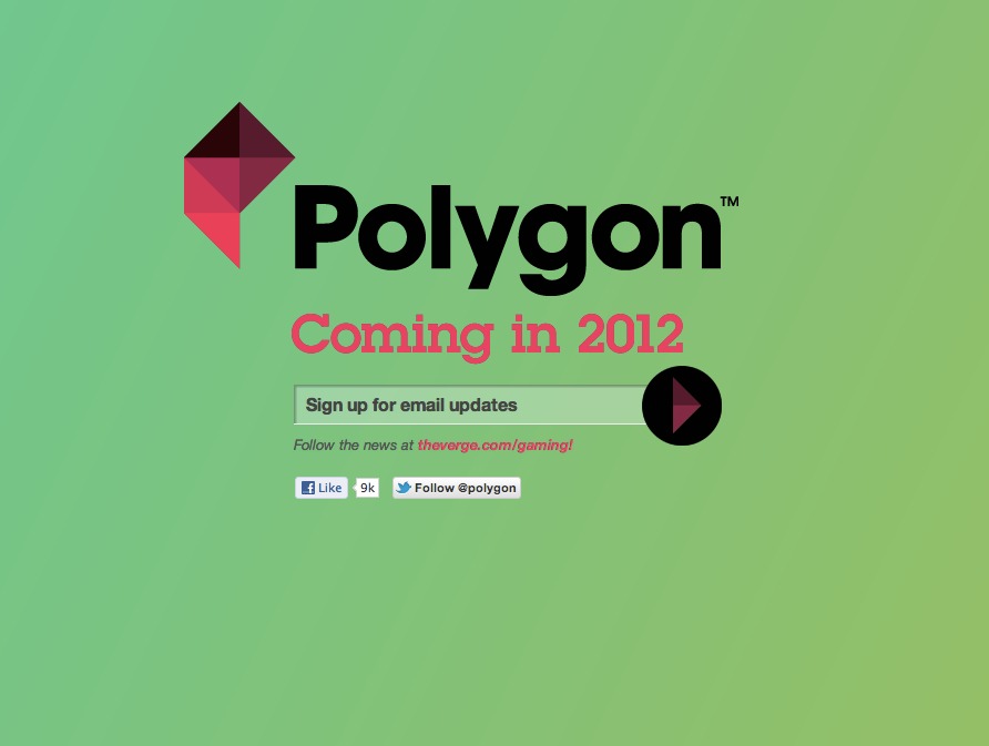
There’s a lot of gamers, myself included, very curious about Polygon, the soon-to-be-launched gaming web site from Vox. Vox is the team that brought us tech site The Verge, which overall is a pretty slick site. Yet Paragon’s teaser website is atrocious. It’s a site guilty of shoving all relevant content on one very long page in a poor manner. That design paradigm – what I call ‘scroll heavy’ – probably sounded cool in design meetings but falls apart entirely in execution.
Just look at this:
Do you have any damn clue at all that’s there’s more content below this email form? Granted, there’s a scroll bar. Yet given how impatient and click happy most web users are these days, it’s unlikely one would scroll down out of sheer curiosity.
It’s unfortunate, because far below the page there’s a Twitter listing of many respected game journalists all across the industry that are now part of the Polygon team. For those “in the know”, the exact “core” gaming audience Polygon should be interested in, this is a pretty big deal. It’s a total lost opportunity.
So if you’re a web designer who’s on ‘scroll heavy’ design duty, be careful. Look out for the following pitfalls:
Navigation or content that fails to imply what’s below. If you’ve got a clear navigation area at the top that scrolls or jumps to content below, you’re probably in decent shape. But if you’re going very minimal and navigation isn’t prominent, be sure a bit of ‘teaser’ content will be viewable at the bottom of most users’ browsers (if in doubt about that bottom point, I’d start with 700 pixels from the page top.)
Inconsistent design among page sections. I’ve seen some designs throw together otherwise eclectic pages together on one scrollable area because it ‘looks cool’; it doesn’t. If anything, scroll heavy design demands more attention to design consistency, not less. Users who don’t notice a site’s cohesiveness between page refreshes are far more likely to clue in when different sections are a few hundred pixels above or below each other.
Too much high bandwidth page content. With all the extra code and content now on a single page, site performance becomes especially relevant; slower connections and processors can choke on a scroll heavy page’s sheer complexity. Minimize http requests by cutting down the number of separate images and/or videos that are part of initial page load. Streamline the HTML and CSS code.
If you’re still having trouble, one example of great scroll heavy design is the Kaleidoscope file comparison app website. It’s clean with bold colors, strong copy and clear divisions between major content areas. Designer Ethan Marcotte’s home is also well thought out with a more subtle color scheme.
Each of these games operates less from a real sense of story than a suggestion of a narrative. Temple Run is little more than an endlessly long expansion of that scene from Raiders of the Lost Ark where Harrison Ford runs away from the boulder (except instead of a boulder it’s a bunch of angry spirit-chimps that are chasing after you). Canabalt, by contrast, sort of feels like the early scenes of The Matrix or The War of the Worlds. Something bad is happening and it involves giant evil robots. You’re not sure why you’re running, or where you’re supposed to go. In both, you just keep going. Instead of words, there are only frantic footsteps and the occasional grunt of effort.
Well written, fairly thought provoking essay on the simplicity of both popular iOS games. Yannick also makes a case for the addictive qualities of running, both in game and in real life.
Flipping on my PS3 this week, I was reminded of the system?s poor user interface. I wanted to watch some Netflix and make some system setting changes, but the setup was awkward and clinical, while also taking longer than expected. Ironically, those same characteristics could be applied to Sony?s tepid response to their recent massive Playstation Network (PSN) security breach.
That?s the thing about user interfaces; they reflect the priorities and values of their makers. Apple?s work is known for its visual simplicity and graceful lines. Twitter conveys freshness and a sense of whimsy. What about Sony? Other than favoring dark color schemes with pulsating icons and text, giving a vaguely generic, Euro-slick vibe, there isn?t anything that makes Sony?s UI stand out or be that approachable.
That?s exactly why a UI refresh is important, especially in light of Sony?s PSN debacle. An improved user experience can both help get the brand back on track and add differentiation from its competitors. I?ve got three suggestions for Sony: ditch the XMB, improve notifications of game and system updates, and emphasize large imagery and user avatars.
For this month: The Egyptian revolution, alternative rock’s rise and fall in the 1990s, a nostalgic look back to adventure gaming’s golden era and Marc Jacobs up close.
Cairo?s recent democratic uprising rightfully received heavy news coverage from practically everyone, be it the Sunday talk shows, CNN or the New York Times. Nevertheless, to my surprise, for weeks an extended written chronology from the ground had been missing.
Leave it to The New Yorker to fill the void. Reporter Wendell Steavenson camped out in a hotel adjacent to Tahir Square, conducting interviews and reports both inside and around the historic area with everyone from low level military officers to anti-Mubarak protesters. Even with a 7000 plus word count (Steavenson reported for a full two week period leading up to Mubarak’s resignation) it?s a fast read given that much of the piece focuses on action (e.g. skirmishes, clashes with police) from within the square.