Journalistic site Krautreporter, writing a post on Medium:
Three years after the death of its charismatic founder, Apple is doing all it can to maintain this reality distortion field, mainly by exercising total control about anything that is reported about the company or its products. In contrast to Apple’s design philosophy this strategy does not manifest itself through clarity and elegance, but through a subtle and sometimes questionable toying with our, the reporting journalists’ vanities and dependencies. If you write positively you’ll be wined and dined, if you criticize, no matter how fairly, you’ll be penalized. Admittedly this is common practice with large corporations, but hardly any one of them will go as far as Apple does. And there is no other corporation that the media have allowed to get away with this kind of manipulation for such a long period of time.
As much as we all admire Apple in many ways, it’s interesting to get a much harsher perspective on its treatment of the media. I question if it’s quite as black and white as Krautreporter portrays here, but there’s been many times where I’ve questioned the relationship between the tech press and Apple.
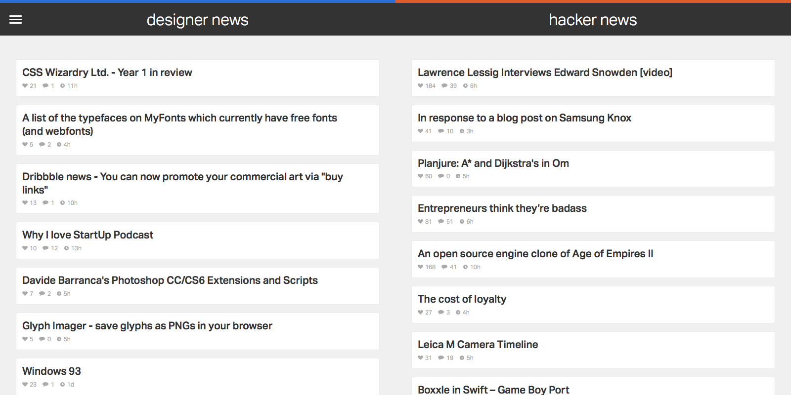
I love practical side projects that I’ll actively use, so I created a web site that shows trending stories from two resources I check daily: Designer News (DN) and Hacker News (HN).
Many designers and developers I know consider both news sources essential reading. They’re the source of engaging Pocket reads, solid tech ideas, and inspiration that helps my career. Yet I’m not fully satisfied by the layout of the original web sites, or with other extensions or apps that aggregate content from either source. So I created my own.
News Funnel has a rudimentary web scraper back end that feeds the 50 top ranked posts in from both Designer and Hacker News. It’s responsive and equally readable on phone, tablet, or desktop. But the site is less about development techniques and more about design exploration around how I use DN and HN. I don’t linger in either news source; it’s more jumping off point into an article or two to read or save for later via Pocket. I want content that I can browse as efficiently as possible.
An efficient design starts with typography. News Funnel is it its core a list of articles, so nailing the right font is a critical step. After researching many options in Typekit I settled on Dalton Maag’s Aktiv Grotesk as the app’s font. While I considered other, more distinctive or whimsical choices with higher contrast, Aktiv Grotesk is a grotesque that’s suited to the straightforward nature of the app. Yet it’s not the expected (and I’d argue, overused) Helvetica either. It’s cleaner, fresher, and more neutral, an effective cross between Helvetica and Univers. That neutrality is a good match for the diverse set of stories that trend on DN and HN. I also bumped up article title size and contrast more than other DN or HN aggregators; I prefer more discernible text over raw information density.
Because of how fast I move through both DN and HN, I wanted hit targets for my mouse clicks or finger taps that were large and obvious. That goal made for a logical match with the popular ‘card’ paradigm design. There’s one card or box per article, and a click or tap almost anywhere in the card opens it. For non-touch users, the border changes on mouseover to reinforce the action state. There’s also a large chat bubble icon with generous padding on each article’s right side to access the comments section.
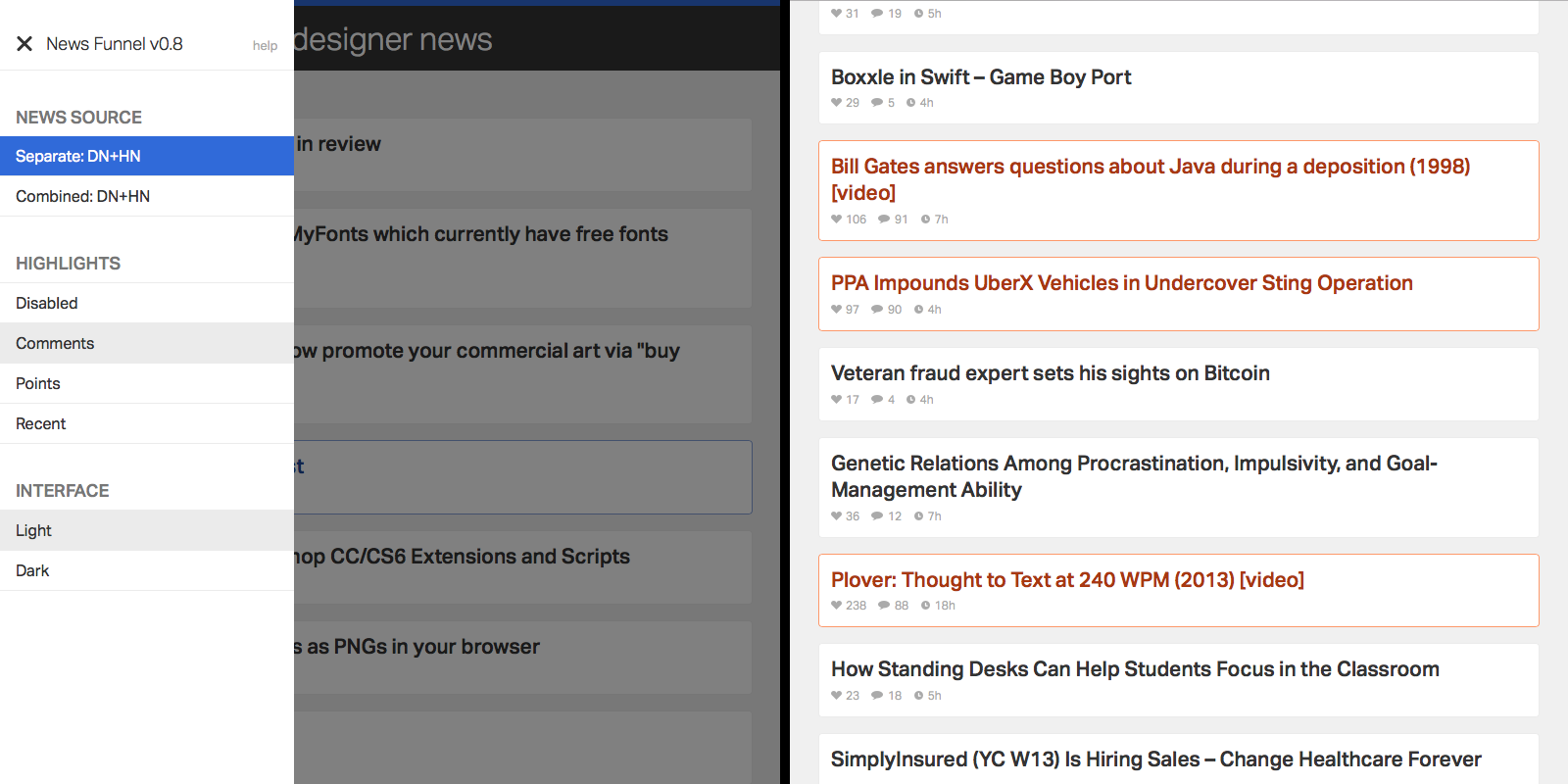
I often visit both DN and HN for various reasons and in a range of contexts, which made adding customization a natural choice. It’s all accessible in a single side menu. By default, wide displays show DN and HN side by side, while narrow displays allow you to toggle between either source. There’s also a special combined mode which pulls articles from both sources into a single column, alternating articles in ranked order. Especially on narrow width displays (e.g. smartphones) that makes it easy to scan through both sources with minimum effort and context switching between apps or web pages. Just scroll down and keep your eye trained on a single column.
I find ranking and title to be an occasionally insufficient indicator of what I should be noticing from either news source. So to keep relevant articles front and center, I added a simple highlights toggle in the side menu. You can choose to highlight stories that have a large number of comments, high point score, or those that reached the top 50 list quickly. There’s no substitution for opening an article, but flipping on highlights and running a quick scan through the app can draw attention to good content I would have missed otherwise.
Add highlights to articles based on the criteria of your choice.
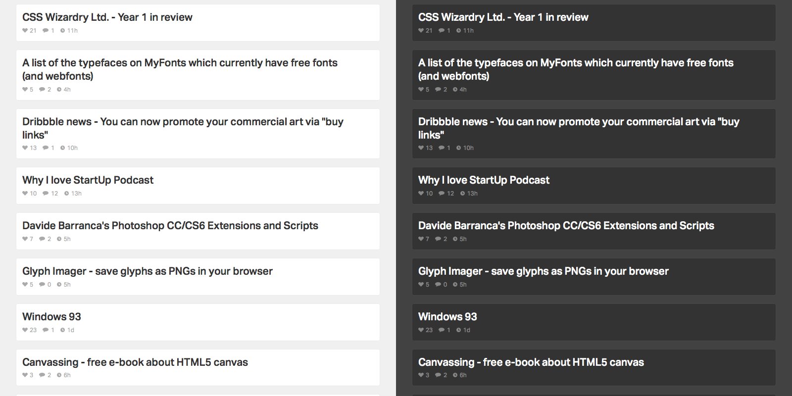
The context of where you access News Funnel matters as well. Much of that is taken care of with responsive web design so the list is readable on any device. But location and time of day is another key factor. I’m often scanning both news sources in low light scenarios, usually late at night on my Macbook or iPhone. To make it easier on the eyes, or for those that prefer a different look, I added a toggle to flip between light and dark color schemes.
Toggle between light and dark color schemes.
While I’m no aesthetic designer, I added a few visual touches to keep things simple and avoid distraction from the actual content. To start, animations are consistent. They run on the same easing scale and, for the exception of the side menu, are exclusively fade ins and outs. The reading color palette is monochrome. To add emphasis to clickable areas, hover states add punchier blue tones on DN content, orange on HN content (albeit toned down from the stronger “official” orange on the actual HN web site) and purple for combined content.
Overall, I designed News Funnel to be a concise way to check up on cool stories going on in the design, development, and the web. Feel free to check it out.
Another OS release, another great review by John Siracusa. Some might find John’s depth maddening (the review’s word count is probably larger than most other OS reviews online combined), but I think that’s exactly why it’s so essential. Treat it like a small novella: have a drink, sit on the couch and parse through the whole thing for a few hours on a low key night. If you love tech, it’s great entertainment.
We’re still behaving like the rebel alliance, but now we’re the Empire. We got where we are by ignoring outsiders and believing in ourselves even when nobody else would. The decades have proved that our way was largely right and the critics were wrong, so our habit of not listening has become deeply entrenched. It even became a bit of a bonding ritual to attack critics of the culture because they usually didn’t understand what we were doing beyond a surface level.
Very solid mini intro to Git by Tobias Gunther over at A List Apart. You can find this content virtually anywhere by running a simple Google search, but Tobias makes a stronger case. First he succinctly lays out the reasons why Git is such an improvement over older repository systems like Subversion. There’s also some great use of visuals here to lay out what happens during core commands like ‘git reset’ and ‘git revert’.
If there’s something I do frequently at work, it’s take screenshots and send them to coworkers. There is your usual stable of options like Cloud and Droplr, but my storage live mostly revolves around Dropbox, and I wanted to stay in-house. Enter this great workflow by “Carlos-Sz” on the Alfred forums. I run a simple global keyboard shortcut, take a screenshot, and it’s saved a public folder in Dropbox, along with an auto generated short bit.ly link copied to my clipboard.
Developer Michael Church writes about the difficulties a friend of his has at getting a senior development job:
This whole issue is about more than what one knows and doesn’t know about technology. As programmers, we’re used to picking up new skills. It’s something we’re good at (even if penny-shaving businessmen hate the idea of training us). This is all about social status, and why status is so fucking important when one is playing the work game– far more important than being loyal or competent or dedicated.
Low and high status aren’t about being liked or disliked. Some people are liked but have low status, and some people are disliked but retain high status. In general, it’s more useful and important to have high status at work than to be well-liked. It’s obviously best to have both, but well-liked low-status people get crap projects and never advance. Disliked high-status people, at worst, get severance.
Michael’s main argument is that the overwhelming majority of those who remain software engineers – even those that are highly talented – can never can crack out of a low social status. Very interesting and depressing nonetheless.
Like many other developers and designers out there, almost every day I make the rounds of Designer News, Hacker News along with occasional forays into Sidebar and Dribbble.
Usually that involves a lot of Safari tabs and context switching. Panda aims to change that: it’s a simple, well designed web app that puts many of these popular sites side by side. As a Chrome extension, it can be the default state of any new tabs you create. There’s a few minor customization issues that keep me from diving fully in but it’s worth a look.
When you hear the word “just” being thrown around, dig deep into that statement and find all of the assumptions made within it. Zoom out and think slow.
Your product lives and dies by the decisions discovered between ideation and creation, so don’t just put it up on a server somewhere.
There are hundreds of new features in iOS 8 and the ecosystem surrounding it that signal a far-reaching reimagination of what iOS apps should be capable of, the extent of user customization on an iPhone and iPad, or the amount of usage data that app developers can collect to craft better software.
Seven years into iOS, a new beginning is afoot for Apple’s mobile OS, and, months from now, there will still be plenty to discuss. But, today, I want to elaborate on my experience with iOS 8 in a story that can be summed up with:
iOS 8 has completely changed how I work on my iPhone and iPad.
I’d consider Federico a much more hard core power user than most, but his argument is pretty sound. For years I’ve been extremely envious of Android users and their custom widgets, keyboards, and third-party sharing capabilities. No more.