Even months removed from their initial play through, Genesis Noir and Observation have stuck with me. It’s not due to either game’s overall quality; both impress with plenty of initial style and swagger, only to narratively stumble in the final acts. Instead, it’s all about their daring approach to user interface and control scheme, both which change frequently throughout the story. The experiences I had with both games made me realize how thrilling it can be when gaming conventions are broken.
For most modern games, the UI and control setup remain consistent throughout the a playthrough. For example, in the most popular game genres today – first person shooters, third person action adventure, and sports – you use a controller’s analog sticks for movement and looking around. For shooter titles like Destiny 2 and the Call of Duty series, there are expected conventions on the HUD to show player health, ammo, and a mini map of the player’s surroundings.
Popular streaming services like Netflix make it challenging to find films older than a few years. As these services increasingly dominate our movie watching time, fewer will be watching older movies. The net effect accelerates an already on the rise movie monoculture dominated by Disney, DC, and Fast and Furious. Fewer films that aren’t blockbuster franchises get made.
The problem starts with streaming service UI patterns, most of which have the same opening interface: a big highlighted promo area up top, followed by long rows of thumbnail content segmented into categories. As I wrote earlier, categorization in the rows can feel arbitrary. Navigating through a single row requires too much horizontal scrolling. In addition, the promo area dominates the visual hierarchy but rarely offers more than a single movie or TV series at a time.
So streaming UI makes browsing dicey for any film. Considering older films tend to be a fraction of the content on the opening page, they, in turn, become exponentially more difficult to find.
How we get from one TV episode to the next on your streaming service of choice requires finesse. The right design pattern saves time through less menu navigation once you reach the end of an episode. But too aggressive of a yank to the next show generates a hurried feel, giving you barely a breath to process what you watched before zooming off to the next show.
The services I subscribe to today – Netflix, Amazon Prime, Disney Plus, Apple TV Plus – take different approaches to this next episode design challenge. All but Disney Plus have an algorithm that detects when you’ve finished an episode, generally the moment the closing credits begin to roll. At that point, UI appears to suggest moving on to the next show. This feature ensures I get the correct episode when I pick back up the series later.
Disney has no next episode detection and no corresponding UI at the episode’s natural endpoint. Continuing the “latest” episode of a show usually drops me midway through the previous episode’s credits. The net effect means I have to manually browse to get to the next episode.
For engineers building user interfaces, I find there’s heavy emphasis on technical chops and little to none on design comprehension. Yet a subset of design skills can distinguish great from merely good UI engineers.
I’d term these skills “pre-visualization”: understanding design specifications before writing any code, and at a level beyond what designers formally deliver. A big part of pre-visualization is the ability to break down specs into reusable components. You discern visual patterns from existing parts of your app, site, or larger OS, and apply them to a designer’s work. In many, if not most cases, much of the spec maps cleanly to what came before. Common UI patterns like buttons, form elements, and navigation generally repeat themselves. Some will not.
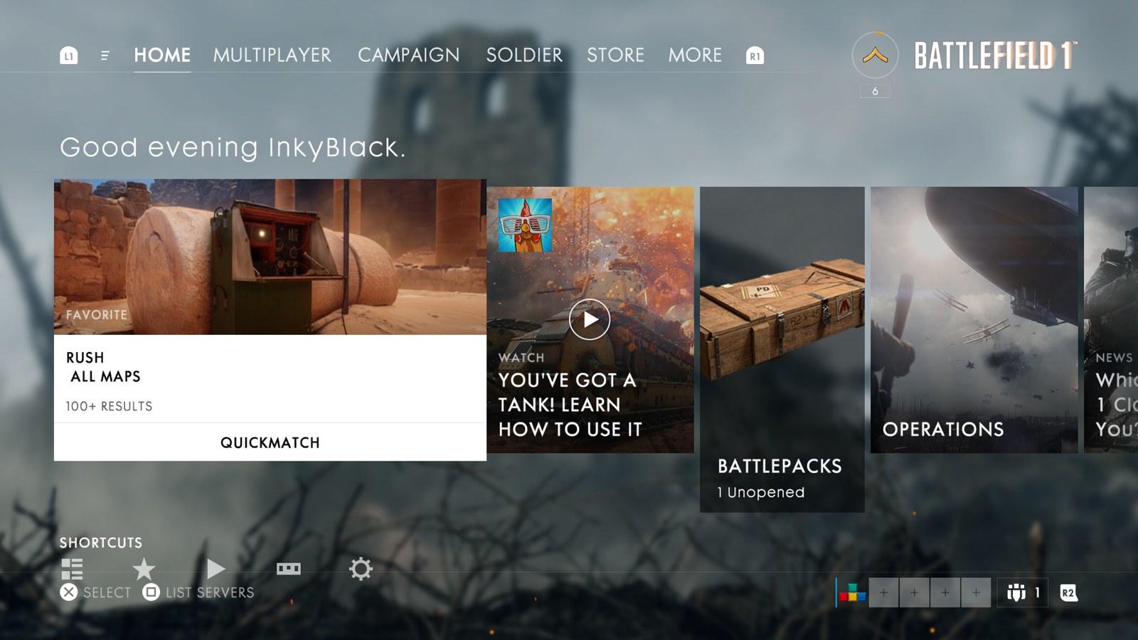
Battlefield 1 has received praise for its gritty WWI gameplay, but its pre and post-game user interface need serious work. They are too cluttered and confusing for casual players.
Let’s focus on BF1’s main menu:
Arriving after BF1’s otherwise stellar prologue, the menu is a momentum killer. There are six areas of functionality fighting for attention on this screen. Players can browse game modes and other recommended content in three interactive rows. Each has a different layout and visual aesthetic. There’s also information on profile, party, rank, and a legend to clarify button actions in the screen corners.
To become a better web UI engineer, study design, communication, and vocabulary. Even if you cut back on some extra technical training, it’s worth it. That’s because the difference between good and great UI work rarely comes from technical prowess alone. It’s distinguished by creativity, visual insight, and sound organization.
Yes, JavaScript and styling fundamentals are important. You need to understand the tech behind your craft. But the solution to a tech blocker can be a tool or coworker away. And once you learn the basics of one MVC JS framework or CSS coding methodology, you can learn another.
Reusability is a bigger issue. Every time you change styling or write a new UI element, consider its impact elsewhere. Think ahead to where the application will grow and how you can cut repetition. It’s more than an blind grep through the code. It’s finding patterns. And visual patterns or usage trends are especially tricky to detect.
Fallout 4 relies on a classic RPG feedback loop. Venture out and discover. Aquire loot and experience from combat and finishing quest lines. Improve your character, equip cool weapons and armor. Repeat. But thanks to an unwieldy user interface, part of Fallout 4’s feedback loop is broken. It’s increasingly problematic for me as I advance through the game’s main narrative.
Admittedly, that’s not a factor during most of my playtime thanks to Fallout 4’s superb open world design. There’s always something new to explore, little of which feels like filler content. The art direction and detail on most locations is impressive. Map layout is intuitive and influenced by real world constraints. Many terminals and safes add to a location’s backstory and the characters that populate it. It all adds to a breadth and unpredictability to Fallout 4 that I haven’t encountered in any other game this year.
Yet solid open world exploration and interesting loot only get you so far. Once you’re back at home base, Fallout 4 strains during character improvements and management. I’ve burned long stretches of time micromanaging inventory, encumbrance, and crafting items.
I’ve bounced between web design and development for years. As someone who has never had a formal instruction in visual design, Erik Kennedy’s primer on this Medium post isn’t a bad start for those new. I especially like his thought processes behind rule three: double your white space. Might be a bit overkill compared to what’s absolutely necessary, but it’s one of the first mistakes I see from design newbies, especially developers starting to dabble in design work.
It’s clear the PS4 is an unqualified sales success. It’s sold around ten million units, roughly 2 to 1 against the Xbox One. Those are impressive enough sales to be a key factor in Sony’s profitability for Q1 2014 after years of losses.
But even hit consoles need work; almost a year into its lifecycle, the PS4 needs to improve its user interface. As I’ve argued previously, the UI gets the job done as a quick, no-frills game launcher. Yet its “horizontal ribbon” layout, with every app (in this post, ‘app’ is a loose interpretation encompassing both games and entertainment apps like Netflix) on the system ordered in strict reverse chronological order, is hampered by its lack of customization (note the upcoming major UI update, as of this writing, doesn’t alter the app layout at all.)
Customization matters
Core gamers, often with large game libraries, have the most immediate demand for a more organization-friendly UI. Yet it’s not just a traditional fan base that may juggle between many apps. Popular premium subscription services like PS Plus, Xbox Live Gold and the recently announced EA Access offer new “free” game downloads at regular intervals as long as you’re a member. And casual gamers that only buy a few $60 AAA titles may buy more games as inexpensive and free-to-play indie titles proliferate on the PSN store.
Also, in 2014, customization isn’t just a nice to have, it’s essential to the DNA of most modern tech gear. Every smartphone, tablet, or laptop allows you to organize apps into folders or across multiple home screens. If I’m paying the same price for a dedicated gaming console as I am for the next iPhone, I expect basic levels of customization to define it as my own.
There’s a philosophical argument as well: gaming is going through the same pattern as all media post-internet, splintering into fragmented, niche genres. With so many on the same base console but able to purse much more individualistic tastes, some basic UI customization helps distinguish my PS4 from somebody else’s.
A multi ribbon interface
With such a large install base, major UI changes can be tricky. Thankfully, the UI doesn’t need a redesign from the ground up, just evolutionary growth into a multi ribbon system. Users create as many additional ribbons as they want and move apps to any ribbon they choose. To keep things straightforward, like with iOS, there are no extra “shortcuts” or “aliases” of app icons, only a single canonical icon within a set of ribbons.
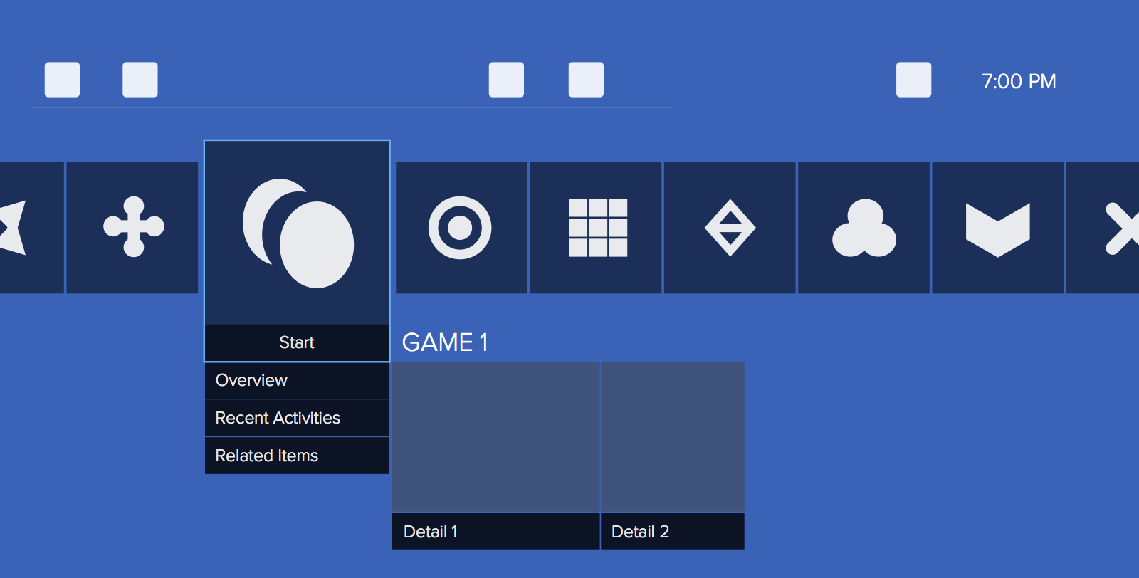
The original, single horizontal ribbon remains unchanged by default. Navigation and controls are identical to before, retaining the three row structure: settings, notifications and trophies are in the top row, apps in the middle, and details on an individual app or game at the bottom (figure A). Only one ribbon appears at a time.
Figure A: Start state of the proposed UI
Users tap the DualShock controller triggers (L2, R2) or speak voice commands to cycle through their ribbons. As each ribbon appears, the scrolling text region in the screen’s top left briefly displays the ribbon name (figure B).
Figure B: user jumps to a new ribbon
Reordering games and editing ribbons
To reorder apps in a single ribbon or move an app to another ribbon, users enter a special “app reorder mode” by holding both DualShock bumpers (L1 and R1) down for a few seconds. This is a nod to the “hold an icon until it wiggles to edit” paradigm in most mobile OSes.
The UI’s look in this mode changes significantly: the top and bottom rows are removed and the app icon the cursor is selecting no longer enlarges the icon. In addition, new text labels are added around the ribbon to clarify the name of the active ribbon and its order (Figure C).
Figure C: app reorder mode
A new, simplified control scheme applies in this mode:
Controller bumpers cycle through the current ribbon’s order options: chronological (default), alphabetical, and manual.
X selects an individual app for movement.
Options opens up a menu to change the current ribbon’s name. Upon creation, all ribbons have an automatic, sequential ordering naming convention like “Games 4” and “Games 5”. But for users with a lot of content or who want a particular organization, custom labels are helpful.
The D-pad and analog sticks navigate between ribbons (up/down) and individual apps on a ribbon (left/right).
Square exits app reorder mode.
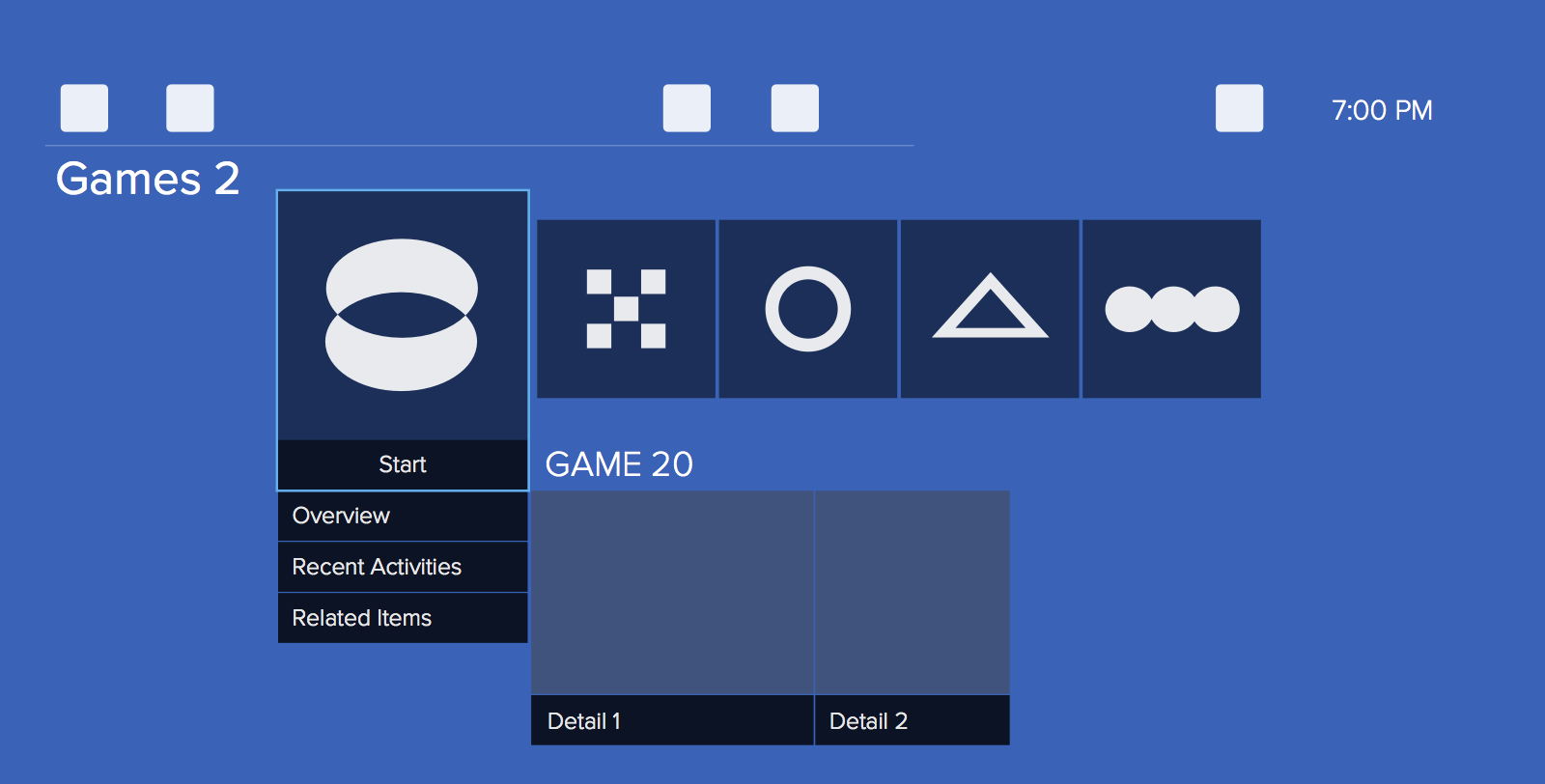
Once an icon is selected, a visual change (e.g. change in selected icon border color or thickness, icon appears to hover) indicates it’s available to move. Up and down always shuffles the app between ribbons. To keep things simple, the ribbons cycle with a definitive beginning and end; the first is at the top, the last is at the bottom and there’s no looping. This way, to create a new ribbon, all it takes is moving ‘down’ from the last occupied ribbon (figure D, E). Conversely, to remove a ribbon the user removes all icons from it.
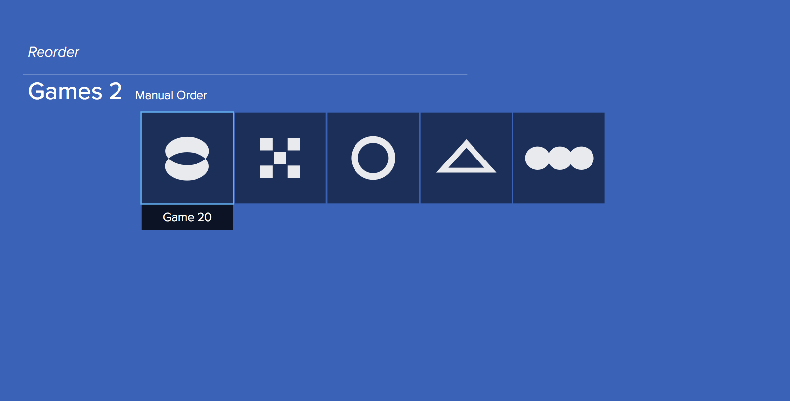
Figure D: Game 20 is selected, ready for movement.
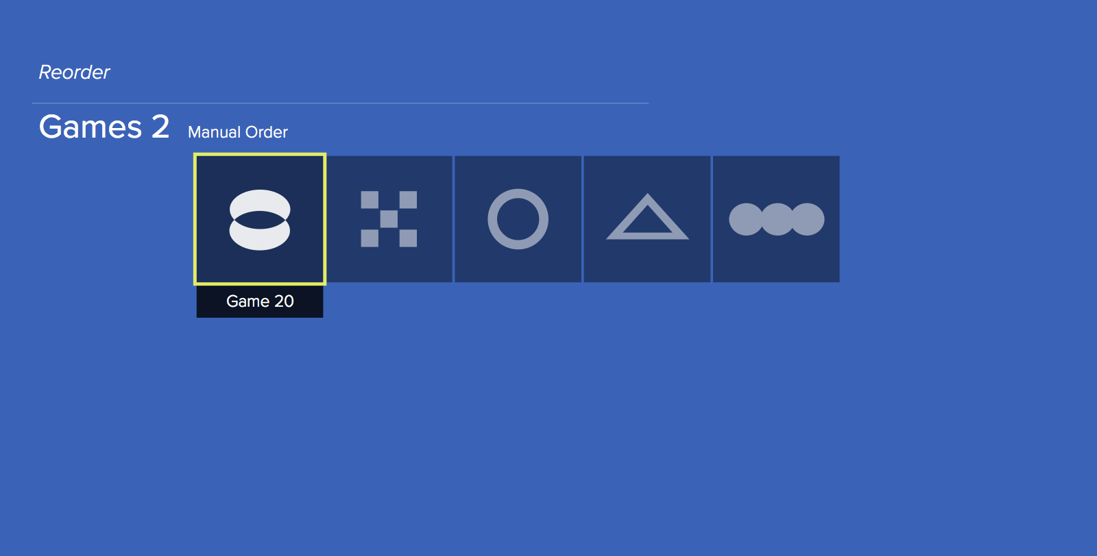
Figure E: Moving Game 20 "down" once auto creates a new ribbon.
Small change, big impact
Adding smarter organization isn’t going to move the needle for PS4 sales. Nor is it likely to affect Sony’s ongoing battle against the Xbox One, a fight centered on game selection, exclusives, and raw performance. Instead, a stronger UI makes users happier while improving their attachment to the device. For a dedicated gaming console in an increasingly mobile-centric world, that’s an underrated, compelling factor in the long run.
A guest Kotaku post by Naughty Dog’s Alexandria Neonakis on UI design within one of the most critically acclaimed games from 2013. I love seeing how the interface changed over time. It’s an especially cool look considering how rarely we get behind-the-scenes access to AAA game design.