06.27.12 |
Web/UI Design |
∞
With modern web development, pages should degrade gracefully. Different browsers aren’t expected to display a website identically; modern browsers get what the latest HTML5 and CSS3 has to offer (e.g. box shadows, animations, semi-opaque backgrounds) while legacy browsers get the functional basics without all the beauty.
We’ve reached a turning point where that philosophy has gotten serious buy-in by many designers and clients. That’s a big win for front end developers. But questions arise: as CSS3 gets used more heavily, how do we best degrade for legacy browsers? Is it a CSS hack? Extra javascript? Also, when does a lack of CSS3 “beauty” turn into a usability problem for legacy browsers?
Put another way, I can pump out CSS3 for the latest Webkit and Gecko based browsers with little worry. It’s degrading that CSS for IE8 and IE9 – on both a technical and aesthetic level – that can drive me crazy. On this post I’ll address that problem. I’ll break down the most common CSS3 enhancements and recommend ways to handle them on legacy browsers. I’ve also intentionally organized the CSS3 enhancements from easiest to hardest to degrade. But first…
Use Modernizr
You’ll see in several of the examples below that I lean heavily on the popular Javascript library Modernizr to help me out. While there are many graceful degradation techniques sans Modernizr, it often helps significantly to have it installed. Check out their documentation for more details.
Border-radius
The border-radius attribute adds rounded corners to an element. It’s an extremely popular technique used heavily in the context of dialogs, buttons, and other call to actions. Legacy browsers require no fallback CSS to handle the border-radius attribute; elements just revert back to hard corners.
It’s rarely a serious issue if rounded corners don’t show up for legacy browsers. In case it is:
If your element has a fixed size, legacy browsers should receive a background png with rounded corners. One extra image, one more CSS rule with a single line of code. Simple.
Avoid flexible elements that require rounded corners on legacy browsers. You have to add four extra HTML elements that are either direct corner images or have a corner image as a background. Each corner image’s position “overwrites” the default hard edge. It’s often tricky getting the corner images and CSS border to match perfectly. Bottom line, avoid whenever possible.
Opacity
Semi-opaque elements are all over modern web designs, especially in overlays and fade animations. You have two options for legacy browser fallback:
Use the Microsoft-specific filter. It’s as simple as filter: alpha(opacity=X), where ‘X’ is a number from 0 (not visible) to 100 (opaque). An alpha opacity filter doesn’t hurt performance too much (unlike other filter techniques; see below). However, there can be occasional strange font rendering issues, especially when a font transitions between 95% and 100% opacity.
Skip the filter and substitute a different image or color. This can’t work as a workaround for most fade animations. However, if you’re dealing with a faded border, font or image on a plain background, picking a different image or hex color can substitute well. For example, take a pure black headline on a pure white background that should be at 80% opacity. For browsers that can’t resolve CSS3, using the alpha filter can make the font very pixelated and harder to read. It’s easier to switch the font to a much lighter color to give the illusion of a faded look.
Box shadow
CSS3-based box shadows are useful to highlight elements or give an element a raised or 3D look. They also take up minimal code and don’t change the alignment or position of an element. Like with border-radius, legacy browsers safely ignore the box-shadow attribute. But because box shadows distinguish elements from each other, you almost always want a good legacy substitute.
Add a simple border on the sides where the box shadow would normally appear. This can be tricky for elements where dimensions are constrained, but if visual parity is important then it’s worth the tradeoff. Use a lighter or less obtrusive color on the fallback than what’s used for the box shadow (borders have distinctly hard edges that can’t be blurred.) Likewise when in doubt favor a smaller border width.
Don’t use the Microsoft-based image transform for shadow (DXImageTransform.Microsoft.Shadow). It does avoid the spacing issues of a real border, but I don’t like the performance or its visual appearance; Microsoft-based shadows have a pretty hard edge that can’t touch the quality of a blur effect on a modern box shadow.
Text shadow
Text shadow effects are tricky to reproduce in legacy browsers. You can’t throw a simple border on a block of text, and often text shadows are deployed with such a fine touch that a fallback isn’t worth the work.
If the shadowed text is not a headline or especially large (e.g. larger than 20px), fallback code isn’t necessary. I generally see text-shadow deployed on smaller text to help it stand out against a busy background or give text an embedded or etched look. The former can be an issue – hand check the text in legacy browsers and either change the background or text color to maximize readability. Cosmetic effects like embossing can usually be ignored in legacy browsers.
Large standout text should be replaced with images if the shadow is critical to the aesthic look. I admit that replacing text with images is a bit scary; it’s poor semantics and a lot harder to maintain the code. However, because CSS3-based text effects are so hard to reenact via CSS hacks or Javascript, image solutions can work best.
RGBA colors
Rgba colors are one of my favorite and most heavily used CSS3 effects. They are great for button and icon inset effects – you can throw on an rgba(0,0,0,0.2) or rgba(255,255,255,0.2) for a really cool effect that blends well regardless of the base icon or button color you’re applying it on. For legacy browsers:
If the rgba effect appears only on a single flat color with no other visual detail beneath it, substitute the rgba with a simple hex color. If you write rgba with best practices you should be doing this anyway. For example, a border-color: rgba(0,0,0,.25) can be preceeded with a border-color: #343434 property.
If the rgba effect has a clearly viewable transparency effect underneith (most of the time this happens with rgba background colors) experiment with overall element opacity. Reducing opacity also reduces the opacity of all child elements so this works best when rgba keeps things mostly opaque (e.g. rgba(0,0,0,0.95)). It’s also best where there are minimal amounts of child elements and text (text that drops to a semi-transparent state turns into a usability problem).
If reducing opacity looks bad, add a new element with a reduced opacity and place it underneith the rgba element. This may sound complex, but it’s simple to implement. Add an extra div or span in your html code. Set its position to absolute, have it mirror the size and position of the target element and make sure its z-index is lower. Give the new element a reduced opacity and appropriate background color, while making sure the original rgba element has a transparent background.
Gradients
We’re long past the Web 2.0 “gradients gone mad” era, but gradients are still used heavily on modern UI design. Thankfully for legacy browsers, Microsoft provides a reliable fallback:
Use the DXImageTransform filter to handle gradients on IE7 through IE9. Syntax is straightforward but there are several limitations. First, DXImageTransform overrides any hover selector treatment. That’s a pretty severe limitation for interactive UI elements. Rounded corners are also ignored; the gradient ends up “poking through” any rounded borders. The filter also doesn’t support color stops and gradient positions.
If the gradient isn’t critical to either the usability or aesthetic of the element, fallback with a flat, simple hex color. As with the rgba example given above, you should always back up your gradient CSS backgrounds with hex color backgrounds anyway. To pick an appropriate fallback color, I tend to visually test out both the lightest and darkest colors of a gradient and just pick what looks better. If both don’t look great, I’ll start testing out color values midway between the two end points.
If the previously noted options are a problem, fallback with an actual background image that represents the gradient itself. I prefer simple flat colors over the image route to both save the extra http request and to avoid the extra production work.
However, if you do go the image route, I recommend making the actual image be a good 5 or 10px taller (in the case of a vertical gradient) or wider (for horizontal gradients), and using repeat-x (vertical gradient) or repeat-y (horizontal gradient) for the background-repeat property. This ensures that if later you slightly adjust the width or height of the element it will still look passable without any gaps (though in the long run, you should recut the image.)
Conclusion
If it wasn’t already clear from the technical details noted in this article, legacy CSS fallback is rarely fun, glamorous work. Good degradation also requires a lot of hard choices. As you’ve seen here, there’s almost never one definitive technique – sometimes the solution is technical, sometimes it’s aesthetic. Yet, jumping into legacy browser issues early and head on will help you grow significantly as a web developer. Rise to the challenge.
06.05.12 |
∞
Designer/writer Stephanie Rieger, talking about her frustrations while browsing the Camper web site:
All this wouldn’t be so bad if each shoe collection didn’t spawn yet another “Please wait” message, and yet another 20 second wait before i’ve even seen the shoes (…but that’s what the awesome copywriting is for…a collection called Flexibility, Together or Cushioning must surely be worth the wait!)
Eventually it becomes unbearable. Where is a good mobile site when you need one?
Like Jeffrey Zeldman noted in his oft quoted article several weeks ago, if we don’t design our content to be easily consumed, we’re toast – users will search for alternative consumption methods (e.g. Instapaper, PDFs, competitor’s web sites) almost immediately.
05.31.12 |
Web/UI Design |
∞
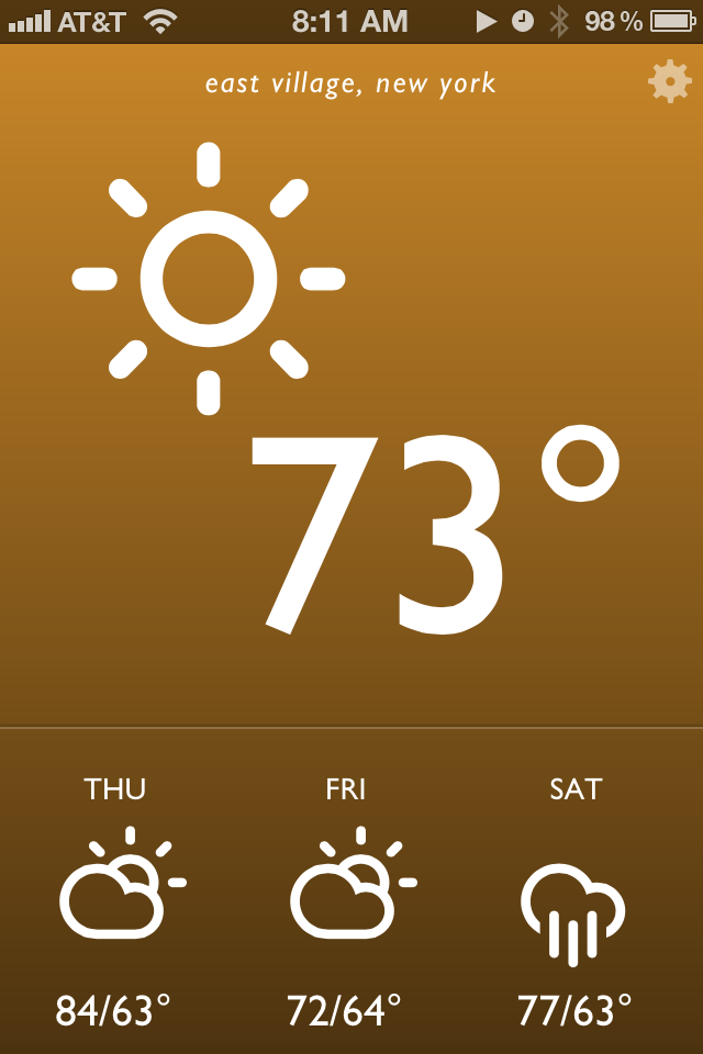
I’m pleased to launch a little project I worked on over the weekend. I called it Blue Drop, and it’s a colorful, simple weather app that’s accessible anywhere you have a web browser. It looks best on an iPhone, iPad, or Webkit (e.g. Safari, Chrome) browser on your desktop. It’s far from revolutionary, but it matches my needs and may match yours as well. On this post I want to break down how it came together and my development workflow.
To give a bit of background info, the idea of a self written weather web app or page had been ruminating in my brain for weeks. I’ve been extremely disappointed by options on the web store. Most weather apps are poorly designed, hard to read at a glance (small text is the common culprit) filled with ads, and tend to provide either too much or too little information. Then a breakthrough came last week – I spotted Degreees, a clever, CSS3 powered web app that relies on geolocation to report local temperature. I knew this was exactly the kind of direction I wanted to go in, but with my own personal spin.
Before I started designing mockups, I jotted down in iA Writer a few attributes of what an ideal weather app would have. It should be reliable and get its weather information from a great source. I’ve always been a fan of Weather Underground’s data so they were a logical choice. Their api is free for developers to try out as long as your daily query size is small. I also wanted a pared down app that gave me quick information at a glance. No maps, no extended forecasts. Just the temp, conditions, and a quick forecast of the near future. Finally, I was heavily inspired by the Windows Phone Metro style UI: big typography, big iconography and a sparse color palette.
I next used Sketch for mockups and wireframes. Based on some searching I settled on Adam Whitcroft’s gorgeous Climacons for icons, and the well tested Gill Sans for typography. Helvetica is a more readable choice but I wanted a mildly warmer and more humanist font. Development was done locally on my Macbook Air with my usual tools: Sublime Text 2, Kaleidoscope and SnapRuler.
The finished app has a few small touches that I think both add personality and increase its usability. First the background gradient changes color depending on both the time of day and the weather conditions. Sunny days have an orange hue, clouds and rain get blues and grays, and thunderstorms are purple. Daytime has bright, punchy colors while saturation and darkness decrease during the evening. The interface is also intentionally simpler than most iPhone apps – this made development and QA more straightforward as well. Everything essential is presented on app launch, and a single tap or click on one of four regions (the top conditions area and the three daily weather icons below) toggles additional detail.
There are still a few rough issues; they mostly deal with the size and space of several icon related items that I expect to touch up in upcoming weeks. For now, feel free to check it out and pass along any feedback.