05.31.12 |
∞
I haven’t bought into integrating a standing desk routine into my workflow yet. That attitude may change with this extended article at Brain Lam’s The Wirecutter. Breaking from its usual review heavy content, author Mark Lukach spends the first half of the article diving into standing desk health benefits and general best practices.
05.31.12 |
Web/UI Design |
∞
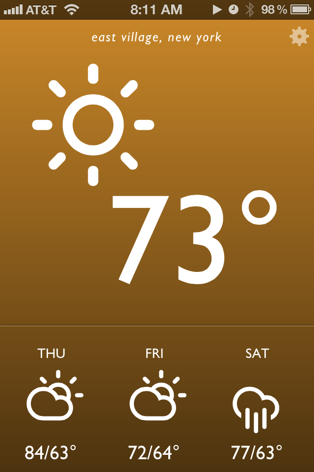
I’m pleased to launch a little project I worked on over the weekend. I called it Blue Drop, and it’s a colorful, simple weather app that’s accessible anywhere you have a web browser. It looks best on an iPhone, iPad, or Webkit (e.g. Safari, Chrome) browser on your desktop. It’s far from revolutionary, but it matches my needs and may match yours as well. On this post I want to break down how it came together and my development workflow.
To give a bit of background info, the idea of a self written weather web app or page had been ruminating in my brain for weeks. I’ve been extremely disappointed by options on the web store. Most weather apps are poorly designed, hard to read at a glance (small text is the common culprit) filled with ads, and tend to provide either too much or too little information. Then a breakthrough came last week – I spotted Degreees, a clever, CSS3 powered web app that relies on geolocation to report local temperature. I knew this was exactly the kind of direction I wanted to go in, but with my own personal spin.
Before I started designing mockups, I jotted down in iA Writer a few attributes of what an ideal weather app would have. It should be reliable and get its weather information from a great source. I’ve always been a fan of Weather Underground’s data so they were a logical choice. Their api is free for developers to try out as long as your daily query size is small. I also wanted a pared down app that gave me quick information at a glance. No maps, no extended forecasts. Just the temp, conditions, and a quick forecast of the near future. Finally, I was heavily inspired by the Windows Phone Metro style UI: big typography, big iconography and a sparse color palette.
I next used Sketch for mockups and wireframes. Based on some searching I settled on Adam Whitcroft’s gorgeous Climacons for icons, and the well tested Gill Sans for typography. Helvetica is a more readable choice but I wanted a mildly warmer and more humanist font. Development was done locally on my Macbook Air with my usual tools: Sublime Text 2, Kaleidoscope and SnapRuler.
The finished app has a few small touches that I think both add personality and increase its usability. First the background gradient changes color depending on both the time of day and the weather conditions. Sunny days have an orange hue, clouds and rain get blues and grays, and thunderstorms are purple. Daytime has bright, punchy colors while saturation and darkness decrease during the evening. The interface is also intentionally simpler than most iPhone apps – this made development and QA more straightforward as well. Everything essential is presented on app launch, and a single tap or click on one of four regions (the top conditions area and the three daily weather icons below) toggles additional detail.
There are still a few rough issues; they mostly deal with the size and space of several icon related items that I expect to touch up in upcoming weeks. For now, feel free to check it out and pass along any feedback.
05.31.12 |
∞
Startup entrepreneur Ilya Lichtenstein on the effects of him picking up basic programming skills:
The lessons I’ve learned from actually building and launching products are invaluable.
I never ask for specific estimates or set hard deadlines for finishing a project. I know firsthand that the last 10% of a project can take 90% of the time.
I don’t say things like “This looks really easy to do, you can throw it together in a couple hours, right?” The most complex projects can look deceptively simple.
Exactly. I’ve worked directly with and for a business almost a decade now. Once you have as little as one or two decision makers on the business side with a technical background, it can have a huge positive effect on relations with the tech team.
05.31.12 |
∞
Pretty brilliant Reddit comment thread that made its way around the internet yesterday:
It’s well known that all of Tarantino’s films take place in the same universe – this is established by the fact that Mr. Blonde and Vince Vega are brothers, everybody smokes Red Apple cigarettes, Mr. White worked with Alabama from True Romance, etc.
As it turns out, Donny Donowitz, ‘The Bear Jew’, is the father of movie producer Lee Donowitz from True Romance – which means that, in Tarantino’s universe, everybody grew up learning about how a bunch of commando Jews machine gunned Hitler to death in a burning movie theater, as opposed to quietly killing himself in a bunker…
…What immediately springs to mind about Kill Bill and From Dusk ‘Til Dawn? That they’re crazy violent, even by Tarantino standards. These are the movies produced in a world where America’s crowning victory was locking a bunch of people in a movie theater and blowing it to bits – and keep in mind, Lee Donowitz, son of one of the people on the suicide mission to kill Hitler, is a very successful movie producer.
We’re going way down the rabbit hole here. If you have even a passing curiosity about Quentin Tarantino’s films, check this out.
05.30.12 |
∞
There’s a lot of wireframing tips floating around online but they rarely focus on just web applications. It’s cool to see that kind of web focus over on Intercom’s design blog. Pay special attention to point three which focuses on speed and exploration:
If you can’t produce concepts quickly, then you’re working at the wrong fidelity. If your wire-framing serves only to deliver a grayscale version of what you’ve already decided you’re building then you’re wasting everyones time.
05.30.12 |
∞
Having shot hundreds of shots via Instagram, I’ve gotten burned out on their strong 60s and 70s esque filters. Results are fast but crude – it often feels like applying a sledgehammer to a job that requires a scalpel. In response I tried a lot of alternatives but settled on VSCO Cam has been my new “go to” choice for post processing my iPhone shots. It’s not as fast as other processing alternatives, but I love the app’s much subtler filter effects, especially the three options in black and white.
For many VSCO Cam can be an all in one photo solution – it loads to take a shot in less than half the time of Camera+ or Camera Awesome. I still found the actual shooting options pretty bare bones, so I tend to shoot in Camera Awesome, and when I have the time later import shots directly into VSCO. Recommended for 99 cents in the App Store.
05.29.12 |
∞
Marcelo Somers:
Facebook advertising doesn’t work because they focus on showing you ads based on who you are, not what problem you are trying to solve.
Ironically enough, Google is running around afraid of Facebook, but their ads have been better targeted all along because they are shown at a moment where one has a job that needs to be done.
Great point. I’ve always felt Facebook’s advertising wasn’t fully effective, but couldn’t articulate why succinctly. No more.
05.29.12 |
∞
Thorough and excellent analysis of this week’s Mad Men by Salon writer Nelle Engoron (spoilers ahead):
But it’s Joan’s story that sadly underlines the circumscribed state of women, circa 1966. Having kept the firm running smoothly for 13 years, she deserves to be made a junior partner on those merits. But instead she must sleep her way into the position, and not even with a powerful man she desires like Roger (who seems never to have considered rewarding her in that fashion) but with a repulsive man who sees her as a pair of breasts between which he symbolically hangs a tiny jeweled chain.
It was an extremely sad, almost tragic episode that, as Engoron focuses on throughout her piece, centered almost entirely on feminism and women in the 1960s. Christina Hendricks deserves major praise for her acting this week; I suspect when we look back at Mad Men series highlights her work in “The Other Woman” will stand out.
05.29.12 |
∞
I can’t put my finger on why, but lately I’ve been skipping a lot of Smashing Magazine articles. That changed with Dan Reynold’s breakdown of body fonts. Very true to Smashing form, Reynolds’ coverage is exhaustive. A few times it becomes too exhaustive (I have doubts on the effectiveness of font ‘apertures’), but this is awesome stuff. I knew a lot of the basics (e.g. go for moderate stroke contrast, higher x-heights), but there’s a lot of info here I haven’t seen anywhere else.
05.29.12 |
∞
Designer Pat Dryburgh’s much passed around account of Photoshop upgrade woes is totally worth the attention it’s getting. His praise of small shops like Panic is what really sells his opinion:
How is it that a small, independent Mac development shop can make this experience so incredibly pleasing, while Adobe—a company with over 9,000 employees and 30 years of experience—can’t process an order quicker than 24 hours?
Wait… Photoshop CS4 just crashed. I think I’ve got my answer.
I find myself increasingly in the situation Pat did. The Adobe Creative Suite is awesome yet bloated, crash-prone, and overkill for at least half of what I throw at it. Pixelmator and [Sketch] have been logical next steps.