There’s a lot of gamers, myself included, very curious about Polygon, the soon-to-be-launched gaming web site from Vox. Vox is the team that brought us tech site The Verge, which overall is a pretty slick site. Yet Paragon’s teaser website is atrocious. It’s a site guilty of shoving all relevant content on one very long page in a poor manner. That design paradigm – what I call ‘scroll heavy’ – probably sounded cool in design meetings but falls apart entirely in execution.
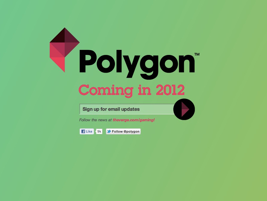
Just look at this:
Do you have any damn clue at all that’s there’s more content below this email form? Granted, there’s a scroll bar. Yet given how impatient and click happy most web users are these days, it’s unlikely one would scroll down out of sheer curiosity.
It’s unfortunate, because far below the page there’s a Twitter listing of many respected game journalists all across the industry that are now part of the Polygon team. For those “in the know”, the exact “core” gaming audience Polygon should be interested in, this is a pretty big deal. It’s a total lost opportunity.
So if you’re a web designer who’s on ‘scroll heavy’ design duty, be careful. Look out for the following pitfalls:
Navigation or content that fails to imply what’s below. If you’ve got a clear navigation area at the top that scrolls or jumps to content below, you’re probably in decent shape. But if you’re going very minimal and navigation isn’t prominent, be sure a bit of ‘teaser’ content will be viewable at the bottom of most users’ browsers (if in doubt about that bottom point, I’d start with 700 pixels from the page top.)
Inconsistent design among page sections. I’ve seen some designs throw together otherwise eclectic pages together on one scrollable area because it ‘looks cool’; it doesn’t. If anything, scroll heavy design demands more attention to design consistency, not less. Users who don’t notice a site’s cohesiveness between page refreshes are far more likely to clue in when different sections are a few hundred pixels above or below each other.
Too much high bandwidth page content. With all the extra code and content now on a single page, site performance becomes especially relevant; slower connections and processors can choke on a scroll heavy page’s sheer complexity. Minimize http requests by cutting down the number of separate images and/or videos that are part of initial page load. Streamline the HTML and CSS code.
If you’re still having trouble, one example of great scroll heavy design is the Kaleidoscope file comparison app website. It’s clean with bold colors, strong copy and clear divisions between major content areas. Designer Ethan Marcotte’s home is also well thought out with a more subtle color scheme.
It’s clear Google+ and Mac OS X Lion are getting a lot of attention from tech and design communities online. Some question the focus, but I think it’s well deserved based solely on both products’ visual design changes. However, it’s not flashy CSS3 animations or iOS-like visualizations that have me excited. Instead, I’m most impressed by the changes in spacing; Google+ and Lion provide significantly more room between UI elements and content than their competitors (or in the case of Lion, earlier versions of Mac OS X.)
That white space factor is one way Google+ distinguishes itself from Facebook and Twitter: Content receives extra padding and wider margins than I initially expected. Side columns are sparsely populated and the pages for Circles and profile management are spaced out to ensure editable elements have adequate room. Comment threads are limited in scope by default (though more customization here would be welcome) to keep the stream view uncluttered. In addition, while it’s not exactly Google+ only, listings in Gmail, Google Calendar and core Google Search results all received a bump in padding to increase readability.
Scanning through the rather gorgeous Gdgt redesign this week, I was impressed with its change in typography. The site uses Proxima Nova for its paragraph text, almost uniformly well above 12px, making reading comments and reactions on the site?s many gadgets easier to browse through. A bump in size also opens more opportunities for sizing variety within a single page, ranging from smaller 10px text for secondary sidebar information to large 16px text reserved for primary questions and notices. Overall, the typographic changes should deliver better usability and most likely generate far higher traffic.
Gdgt?s typographic change illustrates an important web design lesson: To improve the impact and readability of a text or information heavy web site, experiment with increasing the body text slightly. Try to move up from the common 10 to 12 pixel range to something larger, like 14 or 16px. It?s a practice many well designed sites are latching onto, especially in light of higher resolution displays and custom web fonts.
Flipping on my PS3 this week, I was reminded of the system?s poor user interface. I wanted to watch some Netflix and make some system setting changes, but the setup was awkward and clinical, while also taking longer than expected. Ironically, those same characteristics could be applied to Sony?s tepid response to their recent massive Playstation Network (PSN) security breach.
That?s the thing about user interfaces; they reflect the priorities and values of their makers. Apple?s work is known for its visual simplicity and graceful lines. Twitter conveys freshness and a sense of whimsy. What about Sony? Other than favoring dark color schemes with pulsating icons and text, giving a vaguely generic, Euro-slick vibe, there isn?t anything that makes Sony?s UI stand out or be that approachable.
That?s exactly why a UI refresh is important, especially in light of Sony?s PSN debacle. An improved user experience can both help get the brand back on track and add differentiation from its competitors. I?ve got three suggestions for Sony: ditch the XMB, improve notifications of game and system updates, and emphasize large imagery and user avatars.
Considering the App Store’s maturity I’m surprised how many new iOS apps like Pulse and Pocket Casts deviate significantly from Apple’s native visual style. Back in 2008 or 2009 such wide deviations and experiments were expected, yet today I’m downloading apps with solid functionality and design in a package that feels and looks like something Apple could have never designed; that?s a problem.
Don’t get me wrong – I’m not suggesting developers that blindly copy the company’s aesthetic to automatically expect greatness. Originality of design and function, not to mention solid customer support and a well written code base are all critical factors behind app success. Nevertheless, the appeal of Apple?s native app look shouldn?t be underestimated: Remember a huge subset of iOS users spend most of their time buried deep within Apple’s native apps (e.g. Safari, Calendar, Mail, Messages), only occasionally branching off into other third-party apps. If a third-party app it just looks or feel too different from Apple?s approach, especially for novice users, it runs a risk of being ignored or eliminated. In addition, the bias of the Mac tech elite (e.g. John Gruber, Macworld) have toward more native Apple looking apps is significant; often it’s their recommendations that trickle down to other power users (e.g. yours truly) who in turn ultimately spread their influence to a wider, more casual audience.
The enthusiastic response to this month’s iPad 2 launch made me reflect on how far technology has come in recent years: First smart phone computing went mainstream with 2007’s iPhone, followed by tablet computing’s exponential growth years later in 2010 with the iPad. The emergence of these new markets caused many web sites and apps last year to cater to three distinct platforms: desktops, smart phones, and tablets.
I’d argue in recent months we’ve reached another turning point: With advances in technology like cloud syncing and fast mobile processors the wall of separation between each aforementioned platform is breaking down. Whether in the office with my 30 inch display, at home on the couch with the iPad or on the subway with my iPhone, I’m not just doing work (writing, code editing, news consumption), I’m doing the same work. That’s a big paradigm shift from 2009 or 2010. Put another way, in 2011, cross platform coverage isn’t enough; consistency between those platforms emerges as a more critical factor.
Being a fairly prolific iPhone photographer, I?ve been interested in the meteoric rise of the Camera+ (C+) app over its competition like Camera Plus Pro (CPP). C+ has dominated the sales charts for weeks, the only photography app regularly in the top 10 of all paid apps in the App Store. Curious to learn more, I decided to give C+ a try.
After putting C+ through it?s paces for few weeks, I?d argue the app?s appeal is straightforward and instructive for almost any designer: the app adds less functionality than its competitors to avoid being overwhelming, yet throws in enough to feel like a noticeable upgrade coming from Apple?s default app. At the same time, C+ better identifies its audience than its competition, providing an appropriate, well thought out user interface in the process.
Admittedly at first glance C+?s pared down approach appears to be a losing proposition in a crowded and feature rich app market. The economics don?t help either; almost all apps trend in the $1-2 range and it?s hard to stand out with one killer feature.
After months of planning, Gawker Media’s massive redesign was released to the public a week ago. Founder Nick Denton declared the changes to be “an evolution of the very blog form”, strong words from the influential entrepreneur.
In response I took a closer look, and after a week of heavy use across several of Gawker Media’s sites (Kotaku, Gizmodo and Lifehacker) I’ve concluded the redesign is a disaster: Gawker takes a shockingly old media approach to a very new media subject matter, largely ignoring the browse and scroll-heavy tendencies of web users in a desperate grab for page views and ad buys. If this is the solution, in Denton’s words, to “the bankruptcy of the classic blog column”, I shudder for web journalism’s future.
Below, a more thorough breakdown of my four largest problems with Gawker’s redesign. Continue reading…
Today I attended a full day talks from The Future of Web Design NY. The conference showcases a diverse set of speakers, ranging from the design focused (wireframing, typography and music) to the more technical (a HTML5 crash course, responsive CSS design.) This diversity and the short nature of the talks can lead to a bit of information overload, but a few trends stood out:
It’s the small details that can make a design resonate with its users and stand out.
Get your web design ideas in front of clients and users quickly, early, and repeatedly. Focus on speed and repetition over perfectionism.
Give users what they want by keeping text and clear calls to action of primary importance. Conventional graphics can get in the way.